A symbol of new beginnings. A color inspired by nature, grass and the outdoors during spring and summer. The color experts at Pantone calls Greenery their color of 2017, "Nature's neutral". It is a refreshing and revitalizing shade of green with a hint of yellow.

This fresh and zesty yellow-green shade evokes the first days of spring, talks about nature's green revive, and it's a call for people to take a deep breath.
"Greenery burst forth in 2017 to provide is with the reassurance we yearn for amid a tumultuous social and political environment. Satisfying our growing desire to rejuvenate and revitalize, Greenery symbolized the reconnection we seek with nature, one another and a larger purpose." Leatrice Eiseman, Executive Director of the Pantone Color Institute
How to decorate your home with Greenery?
Greenery + other green tones: modern look
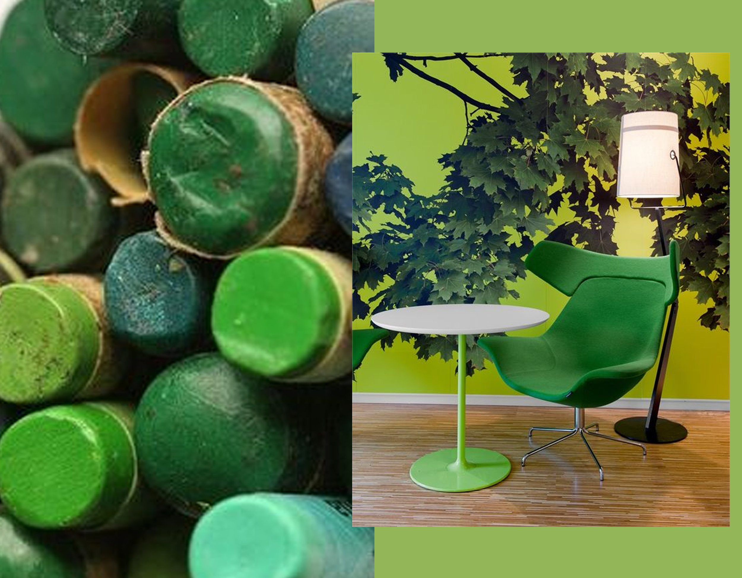
green wax crayons Pinterest - interior image via Archilovers
In nature we will find more than one tone of green, so give depth to your design or interior by using more green tones. Make it rich by adding structures, small or big motifs. A mural with a nature image will change the complete look of your room.
Greenery + white: refreshing
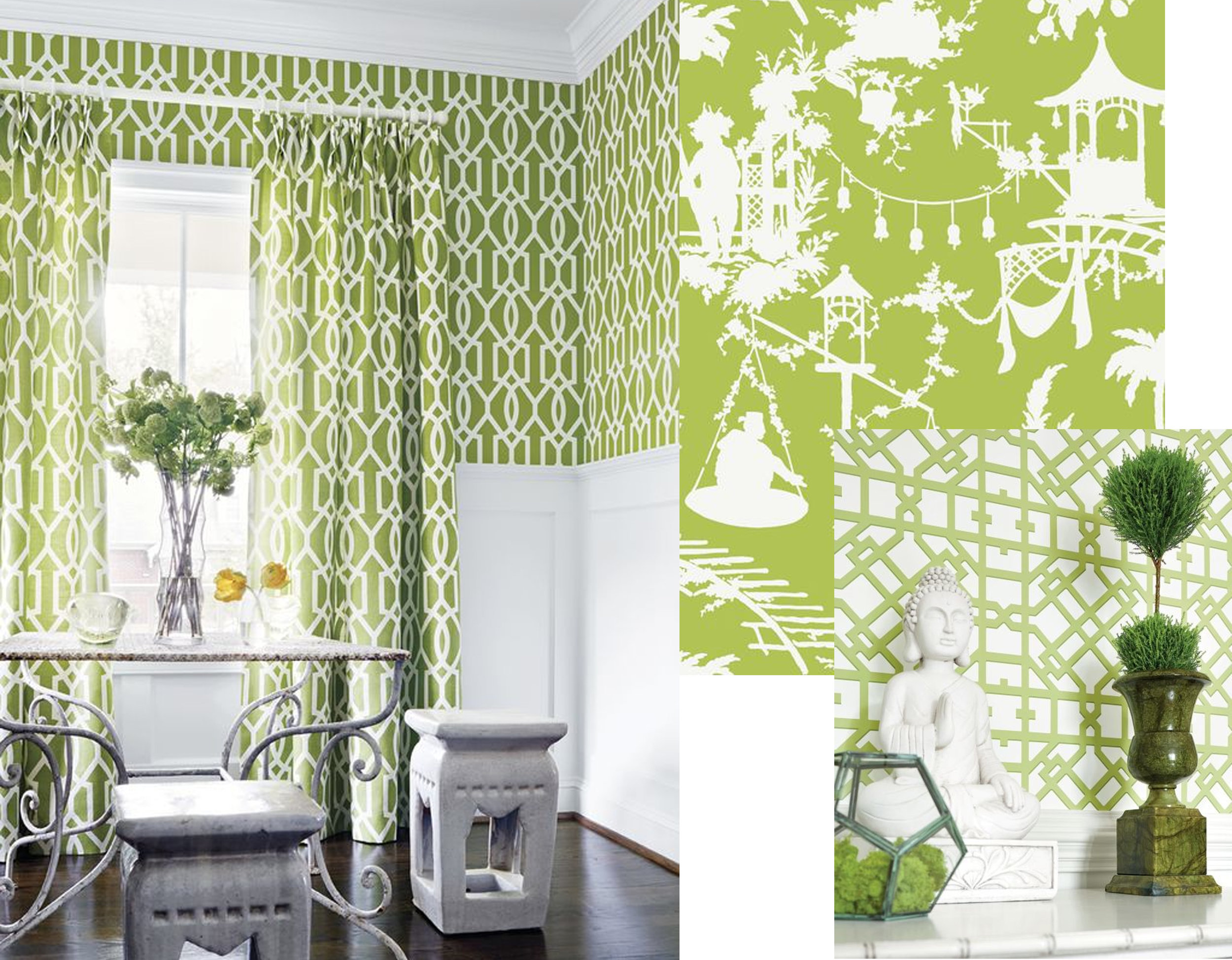
Green and white is a very refreshing combination. When using just one color combined with withe than it is easy to mix different prints. Boldly patterned bright green wallpaper will bring a lot of personality in the room. By adding some real plants you will give the room a natural look.
Greenery + classical style: a surprising match

armchairs Gilles Nouailhac - wallpaper Azari Osborne & Little - classical interior via Pinterest
I'm quite sure it never came to your mind to have a classical library in such a vivid color as Greenery. It is bold, refreshing, and gets very modern. Same for classical wallpaper dessins, once printed on a big scale in Greenery it becomes a statement. This color is always fresh and will never be outdated. A color to bring balance and harmony.
Greenery + outdoors: a Palm Spring look

facade via Flickr - cactus via Pinterest - wallpaper Mauritius Pierre Frey - chest of drawers Moissonnier
When we think of Greenery, we think of nature. There is a growing desire to reconnect with nature. We need a break, summer is still far away from us, we need to stop and breath. Bringing the outdoors inside is a perfect way to create this relaxing mood. Green becomes a link between outside and in. Combine it with some drama and you will get a fresh eclectic style.
Greenery + black/white: modern glamour

interior Verner Pantone via Yellowtrace - interior bar via Concepts and Colorways - fabric Ellipse Thibaut - fabric Sarah Spot Thibaut
Using green in your interior will give it both an extraordinarily personality and peacefulness. Combining it with black and white will create a very modern glamorous space. In this case go for one tone of green and for big scale black and white prints. A touch of gold will make it outstanding.
Greenery + bathroom: a perfect match

image bathroom via The English Room - paint Emery - glass tiles Emery
Green is color for relaxation, rebirth, rejuvenation, all things we can identify a bathroom with. Green breaths freshness in combination with white. A little space can look happy by using green walls.
Greenery + fashion: colorful minimalism

We have seen a lot of green tones on the runways for next springs / summer collections. How to wear Greenery: keep it simple, make it minimal. But not only the color should or could be green, think of the environment, how things are made, go for natural materials. Re-cycle, up-cycle. We will see in 2017 a return to the natural.
Greenery + nude tones: poetic

cactus David & David studio - photpgraphy Bernard Handick via Vingle
Green is a strong color, you can make it softer and more poetic by combining it with nude tones or other pastels. Society is looking for unfiltered imperfection, individuality, and non- manufactured resources. Leatrice Eiseman said the choice of Greenery was made in response to a "stressful and tense world". The yellow pigment we find back in the green tone references the sun, the symbol for the light that people need in those times. Let us dream a bit.
See how you can introduce Greenery into your home
- use it for accessories: you can add or take a way, according to your mood
- simple: add plants, and buy yourself a nice flower bouquet each week
- mix shades of green, add texture
- combine different motifs / dessins
- paint an accent wall in Greenery, or another green tone
2017 is a new beginning filled with hope, and so is the Pantone color of the year.
A simple click, on the Like button of my FB page, and you are sure not to miss any of my blog post. Or follow me on Bloglovin'