For the first time Pantone choose the blending of two shades as their Color of the Year: Rose Quartz and Serenity. A balance between a warm embracing rose tone and a cooler tranquil blue. Every year Pantone is announcing their color of the year to inspire the fashion world, the beauty world, as well as the interior world.

Those soft pastel tones are reflecting simplicity, but suggesting at the same time a certain character, giving an identity. A perfect balance for two complementary tones. Comforting, relaxing and dynamic,

Rose Quartz is a persuasive yet delicate powder tone that conveys compassion and a sense of composure. It carries a soft feminine energy of compassion and peace, tenderness and comfort. Rose Quartz also inspires the love of beauty.

found on Pinterest
Serenity is a soft mix of lavender and an icy blue, refined and timeless. It is weightless and airy, like the expanse of the blue sky above us, bringing feelings of relaxation and peacefulness in turbulent times.

Willow Bougs William Morris
Whether in soft or hard surface materials, the pairing of Rose Quartz and Serenity brings relaxation. Rose Quartz and Serenity are the perfect mix for bi-colour interior.

Marie Claire Maison - pillow The Estate of Things
For a serene and light univers you can propose Serenity in all the rooms of the house. To bring a warm touch to the cool tone you can match it with some warm colours. Perfect combination with brown and beige tones for creating a refreshing and comforting ambiance. Add some contrast by using black or dark grey tones, and add sparkle by using orange and red tones.

wallpaper De Gournay
Serenity in combination with other blue tones, as petrol blue, nautical blue or dark blue will bring an elegant masculin style in your house. Adding a bit of Rose Quartz will give it a softer look.

image via Fashion Squad - marble wallpaper Ferm Living - lamp PH5 Louis Poulsen - chiffonier Directoire Moissonnier
Mid-century look for the kitchen with pastel tones and round shapes. Using pastels in the kitchen is the best way to add subtle color and charm.
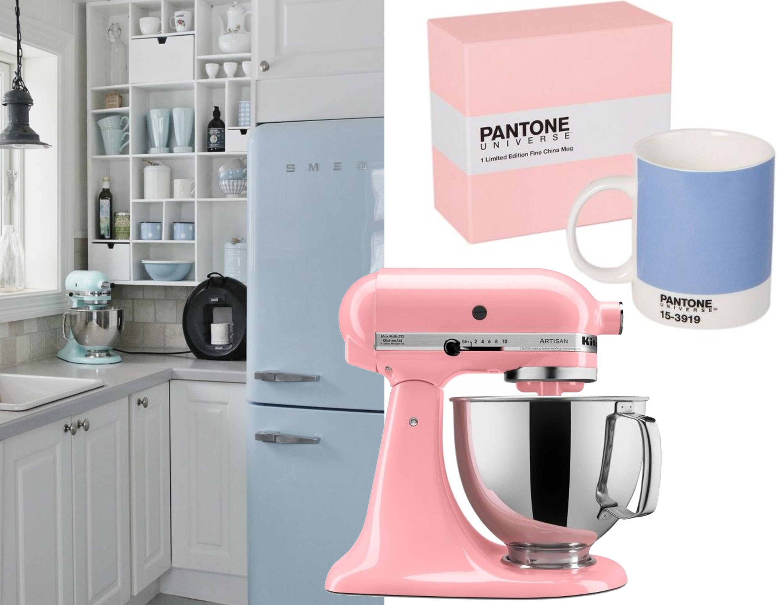
fridge Smeg - Pantone Universe mug - Kitchenaid
Rose Quartz is kind of an old-fashion pink with a modern touch. Easy to combine with a lot of neutral and timeless colours as grey, off-white, beige, to create an elegant interior. To create a more intense and chic atmosphere: combine it with black, grey antracite.

image via Vogue+Living - image Pinterest
Appealing in all finishes, matte and glossy, this combination of colours joins easily with other mid-tones including greens, neutrals and all shades of yellow.

image via Resource Furniture - House of Ceramics
It is nice to have more than one option to decorate your home with this year, I'm curious which one is your favorite: are you more into the soft Rose Quartz or you prefer the cool look of Serenity?
My favorite is the Rose Quartz.