Autumn is the time for warm, rich and cosy colours. It is largely associated with dark colours, but it is time to rethink your autumn colour palette. Classical autumn colours are hues of burnt orange, red, golden yellow, hunters green, and chocolate brown. Pastels and intense colours shouldn't be considered only for spring and summer.

inspiration image Pinterest - from top down: Sanderson Kent Grey - Benjamin Moore Foggy Morning - Emery et Cie Rinpoche - Sanderson Firecracker LT - Benjamin Moore Chocolate Candy Brown - Emery et Cie Tete de Negre
Autumn brings the desire for tranquility. Warm neutral colours are the perfect base to be combined with more typical autumn colours and you can bring some contrast with a bold red that is warm, sensual and pleasing to the eye. Those neutral tones will give reassurance, stability, and a grounded feeling.

It is a timeless colour palette, so what makes it a good choice for autumn? A soft, neutral colour palette doesn't have to be boring: in your interior a neutral backdrop allows you to bring out some bold elements and make them the attraction point in the room.

tile Concrete Oregon Tile & Marble - tiles Going Underground Smink Things - wallpaper Suminagashi Zoffany - bedspread grey silk/velvet Fabric Copenhagen - concrete fruit bowl Rough Fusion
Autumn is the perfect season to layer textiles, it is the key to create a warm space and neutral colours will make this easy for you. Warm textures and some warm colour splashes will turn this space into a welcoming room. You will never grow tired of neutrals, they will always be a classic which you can change when you decide you need some vibrant colours in your life. A bouquet of flowers, some cushions and the room will look different without spending to much.

hand-dyed paper Crystal Maya Romanoff - hand-painted paper River Bed Maya Romanoff - antique French linens Design Mom - phone Pinterest - paint image Good House Keeping - image entree FusionD
So how can you make neutrals interesting? Choose a wallpaper with structure or a tone on tone print. There are a lot of paints which will bring some kind of soft effect to the eye on the wall, keep the finishing mat, not shiny. Hand-painted tiles, woven fabrics with small structures. Heavy linens shouldn't be considered as only for summer as it is the natural crinkle of the fabric which will give the lived-in character.

image inspiration via Style Caster - from top down Emery et Cie Rose Marrakech - Benjamin Moore Fruit Punch - Benjamin Moore Tooty Fruity - Farrow & Ball Skylight - Benjamin Moore Million Dollar Red - Farrow & Ball Tanner's Brown
A classical autumn palette can bring comfort during the grey and rainy days. The earth tones, burned orange and red tones will give you a grounded feeling. Benjamin Moore's Fruit Punch will make that your room will feel anything but flat, it is a colour with real substance which will stand out.

image inspiration via Style Caster - Interior Sutro Architects
This autumn palette invites you to use some exquisite materials to add a degree of sophistication to your room. Wall paneling, velvet fabrics, refinement through details. A dark painted ceiling will give a cosy feeling to the room, you will feel protected.
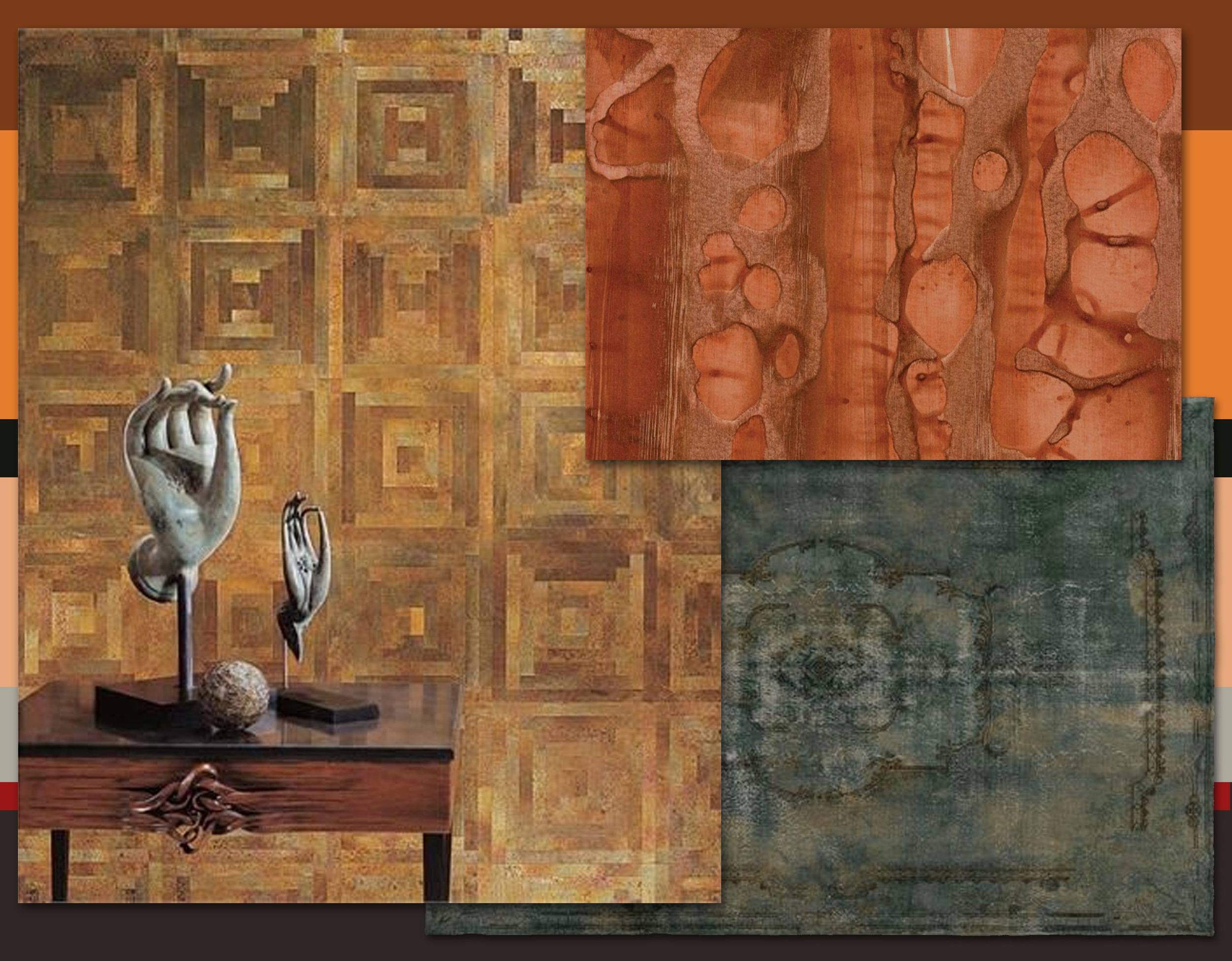
True Metals Maya Romanoff - hand-painted wallpaper River Bed Maya Romanoff - decolorized rug Golran -
Make your room outstanding: take a new look on antique gold metal, it is not at all glitzy but can turn a wall in a piece of art. Antique gold or bronze metals for the curtain rods, door handles. The imperfection of the hand-painted wallpapers is what makes them perfect. Decolorized rugs or fabric will add depth to the room. We can't reflect autumn with a solid colour, it needs something extra, some depth.

wallpaper Medevi Mirror Zoffany - wallpaper Metallo Zoffany - rug Monarch Smoke The Rugcompany - lamps Porta Romana
Earth colours, neutral colours can be boring: wallpaper and ceramic with outstanding finishes, or some optical illusions, they all will make your earth colours interesting.

image inspiration via Design Sponge - from top down Benjamin Moore Tara - Sanderson Grey Squirrel - Benjamin Moore Black Forest Green - Benjamin Moore Fresno - Benjamin Moore Blushing red - Emery et Cie Terre Orange + Blanc
A floral palette of a dusty pink, warm orange and an intense red paired with dark forest green will be a more sparkling approach on the classical red - green hunters palette for autumn. You feel immediately that we go here for a more dramatic approach.

Florals via Design Sponge - interior Rue Verte
Green seems to be sticking around as a trend. Green is an exciting colour that works equally well in modern and traditional interiors. Paired with pops of vibrant colours which, seem to you maybe more for summer, will bring glamour to a dark interior. An exciting and dynamic colour palette, which will evoke unmistakable confidence.

wallpaper Benares woven wild silk on non-woven backing Elitis - floral painting Bobbie Burgers via The Jealous Curator - dining table Equator Ochre
So how can you add those vibrant colours into your home? A bold floral painting, can add drama when you go for big scale. When you are not afraid you can use some wallpaper in dark colours with an expressive floral print. In case you use it on one wall, than I would suggest to paint the other walls dark. Or for those brave enough: wallpaper on all the walls.
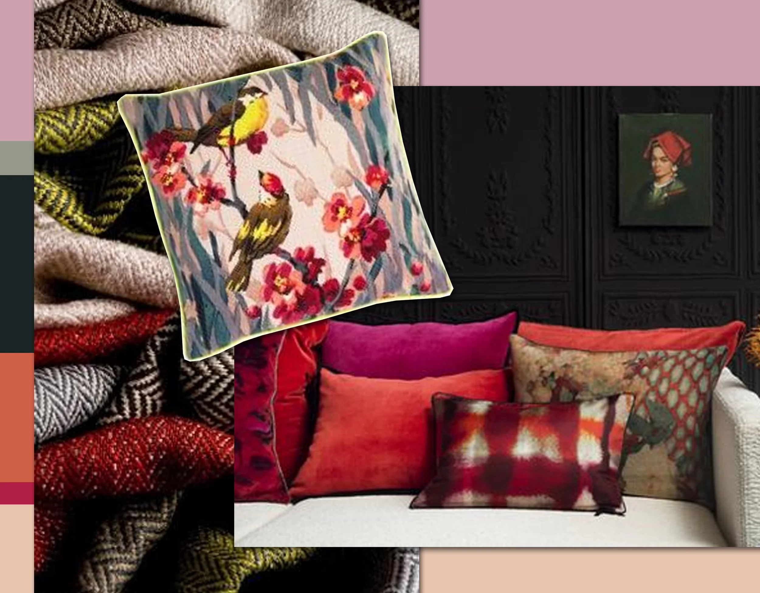
fabrics James Malone - Birdie Blossom cushion The Rugcompany - mix of cushions Elitis
Classical wool fabrics such as herringbone and checks are almost a must for autumn. The combination of neutral tones with a vibrant colour will make them look modern. Your room can be comforting, in warm neutrals or very dramatic in dark colours, colourful cushions will bring a sparkle to every room.

Still Life photography via Pinterest - from top down Farrow & Ball Skylight - Benjamin Moore Dried Mustard - Zoffany Husk - Sanderson Turtle Dove - Benjamin Moore Citrus Burst - Zoffany Pewter - Zoffany City Grey
Grey and other greyish neutrals are pair-able with almost every colour, bright or muted. Citrus Burst of Benjamin Moore is an exotic addition which will add a unexpected and unusual splash of uplifting vibrancy.

Bebe chandelier Marjorie Skouras Design - interior C.O.Q hotel via Tablet
Neutrals work all year round, so you shouldn't abandon your beige favorites for darker browns. A neutral colour palette, paired with dried mustard and citrus burst, feels unique and modern, yet not overwhelming but refreshing.

bathroom tiles via Pinterest - Paktong Silver Planks De Ferranti - wallpaper Suminagashi Zoffany - Tension Mirror Pearl Katharina Eisenkōck
Those neutral tones are much more feminine than the classical autumn colours. How can we give them a masculin touch? By choosing materials with refined and unexpected finishes. Antique metals will bring depth to your colour palette. Your room will evoke a luxurious comfort.

After Lowry ceramic tiles Smink Things - Tidal rug The Rugcompany - collection of cushions Elitis
There is a definite air of indulgence about this season's throws, rugs, and cushions. The textures are as important as the subtle colour nuances. Textured materials will add softness and interest to the eye.
So how to make this autumn different:
- start with a neutral colour palette
- layer textiles
- add a splash of a vibrant colour
- hand-painted wallpapers
- de-colorized rugs and fabrics
- textured materials
- antique metal finishes
- exquisite materials
- the imperfection will be perfect
Enjoy this time of the year, make it cosy at home for the coming months.
A simple click, on the Like button of my FB page, and you are sure not to miss any of my blog post. Or follow me on Bloglovin'