Time comes and time goes, season after season. The cold light in winter, the warm light in summer, it all influences the colors we use.

Spring
I just love the first warmth of the sun after a long and cold winter. Getting out of our hibernation mood and slowly getting color back in our life and our homes.

Pastel colors come to my mind, as you would see them in Miami, when I think of spring colors. They make you dream of sunny days.

Pastel colors will never be to sweet for the romantic soul. There is something about soft tones that whisper spring.

Spring is when you feel the first warmth of the sun on your face. The shimmer of the sun, the reflection of the light on the water.

Time to play with different green tones, add a soft warm neutral.
Summer
Summer is the season when the days are the longest and the nights the shortest.

Summer also means time off, holidays, long days, moments to be creative. Strong colors will give you energy and will inspire you.

Did you ever think of using neon pastel colors? Neon pastels are modern and will give a contemporary fresh look to your interior.

Summer means also seaside, the underwater world will give us plenty of strong colorful ideas.

Warmer temperatures invite us to take advantage to spend more time outside, to travel to the beach, let the sun bleach our hair, and make our skin glow.
Autumn
Autumn is the time for warm, rich and cosy colors. Classical autumn colors are hues of burnt orange, red, golden yellow, hunters green, and chocolate brown.

It is largely associated with dark colors, but it is time to rethink your autumn color palette.

A more dramatic approach for autumn, a floral palette of a dusty pink, warm orange, and an intense red paired with dark forest green.

Earth colors, neutral colors can be boring, so how can you make neutrals interesting? Pair them with a brighter or muted color.

Autumn is a season for a classical color harmony, dark colors, neutral colors and a dark warm red tone.
Winter
Temperatures have dropped under zero. There is a sense of yearning for calm and purity.

Frosty windows will filter the sun light coming in. Blue sky and crisp air. There are hundreds of white shades. And you think white is a cold color? It all depends on the material.

Not every day in winter we wake up with a blue sky, there are a lot of other days when the foggy air slowly vaporizes, giving only a slight idea of what is behind. There is softness, no hard edges.

January and February don't have to be a grey and sad, let us create a positive vibe. We can use colors to brighten up the dark days, There is a certain "fun" factor in this harmony, to break through the winter gloom.
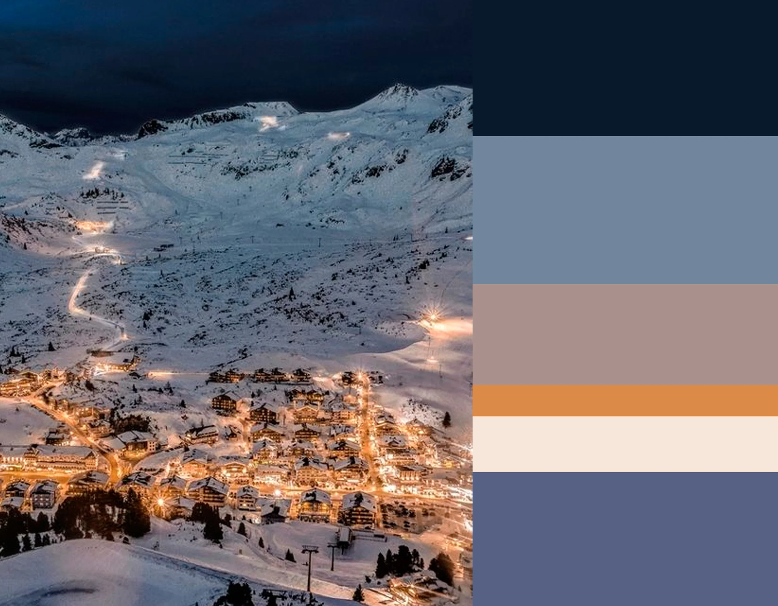
Midnight blues to reflect winter's deep color harmony, dark and moody with some vivid highlights.
I just love to work with colors, so this series of color mood boards were joy to work on. Click on the links under the images to bring you back to the different seasons ans see more about them.
What was your favorite season?
Now in the new year there will be more on color, just follow me.
A simple click, on the Like button of my FB page, and you are sure not to miss any of my blog post. Or follow me on Bloglovin'