I love colors, I love to work with colors. Since quite some time I dreamed of developing a color harmony for somebody. So when Lia of Ton Corner asked me last year to create a color harmony for them, inspired by Viscri it was a dream come true.
Viscri
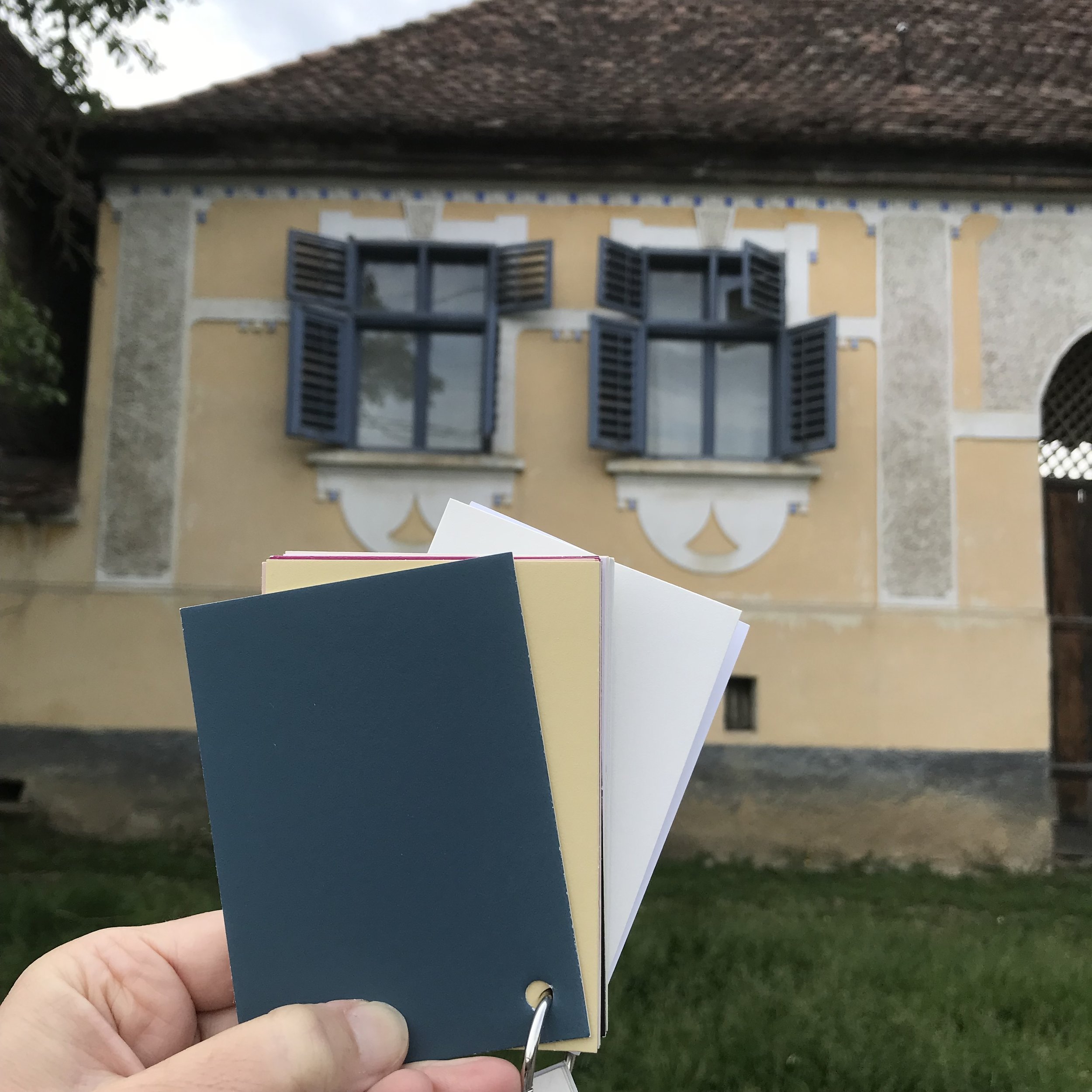
About ten years ago, I visited Viscri for the first time and since then went back at least twice a year. Nine years ago I started to organise workshops at Viscri 125. Over the years I made hundreds of pictures. So I started looking through those as a first inspiration for the Viscri color collection. Collecting color swatches, small pieces of fabric and yarns to make a first selection. Next step was to go and check them on the spot. The whole process took over a year. From the first presentation of the concept, selection of colors, checking for the right tone in Viscri till we made the launch beginning of May.
image Goran Drenkov
Colors of Viscri, Colors of Emotions by Martine Claessens for Ton Corner
Viscri as inspiration for paint collection
18 colors inspired by Viscri for Ton Corner
Ressource, specialist in creating sublime colors, developed the color samples. Most of them came out well from the first tests that we received, some needed some fine tuning. Before launching the collection in May we went back to check the final color samples. The Viscri paint collection exist out of 18 colors. The colors of Viscri, the colors of emotions. Most of the colors come from the facades in the village, the wood work, nature. Some of those 18 colors are closer to my heart, are colors of emotions..
Viscri blue from the collection of Viscri colors for Ton Corner
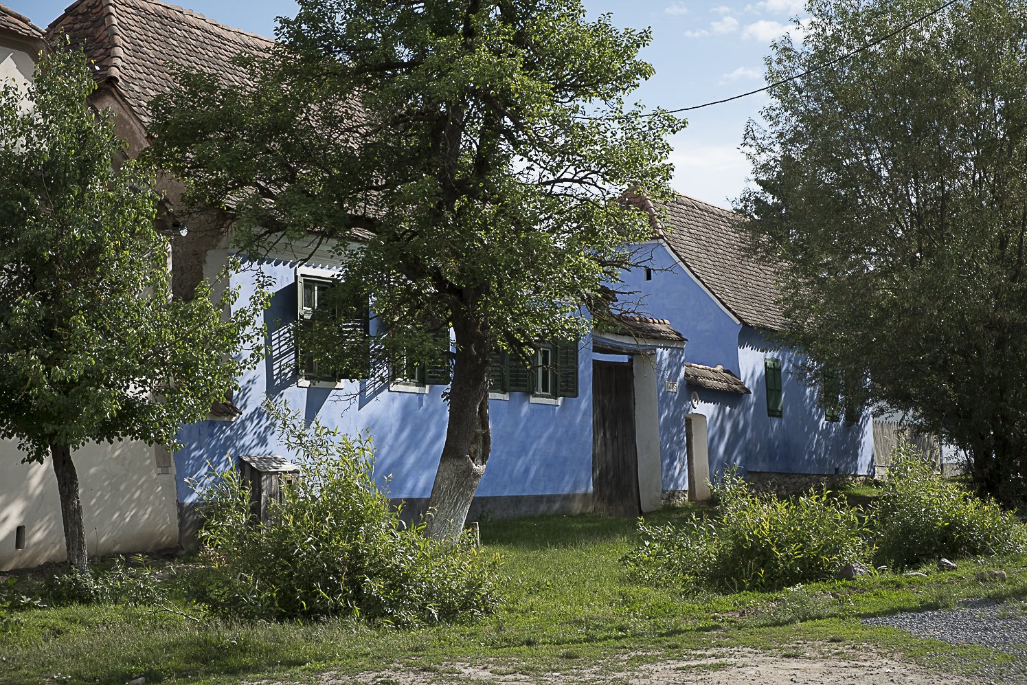
Viscri blue was a must, it is the colors that pops in your eyes as soon as you arrive in the small village. Viscri is a village in Transylvania, Romania, with a fortified church. The church and the village is on the Unesco heritage list and gets every year more and more tourists making a stop on their way from Brasov to Sighisoara.
Color combinations from the Viscri colors for Ton Corner
Walking around in the village you will get inspired to combine the colors. A main color with the accent colors to put them in perfect balance. You will see the combinations coming back.
Color combinations from the Viscri colors for Ton Corner
color combinations inspired by the facades of Viscri
Some colors come with a story. A friend gave me a few years ago some unbleached wool, spun by her mother. This was the most challenging color to be developed for our paint collection.
image Goran Drenkov for Ton Corner
Viscri blue, Viscri green and Hay are the colors you see all around the village. They are amazing to be used in combination with Elderberry Flower and very warm and sunny white tone. Ot to combine them with some neutrals as the Unbleached Wool or Before the Storm.
neutrals from the Viscri paint collection for Ton Corner
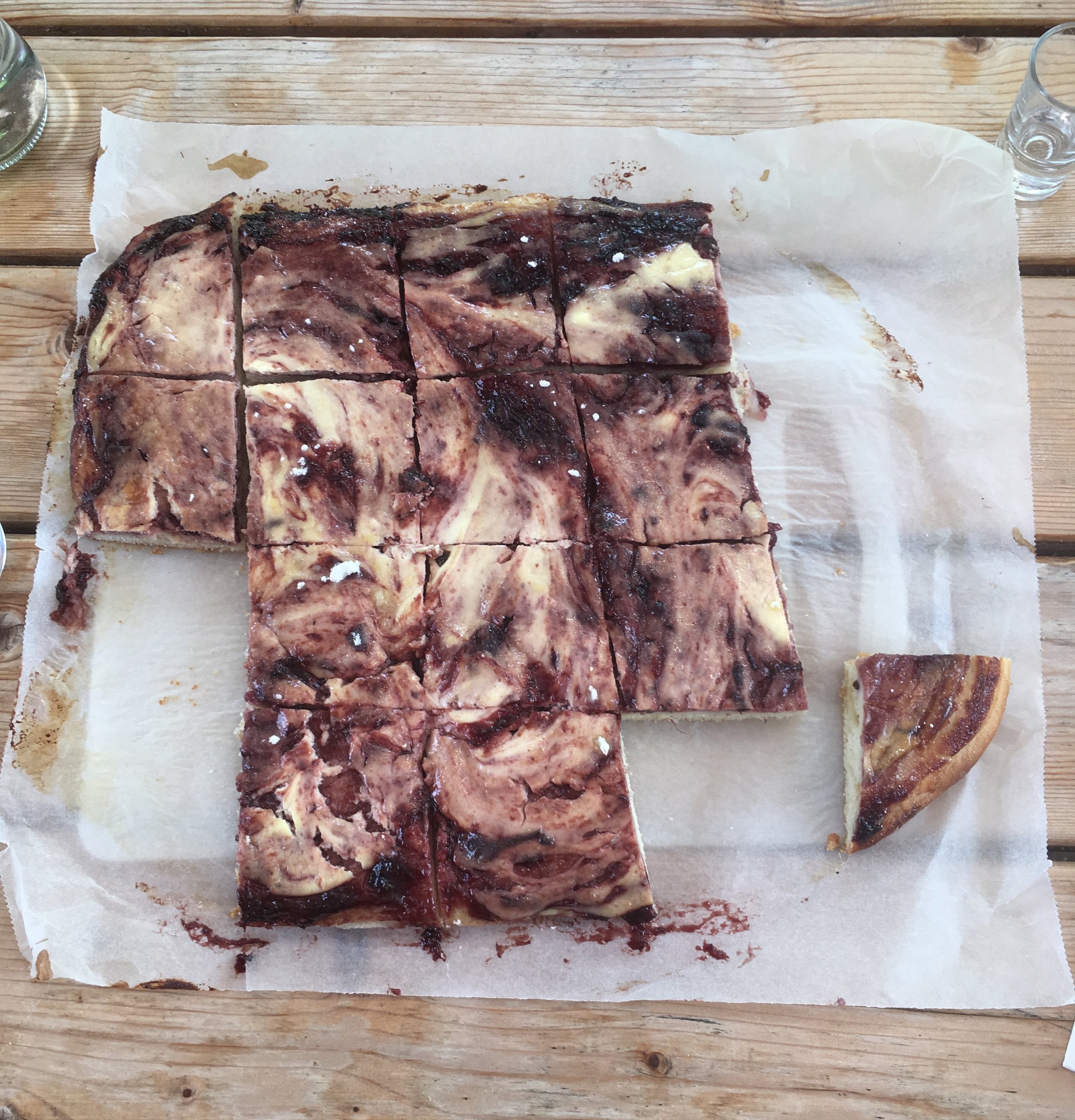
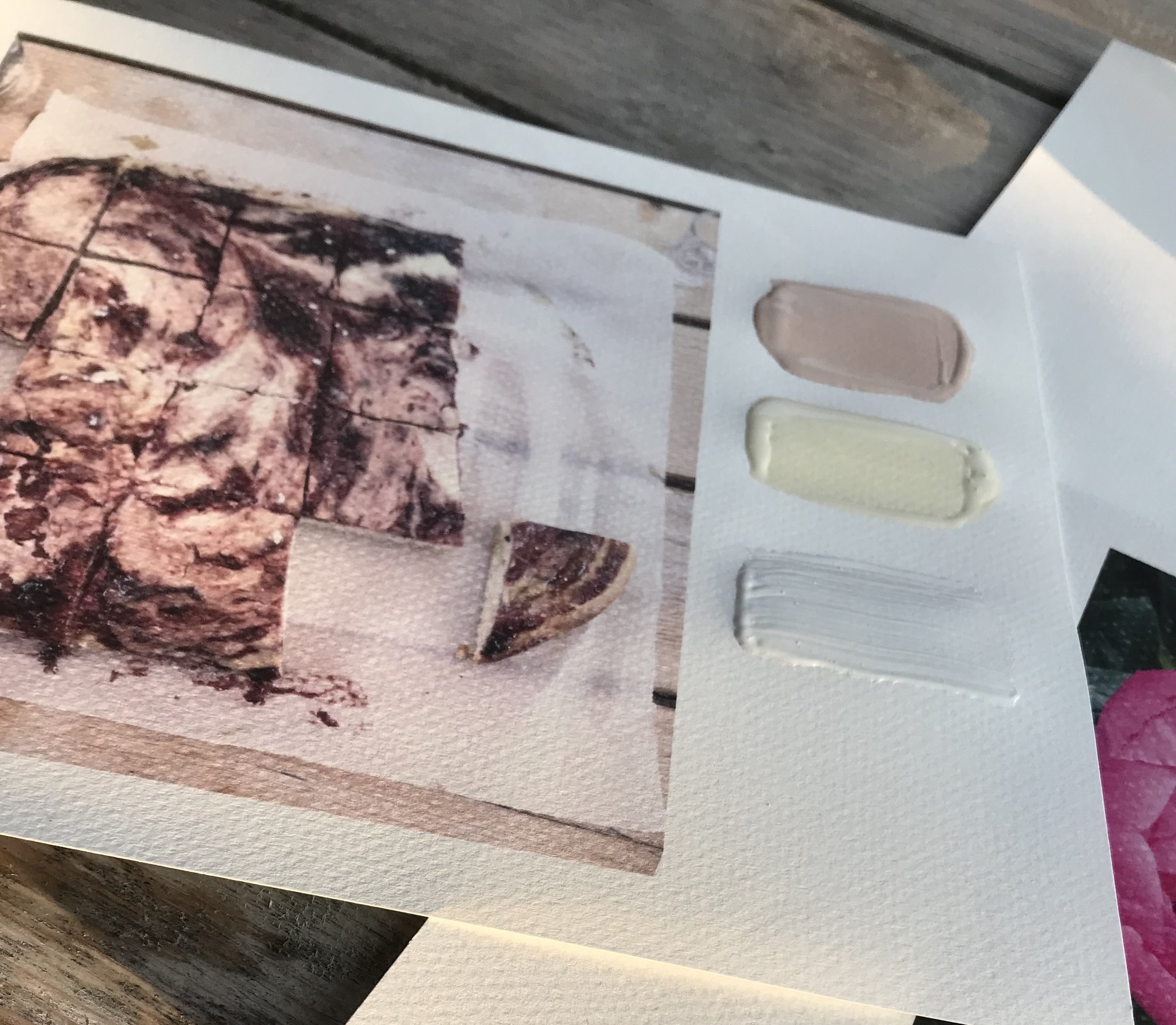
Another color comes from a cake done by Viorica on a Sunday afternoon, after a weekend workshop at Viscri 125 and before everybody would leave back to Bucharest. She came out on the terrace with the cake on the parchment paper and asked if she could just serve it like that and placed it on the table for us to enjoy. The love it was made with, it still warms my heart and it inspired me for the Cheese cake color. This color is kind of a neutral, not to yellow, not to pink but light and with a lot of personality. For sure my favourite in the collection.
inspiration for Viscri color Cheese cake
Viscri color combinations
The Peony color brings a vivid accent to the collection. Peonies have always been for me a very precious flower, a bold flower and elegant at the same time. When you see them in the flower shop they just stand out. It was such a surprise to see them growing in the street, without being pretentious, just show their beauty.
image Goran Drenkov for Ton Corner - color combinations of the Viscri paint collection
During the last workshop in Viscri in May with did a color hunt, going around the village they had to find where I found my inspiration. Some were easy, some were a bit more hidden. They started by choosing some of the colors, paint the paper and ready to start the color hunt.
Viscri colors for Ton Corner
Color hunt
checking the terracotta color
checking the peony color
The collection of Viscri colors are available at Ton Corner in different finishes. Ton Corner sells Ressource paint, an ecological French paint. Ressource is a small family company in the South of France.
Ton Corner
Paint collection Ton Corner inspired by Viscri
Collection Viscri colors
So you see, dreams come true.
Wish you a colorful week.


