Let me tell you the story of my first project, almost 9 years ago.
I was designing a kids' collection at the time and Roxana was my colleague in that company. She knew I was more and more interested in interior design and she asked me if I would not be into designing her new home. She and her family lived several years abroad, Canada and France and she developed a much more Western European taste. She loved France, specially the Provence.
The patchwork tiles are bringing the spirit of the south into the kitchen. Photo Caminul - images (insert) found on Pinterest.
To start and understand a bit more about the things she liked I gave her a stack of magazine and told her to put Post Its. It could be a beautiful interior, a travel image, fashion.... whatever was catching her eye. When I got the magazines back and looked at all the things she marked I saw she really liked red and I told her. She was surprised, but when she looked again to all the Post Its she put in, she had to admit she discovered something she didn't realised, I was right.
So I can say red is the red line through the project.
The house has about 300 m2, ground floor, first floor, and an attic: perfect size for a young family with 2 kids.
Floor plan house
When we think of the Provence we think of relaxed interiors, holiday feeling. So for the living room I combined different fabrics in ivory and red. You don't have to be afraid of combining stripes with flowers, as long as you stay in the same color range nothing can go wrong. Different shapes for the sofas and armchairs, different fabrics, this all together will make it look very natural, in a way that you didn't buy them at the same time. You don't want to create a "showroom".
The living room: different stripes, plain fabric and printed fabrics all in same color range. You don't have to be afraid to use to many different fabrics or designs, it make the room look more interesting. Photo Casa Lux
The open fire place is in lime stone, an old trunk works perfect as a coffee table. And see how the rug in red and beige is bringing all the different armchairs and the sofa together. Photo Casa Lux.
A more expressive wallpaper in the dining area gives the whole room a modern touch. When I first showed Roxana the wallpaper she was a bit afraid it would be to powerful, colourful, but as all the rest is in perfect harmony you can make some kind of a statement.
The wallpaper is making a statement in the dining - living area. The very fine stripes of the fabric for the chairs repeat the colours of the wallpaper. Photo Casa Lux
Often the space under the staircase is an open and lost space, so building a library under the stairs can be a good solution. Another option would have been to close it completely, with a door so you can still access it, but here it would have made the room visual smaller.
When we go for a Provence style, or a Mediterranean style we can add some Moorish influences, just take a look at the hanging lamp and you will see more at the first floor.
Once Roxana had seen the wallpaper on the wall in the dining area she was also open to put a big design in the bedroom, an amazing kashmir design in strong colours, combined with dark furniture gives it an exotic touch. For the curtains and the pillows on the bed we choose a striped fabric combing all the colours we had in the room. Later an old Romanian rug was still added in the bedroom, we found this in an antique shop in the old center of Bucharest. Don't get stressed if you don't have all when moving into your new home, is always good to let some space to add objects later, one day you will find the perfect rug, frame, .....
A strong contrast between the colourful wallpaper and the dark furniture. A modern interpretation of the Mediterranean style. Photo Casa Lux.
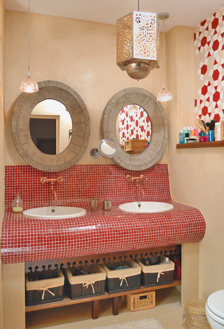
More Moorish influences for the bathroom: the small glass mosaics, in a warm dark red tone, are covering the space around the wash bassins. The bronze faucets, some small hanging lamps instead of the classical wall lamps next to the mirror and not to forget the painting on the wall, all make this bathroom different from a classical bathroom. It would have been nice to have a wall with zelliges but as the budget for the bathroom was limited the painting was the perfect solution. All the other walls are finished with tadelakt, used everywhere in Morocco in bathrooms, even in the shower area.
Lots of details to give this bathroom an ethnic touch. Photo Casa Lux
How can you create the relaxed Mediterranean look? Combine fabrics, motives, the furniture can have a vintage look, finished with a patina, it could be an old piece from your grandmother. Keep the colours light, a lot of white, ivory, taupe colours combined with red or blue, yellow.
You can't find a better place to look for the fabrics and wallpapers than at Pierre Frey and Braquenie, they have a long history of French designs
Red is not your colour? No problem, try a blue and yellow combination. The wallpaper with the flower print, the striped and checked fabrics are from Sanderson. If you compare the red-ivory combination with the yellow-blue combination that I would say the red one is warmer, the yellow-blue one has a fresher touch.
This project is realised in collaboration with La Maison - Bucharest.
Wish you a great week.


