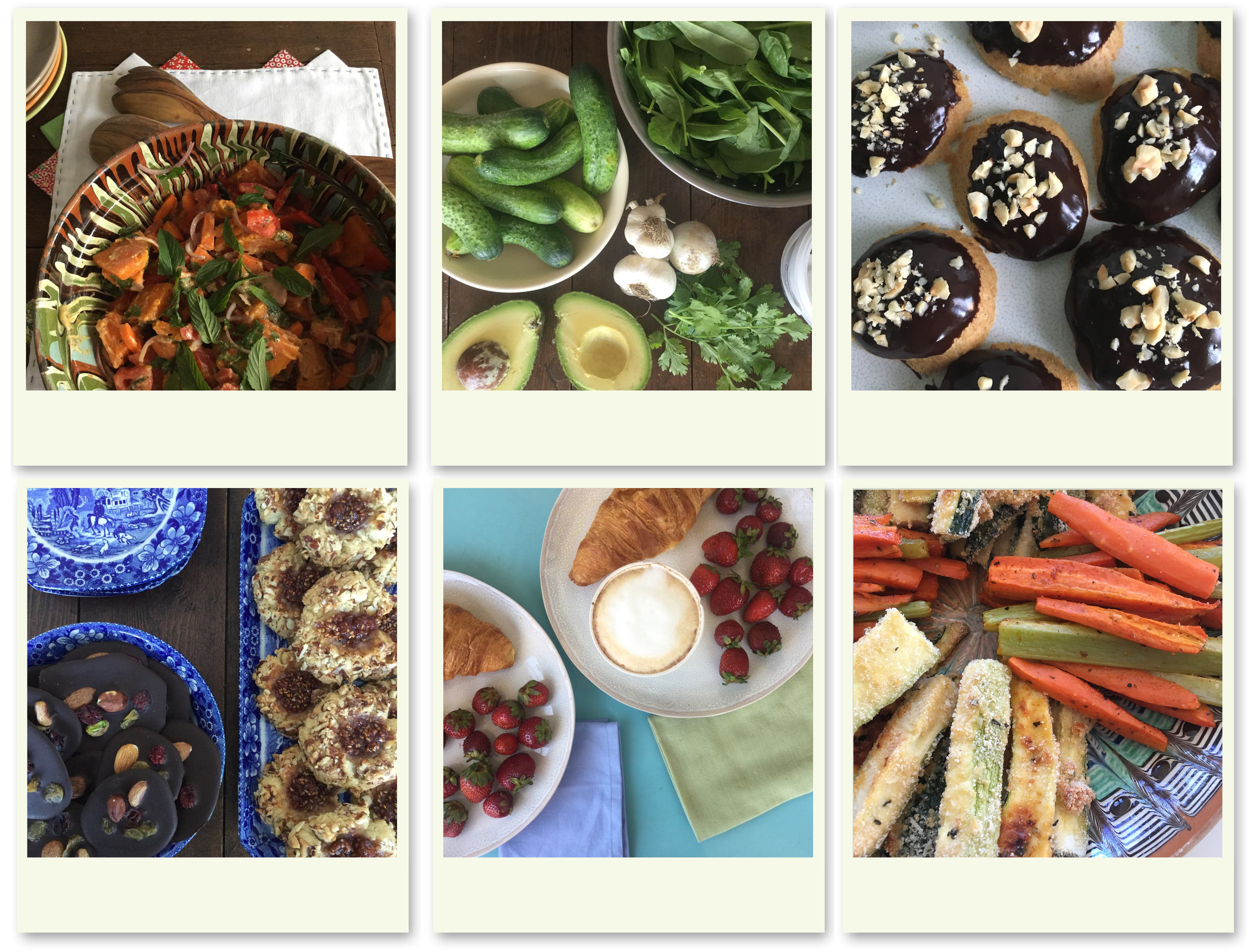
I try to inspire you to get out, look around, be curious, and make a quick snapshot of all the things which catches your eye, things you find interesting. But than you ask yourself what you should do with it.
snapshots
Once we start looking around we will see there is a lot we don't notice on a daily base as we are to busy, rushing around, we are not present in the moment, and we miss out on a lot. So slow down, look around. And than at the end of the week you will have a pile of snapshots which maybe have nothing in commun. Put them on the table and organise them: food, color inspiration, architecture, art, shops, nature.
Than comes the more challenging part. But don't forget that all the snapshots you this week were because of something you found interesting for one ting or another. Ask yourself: is it the color, is the structure? Reflect a bit on it and see how you can translate them.
Arty wallpaper in kids'room Pierre Frey via Instagram- colorful print EsteMacLeod Design - Parrot Costume BHBKidstyle
My first series of snapshots of the Wynwood Walls in Miami are colorful, artsy, so not really the best starting point if you are going to decorate your home in a classical style. But why not adding a modern art work in your classical interior, you will see the change it will bring in this room. Those snapshots could be a good starting point for a colorful kids' room. A kids' room is a room in the house which will be changed a few times, as a kid will have different interests when growing up.
colorful interior via Etxeko Deco - Starburst Clock Sennki - Bishops Stools Inda Madhavi via Interior Design
Colorful rooms are not only for kids. Also young people, or simply for somebody who loves color and modern modern art, can get a lot of inspiration out of the Wynwood walls. Make it graphical, combine colors, motifs and make it playful. Simple shapes, bold colors, funny prints.
White can be cold, but when you look a second time to different materials or structure in white you will see that white doesn't have to be cold. White wool can be cozy in winter, a white lacquered piece of furniture will give a much colder impression as it is reflecting the light.
DIY kit - extreme knit pouf De Brosse NYC
At the end of the week you maybe got out to buy this DIY knitting kit, you fueled your creativity this week just by getting curious. Elizabeth Gilbert tells the story in Big Magic, Creative Living beyond Fear about how to find a new hobby: Be curious, dig into things you don't know, study, and you will find your passion.
fabrics via Cabin & Cottage - hanging lamp Capellone Ela Dany - ceramics Sara Paloma
A white interior doesn't have to be cold. Combine different materials, different structures to make your white interior cosy. The more the surface is reflecting the light the more the object will be shiny, giving a colder appearance. Linen, wool, cotton velvet are perfect choices for white fabrics.
And than you say: what should I do with food images?! A lot, rich color harmonies. The plates on which the food is presented, can give you an idea for the tiles in the kitchen. Wooden spoons can be translated in wooden tables, accessories, to add warmth to a room.
wallpaper Surface View - Three Wise Men pendant lamp by Samual Chan for Channels via Dezeen - bed Ziggy by Porada via Architonic
You've seen the Romanian bowl in the picture on top / left? Looks very stylish as a wallpaper, what do you say? The burned orange tone of the sweet potatoes are translated in the cotton velvet fabric for the bed and the wooden spoons became the wooden hanging lamps.
kitchen via Residence Style - Azulejo tiles Viuva Lamego - ceiling mount lamp Industrial Light Electric - interior image via Collage Dersign
The cookies on the blue and white tray make me dream of a dark kitchen, lighted up with some hand painted blue and white tiles from Portugal. Take care in a dark room that you have highlights, if not the room won't be inviting.
So you see, there is a lot of inspiration hidden in the pictures you took during the week. I hope you are having fun with making the snapshots. Don't forget to send them to me on info@martineclaessens.com, I'm sharing to most interesting ones on my FB page at the end of the week. You can also join me on a workshop Who am I ? where we will look together on how to translate your inspiration. Or during a one on one coaching session, more about this soon.
A simple click, on the Like button of my FB page, and you are sure not to miss any of my blog post. Or follow me on Bloglovin'


