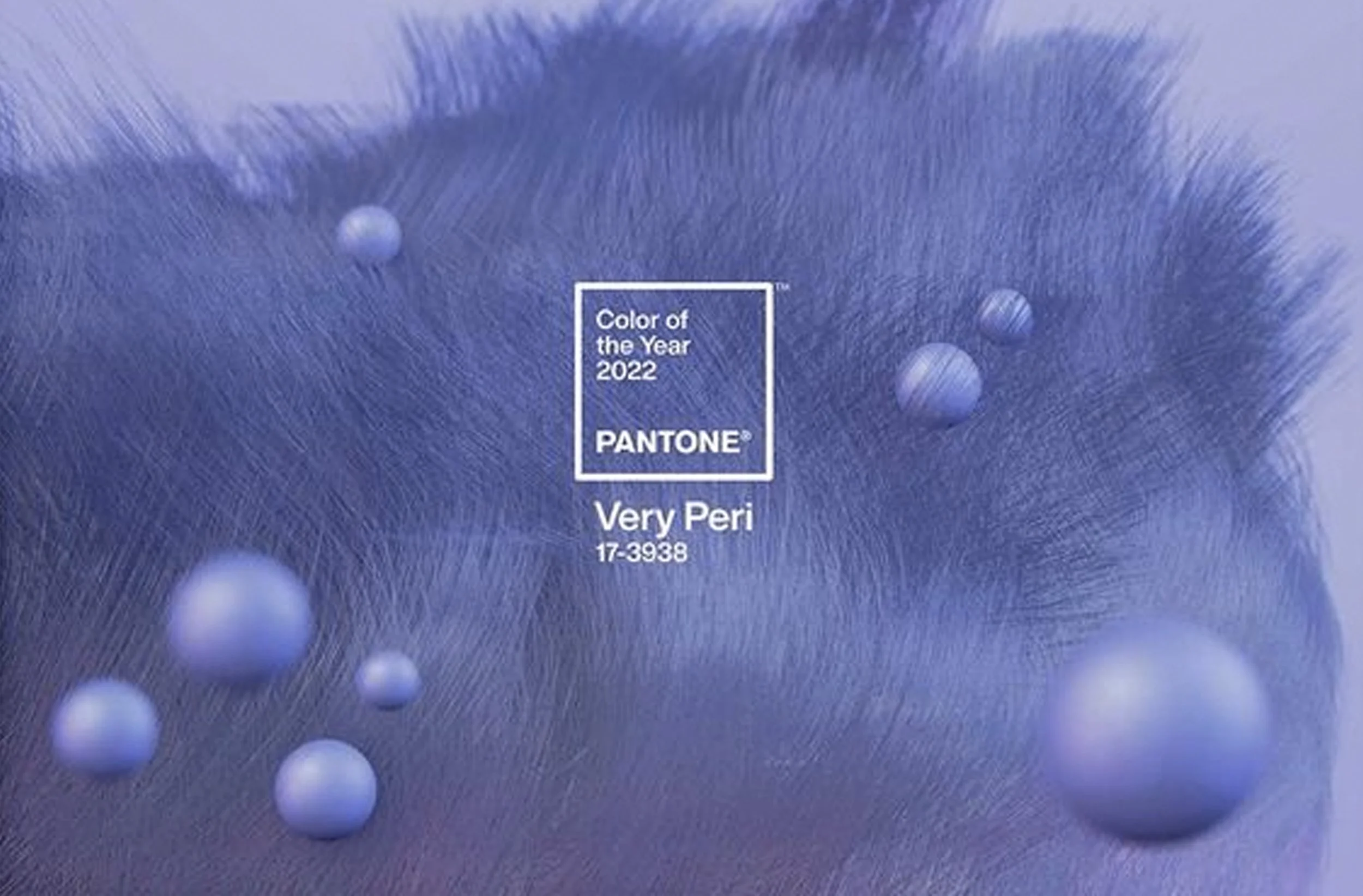
The new color of Pantone: what will it be, will it inspire the fashion, design, or graphical world? And will it inspire us for our interior or other projects? Veri Peri 17-3938, Pantone’s color for the new year is mystical blue tone. A color to encourage creativity.
The Pantone Color Institute is combing the world, looking what is happening on the runways, exhibitions, movies, socio-economic conditions and to discover new color influences. They follow every trend to find their color of the year. Trends come and trends fade out, they are influenced by the events happening in the world around us. The Pantone Color Institute advices also companies for product and brand visual identity.
“The Pantone Color of the Year reflects what is taking place in our global culture, expressing what people are looking for that color can hope to answer.” Laurie Pressman, Vice President of the Pantone Color Institute.
“As we move into a world of unprecedented change, the selection of PANTONE 17-3938 Veri Peri brings a novel perspective and vision of the trustes and beloved blue color family, encompassing the qualities of the blues, yet at the same time with its violet-red undertone, PANTONE 17-3938 Veri Peri displays a spritely, joyous attitude and dynamic presence that encourages creativity and imaginative expressions.” - Leatrice Eiseman, Executive Director of the Pantone Institute
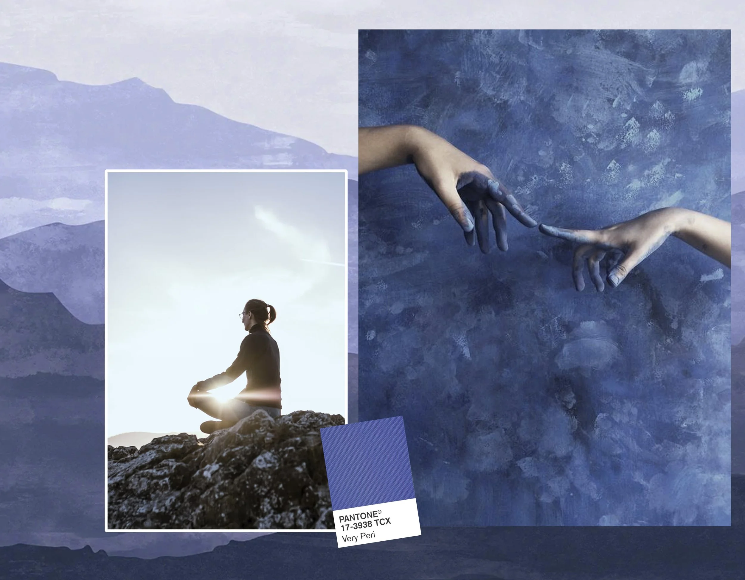
We all know the qualities of the blue tones : relaxing and refreshing. Veri Peri has a warm violet undertone that will connect us with our higher mind, it displays a spritely, joyous attitude. Veri Peri is a color for meditation, to open our mind and give us a new vision, now that we are ready to rewrite our lives. This color is giving us confidence to express our inner being, to be creative and give meaning to our lives.

Veri Peri encourages courageous creativity, the violet undertone brings a dynamic to the blue tone. Feel confident and express you imagination. Get out of your comfort zone, Veri Peri is a color you can use without making mistakes.

Butterfly Bath by Jovana Rikalo - frozen berries via Flickr - beauty photography by Adrian & Gidi
The warm violet undertone make Veri Peri a feminine color with a vintage touch, You will feel inspired to relax and indulge in a warm bath with natural bath salts. An inspiring color for the beauty industry. An attractive color for packaging, a color to become an evergreen. Would you try it as a new color for your make-up? I think as a nail polish it has a great future.

image in the back via Deco Idees - interior via Archdaily - cocktail via Wattpad - Alberta Ferretti via The Glossary
We lives in strange times, we feel that transformative times are here. The pandemic has made us stay more at home, maybe this year we can party again after a long period of isolation. Veri Peri will bring you in the right mood: a touch of sparkle add to your cocktail drink and Veri Peri is a trendy color for this summers fashion outfits.

macro butterfly wind by Chris Perani - underwater crab via Reddit - glass sculpture made by JDC Roman via Arts120d
Veri Peri has something artificial to it, we see this color in our digital lives, our virtual world. Very Peri illustrates the fusion of modern life. We find this color also a lot in nature: flowers, butterflies and fishes. The organic shapes will inspire artistes to create organic sculptures.
Veri Peri, Pantone’s color of the year to inspire all your projects, enhance your creativity
Is this a color you would use or that inspires you?
Don’t miss any of my blog posts! Follow me on my FB page, or Bloglovin' or even better subscribe to my newsletter and get tips for travel, exhibitions, recipes and things I discovered during the week.