We all have our preferences when it comes to choosing colors. Some people are naturally drawn to warmer shades, while others prefer cooler tones. Is it ok to stay within a single temperature range, or should we mix them up to create contrast and visual balance?
Using one single color throughout the room can create a striking effect. It is always important to test the shade and observe how this color behaves in your specific space. Already the light will have a great impact; natural light and artificial light produce very different results. When you have daylight coming in, the color may appear very different in the evening than it does in the morning. Morning sun, or afternoon sun? Still different appearance. But all this should not stop you to use color, be bold, be you.
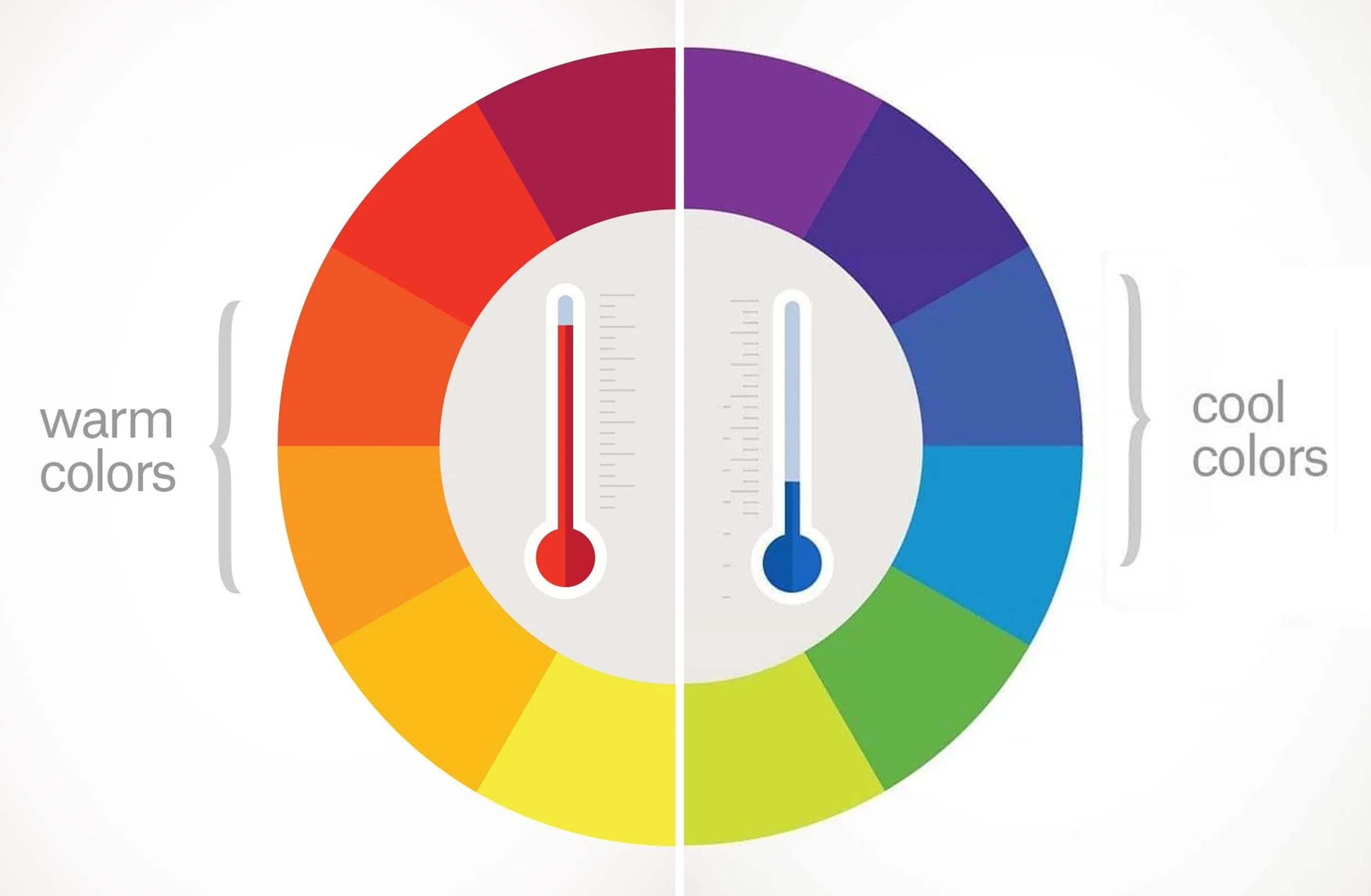
Image 99 designs
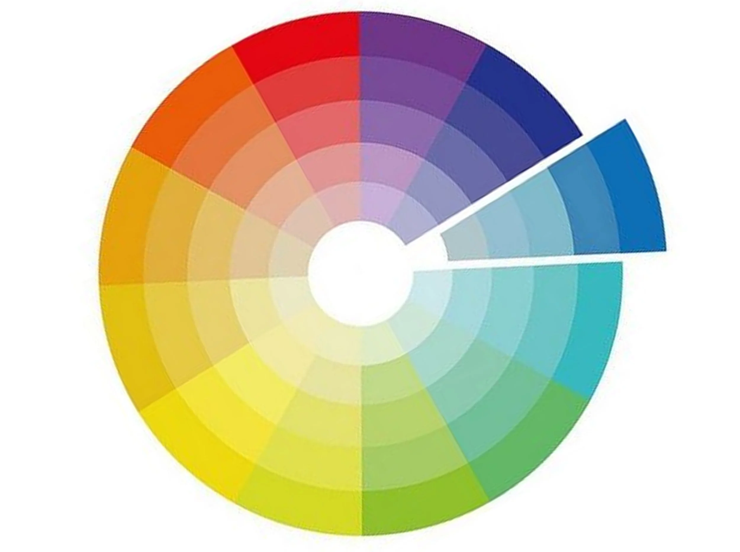
I’m quite sure you’ve already heard about the color wheel. In the image above you can clearly see that one side contains the warm colors while the opposite side shows the cool colors. Warm colors include a range of yellow, orange and red tones, evoking energy and warmth. Violet, blue and green tones belong to the cool colors and tend to bring calmness and distance.
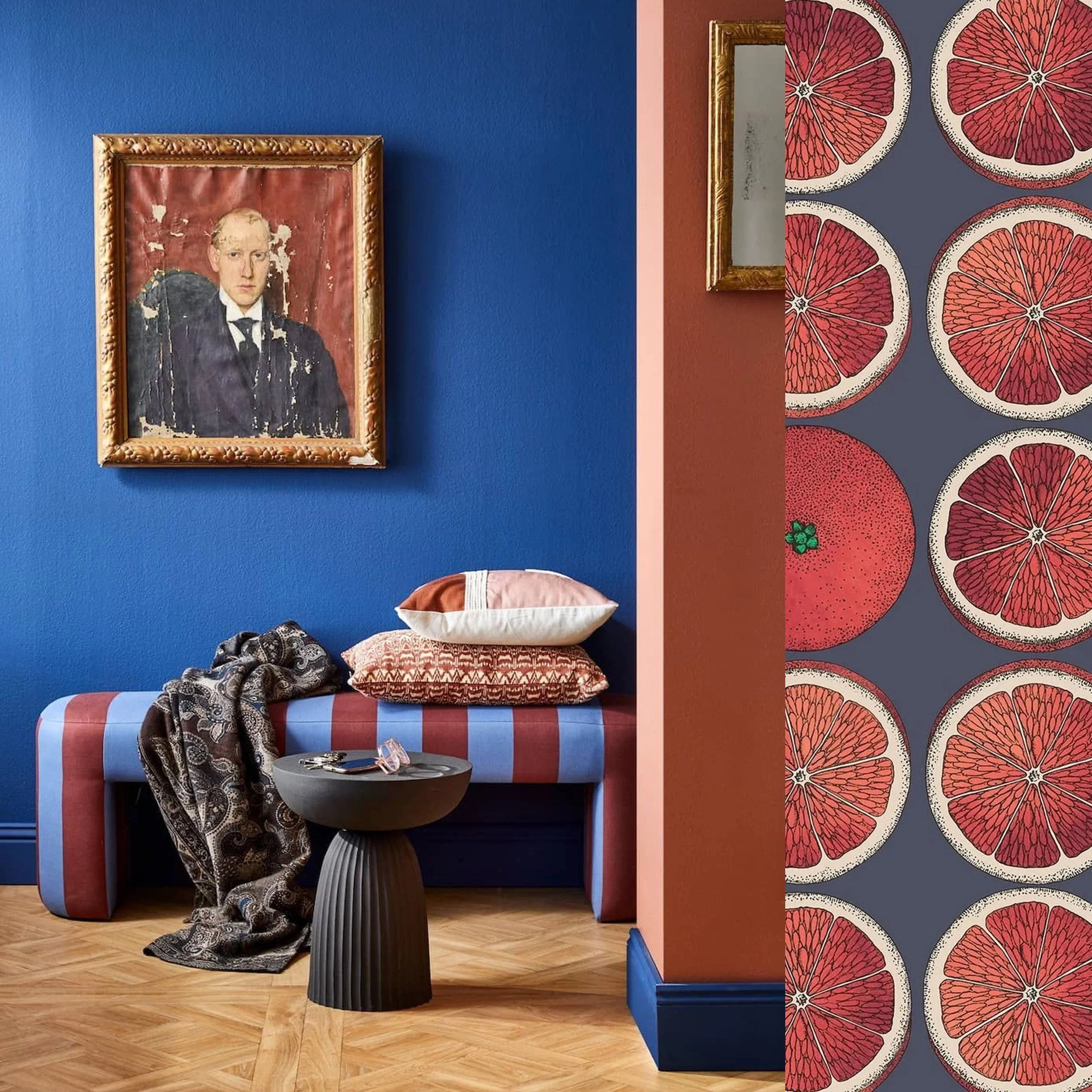
picture on the left via Pinterest - on the right wallpaper Arance Cole & Son
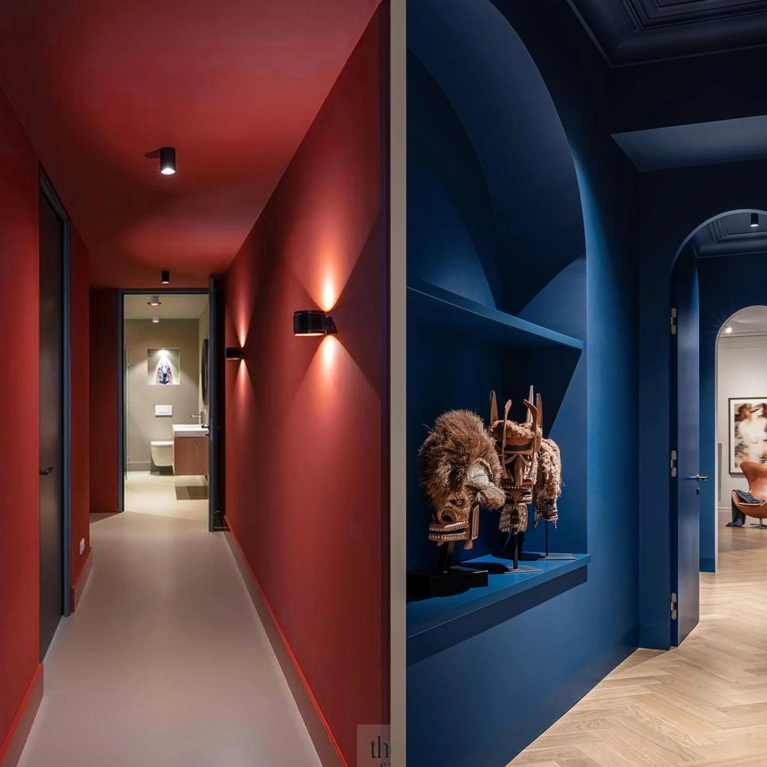
Here we mix the warm red tone with a cool blue tone. Depending on the proportion of each color, the overall effect will change noticeably. When you have one wall painted blue, another area of the room red, you can bring the two together by introducing striped or printed fabrics that contain both hues; a wallpaper that blends the two tones is also an excellent way to mix them up in a balanced manner.
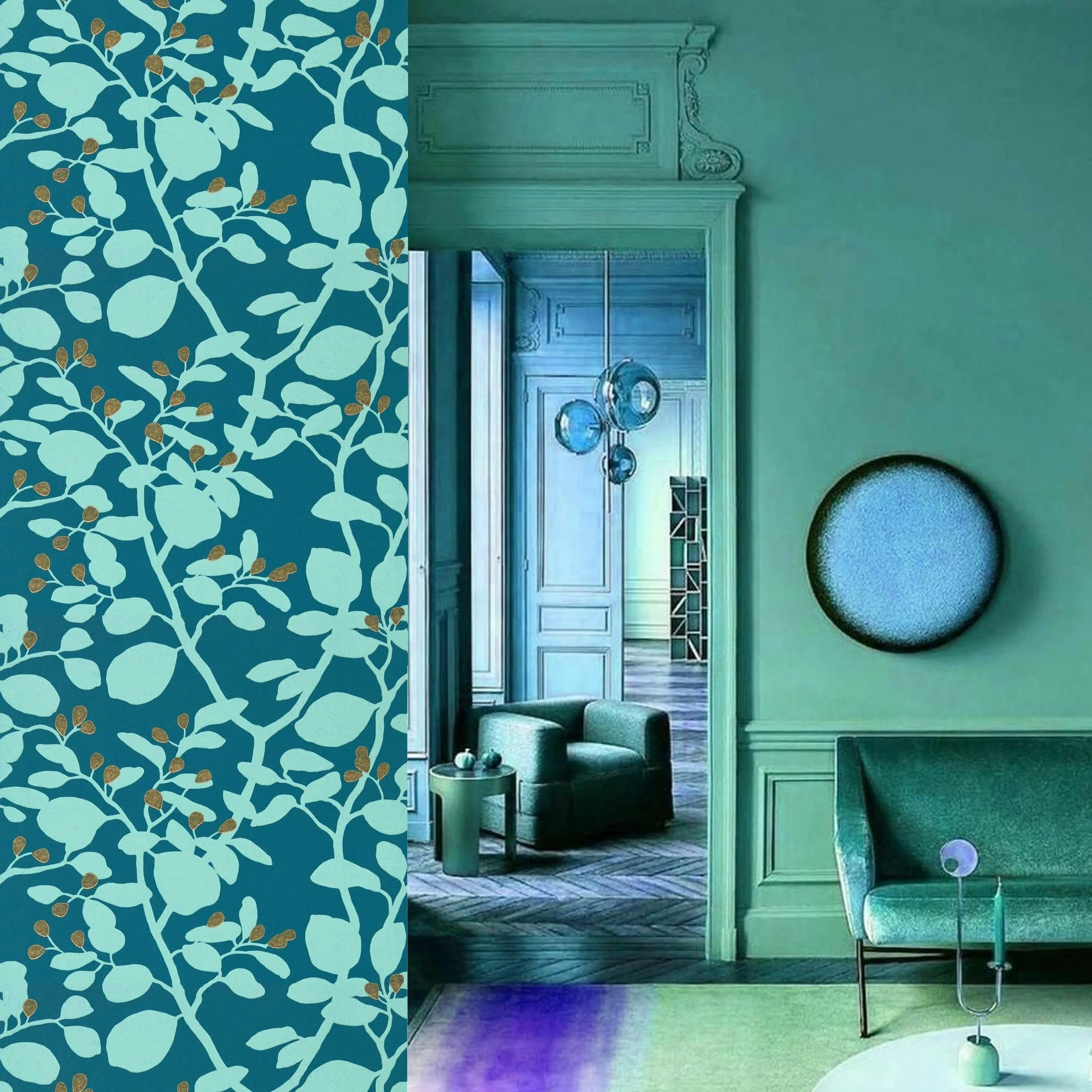
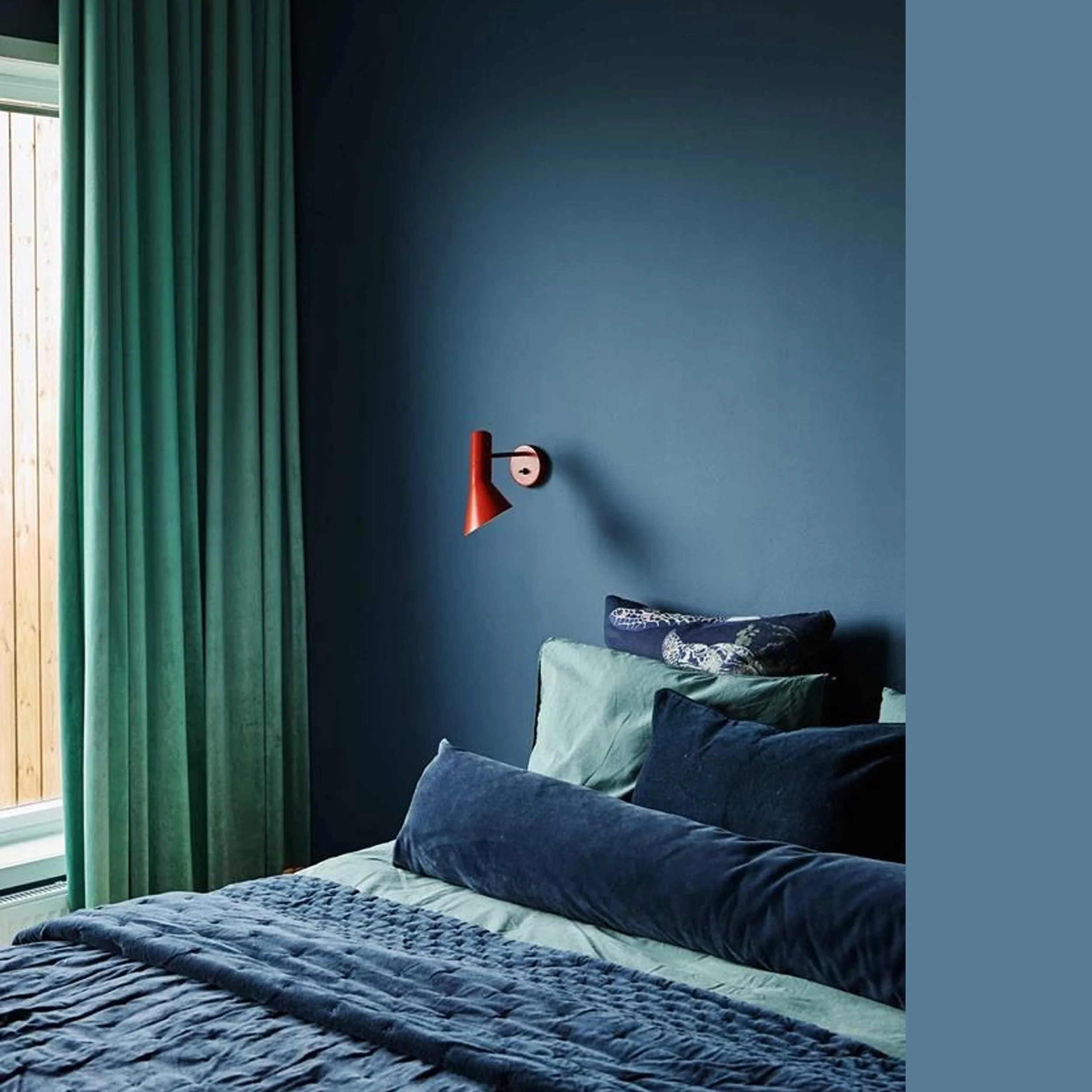
Using different tones within the cool color range will give you a crisp interior. The overall feeling remains quite relaxing, since blues and greens evoke relaxation and rejuvenation. Play also with different shades and intensities to create depth throughout the space. Mixing materials is equally important: each surface will catch and reflect the light differently, adding texture is a way to create a more complex and interesting ambiance.
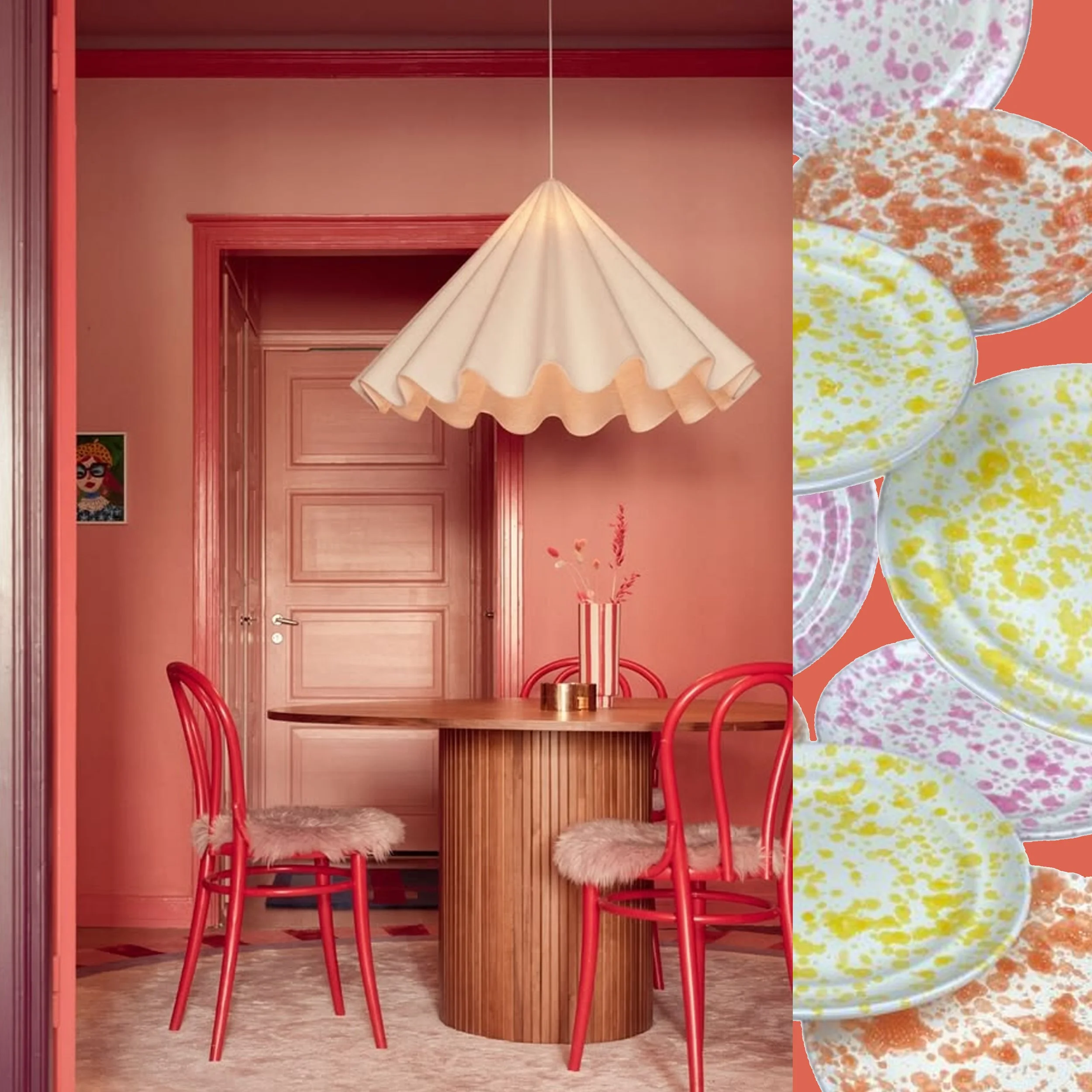
image on the left via IG - Dessert set Smambriata collection Nicola Fasano
You can clearly see the difference when using warm colours versus cool colours. Warm colors will bring a summery, sunlit feeling into the room. You create a welcoming, convivial environment, perfect for gatherings and celebrations. There is little chance to relax here; you will feel the energy flowing through the space. Everybody will be at ease, and the warm tones will naturally enhance the appetite and encourage lively conversation.
And those warm colors and cool colors don’t have to be the strong hues from the color wheel. You can choose softer pastel shades or more muted tones to create an inviting interior that feels thoughtfully designed, calm or energetic. Adding subtle variations in saturation helps the space read as intentional and comfortable rather than overwhelming.
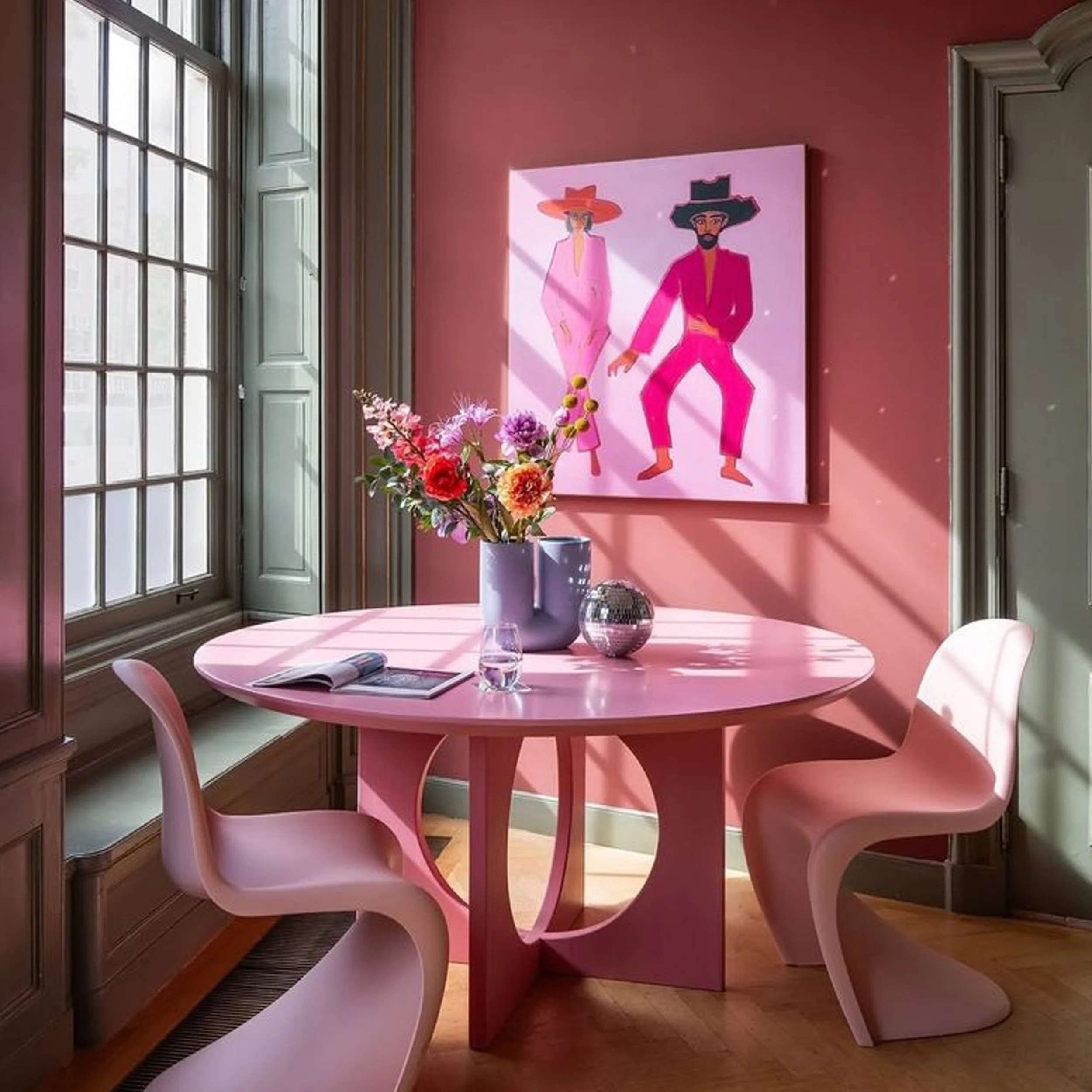
image via IG
To balance the feeling of the colors in the room, combine a warm and a cool tone while keeping them at a similar intensity, this creates a very relaxed effect for the eye. You can still introduce a few stronger accents to add depth and contrast, making the space feel more lively and dynamic.

Adelaide wallpaper Farrow & Ball - image on the right via Pinterest
Or you can choose to make more of a statement; in that case select one color considerably darker and the other more towards a pastel tone. It is important to have both colors or bold or more muted, as on the picture above. Everything is possible, the final choice depends on personal style and preferences.
picture by James Stokes
And even when you are a true fan of one particular color pallet, adding a touch of a contrasting hue will create a subtle contrast and make your room look truly outstanding. Imagine here the room without the red wall lamp, you see, it makes all the difference.

image via Dezeen
Even for the fans of neutral interiors - whether in black and white, or in softer neutral tones - introducing a single piece of furniture in a warm or cool color can transform the whole room and create a striking focal point. And in this case there is no need to repeat that color.
So how to use warm or cold colors
important to make a test in the room where you want to use the color, light makes all the difference
use them as a single color in the room
make a statement using one warm and one cool color, and use fabrics, wallpaper or accessories with a mix of those colors
combine colors and tones out of the cool range, or out of the warm range
combine a warm tone and a cool tone, both saturated, or pastel, or muted
combine one color much darker, the other one more towards pastel
stay in one range and add a small accent from the other range
use and accent color in a neutral setting to bring visual interest
You are ready to play with colors?
Don’t miss any of my blog posts! Follow me on my FB page, Instagram or Bloglovin' or even better subscribe to my newsletter and get tips for travel, exhibitions, recipes and things I discovered during the week.