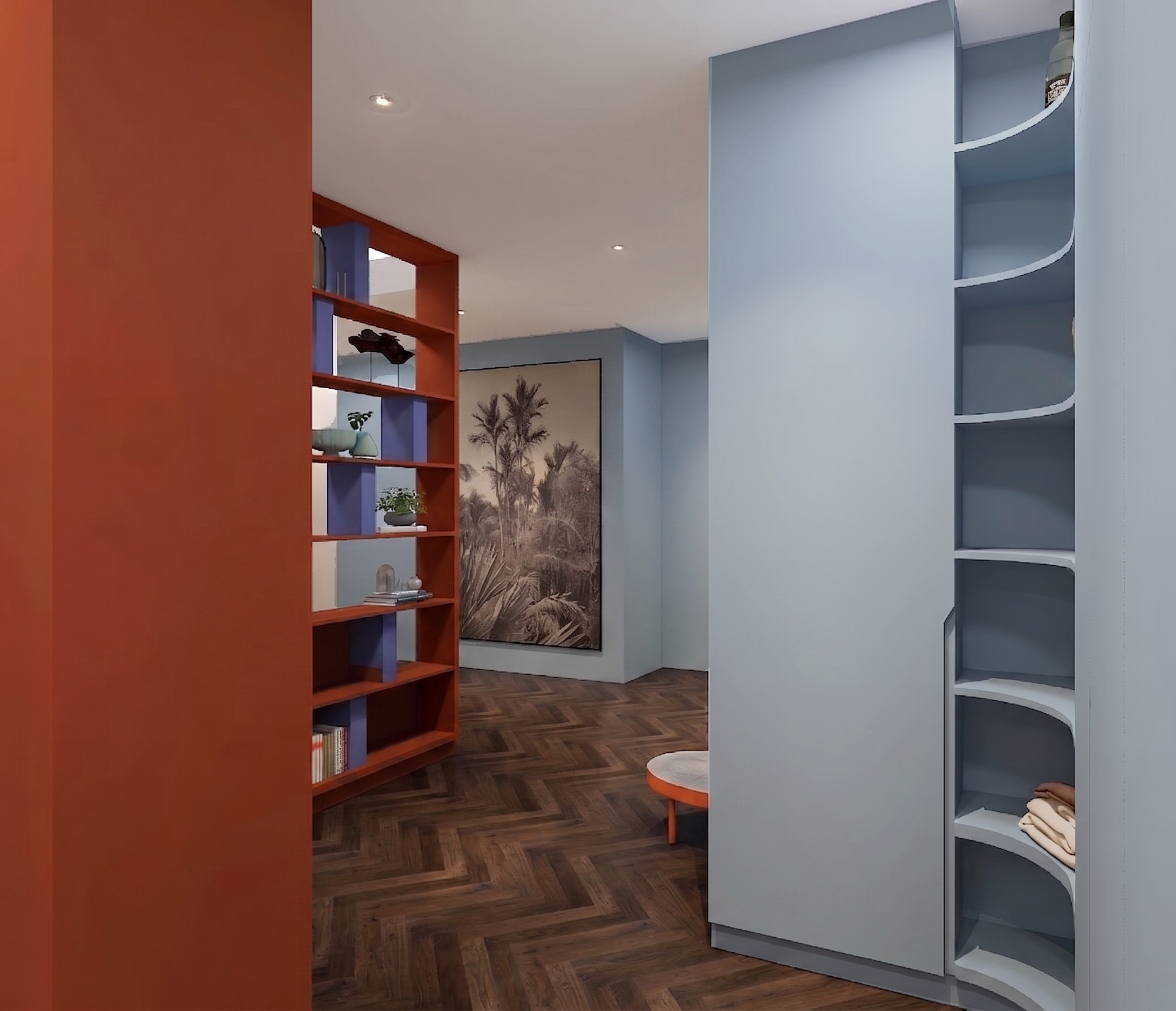
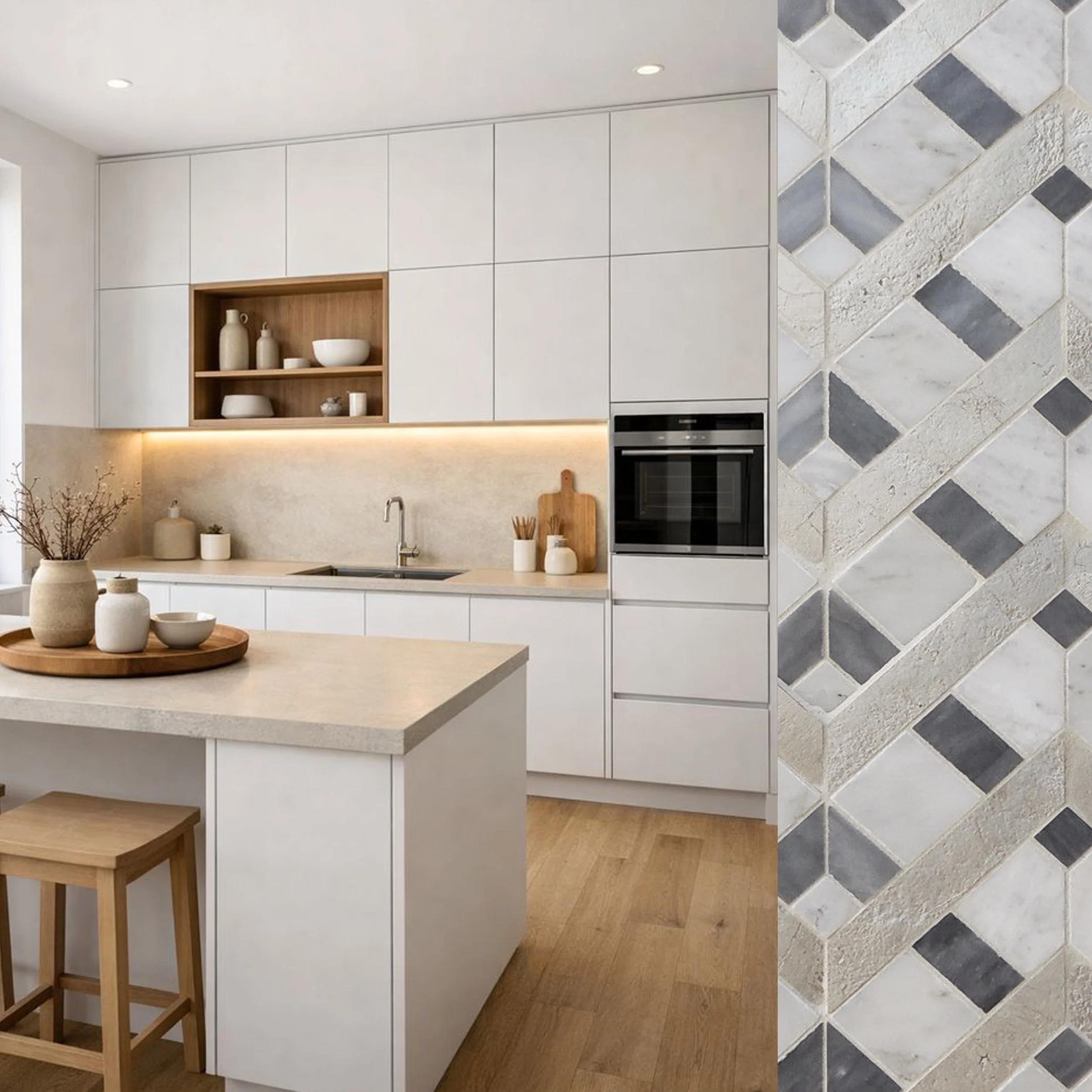
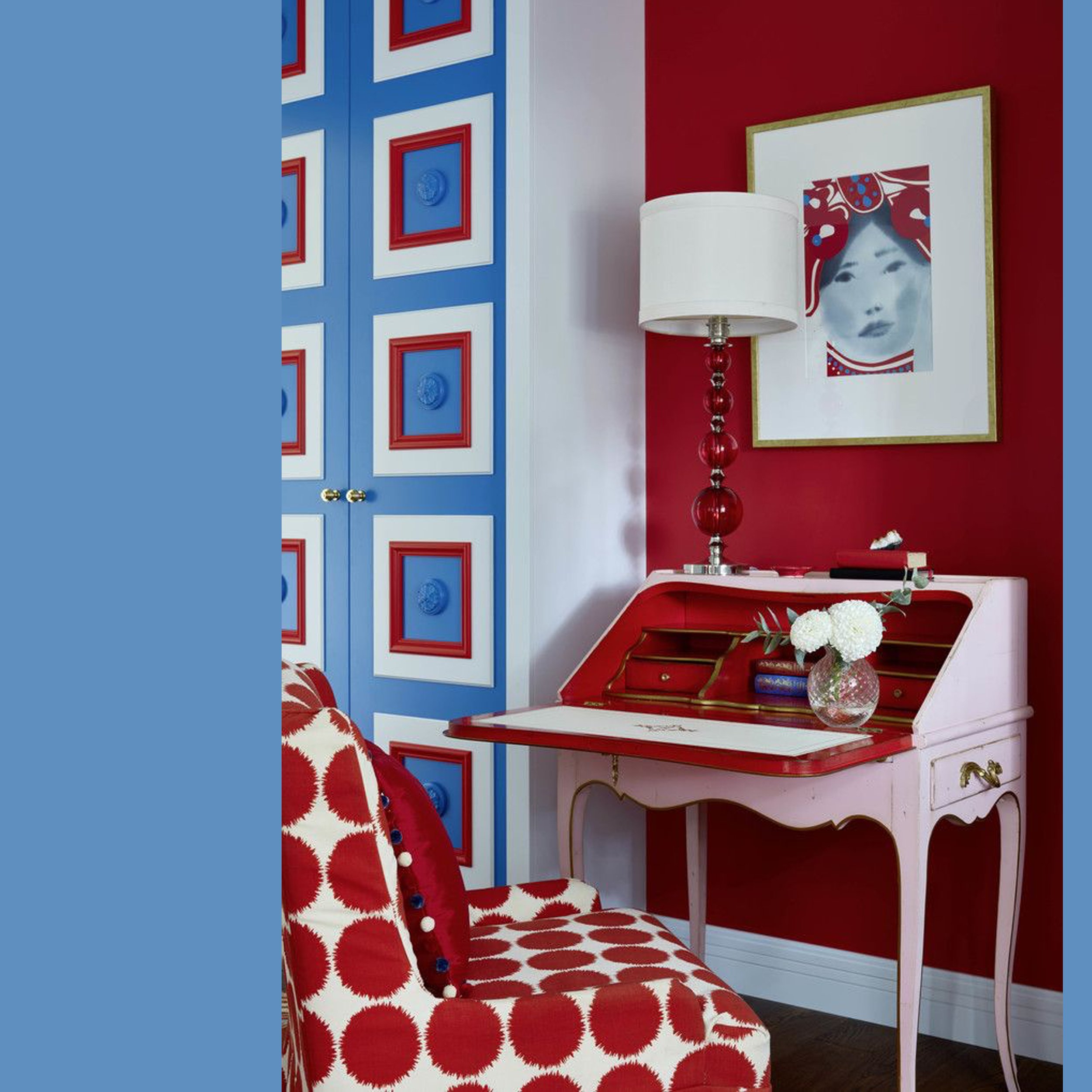
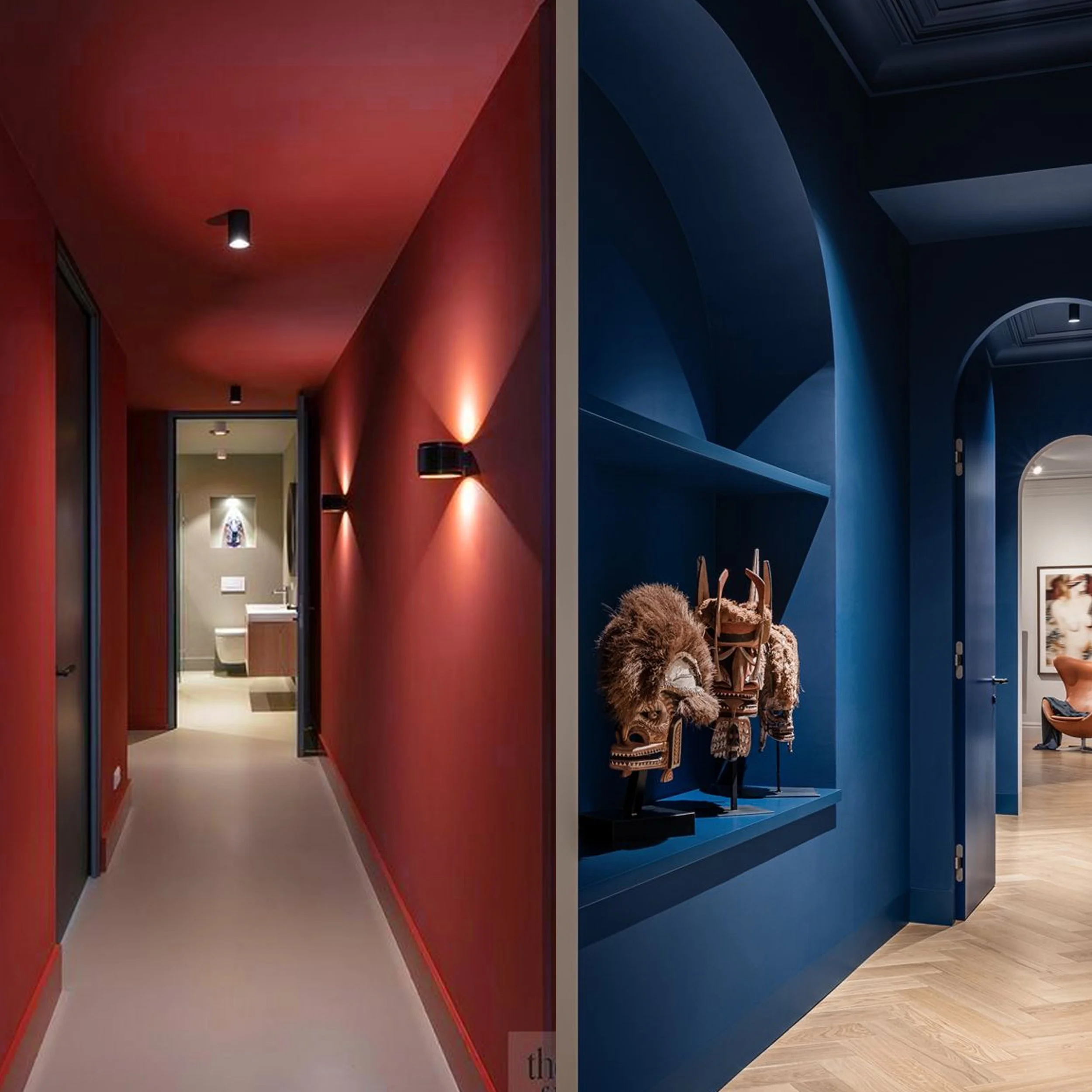
Did you ever enter a room and feel your mood change in an instant? Color can strongly influence your mood, emotions and the way you perceive the space. Warm tones will give you an energy boost and create a sense of warmth, while cool colors are perfect when you want a room that helps you unwind. Light neutrals shape the overall sense of space and light, making the room feel more open and airy.
Read MoreWhat is the perfect color for your kitchen? Maybe I should ask if there even is a single perfect color for every kitchen. Honestly: I’m not sure. It will, for sure, depend on personal preferences and overall style.
Read MoreSummer is officially here, and with temperatures skyrocketing around the globe, we can only think of a relaxed holidays. When we slow down, the inspiration often strikes and we want to bring the same easygoing feeling into our homes. Is it truly wise to bring that holiday aesthetic home with us, or should we pause before painting our living room Mediterranean blue?
Read MoreWe all have our preferences when it comes to choosing colors. Some people are naturally drawn to warmer shades, while others prefer cooler tones. Is it ok to stay within a single temperature range, or should we mix them up to create contrast and visual balance?
Read MoreColor drenching basically means painting every surface in the room in the same hue. Subtle variations in shade will add depth to the room, preventing it to feel flat. Color drenching is not new but is still ranking high on the scale of trends.
Read MoreMagenta is a striking color that combines the energy of red and the tranquility of blue, it holds a delicate balance between these two opposing forces. It evokes feelings of creativity, passion, and energy, a color full of life and expression.
Read MoreA few weeks ago I was telling you about how this Viscri paint collection was inspired by a small traditional village in Transylvania. I showed some inspiration for the cold colors of the collection: Viscri blue, Viscri green, Hunter’s Green and Peacock. This time I want to inspire you to apply some of the warm tones of the collection of Viscri paint colors.
Read MoreColor can change our mood and emotions in different ways. Color is a powerful tool in interior design, capable of changing even the perception of space within the room. Adding color can be even a boost for your mood.
Read MoreAfter years of strong, vibrant colors Pantone has chosen a very comforting and grounded color for the year 2025: Mocha Mousse 17-1230. A sophisticated shade for various applications and settings. The warm undertones evoke a feeling of stability.
Read MoreCinnamon Slate, Benjamin Moore’s color for 2025. A perfect balance between heaters plume and a velvety brown. A restorative color that brings warmth and a feeling of tranquility in your home.
Read More