A few weeks ago I was telling you about how this Viscri paint collection was inspired by a small traditional village in Transylvania. I showed some inspiration for the cold colors of the collection: Viscri blue, Viscri green, Hunter’s Green and Peacock. This time I want to inspire you to apply some of the warm tones of the collection of Viscri paint colors in your home.

Viscri collection TonCorner
The pictures I used for this blog post are meant to be illustrative examples; they are not in the exact Viscri paint color, and may not represent the precise tone either. They are intended solely as a source of inspiration for you to incorporate them in your home projects. So, let’s explore how you could effectively use them.
This week we will see inspiration for a warm tone of yellow: Hay. Once upon a time, is not a pink neither a light terracotta, it is as a very interesting almost neutral tone. Terracotta will bring a summery feeling in each interior. Peony is meant as an accent, more about this color later in this blog post.
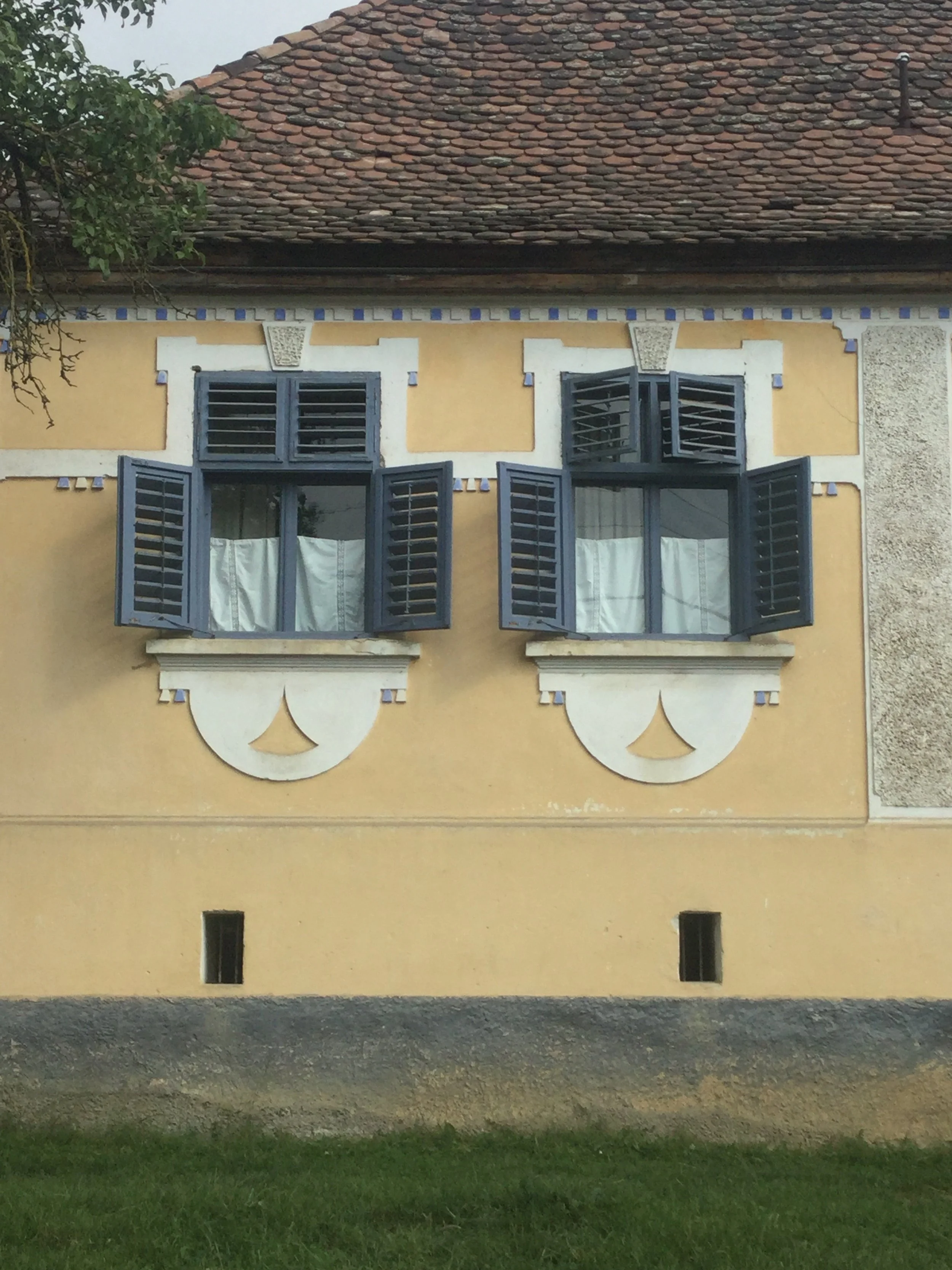
facade in Viscri
The houses with the facade painted in Hay are my favorite ones, they are most of the time in combination with Hunter’s Green or Peacock, used for the shutters and a touch of Elderberry flower as an accent around the windows. Hay is a color that brings the sun inside even on dark and rainy days. I love this color, is one of my favorites of the collection.
Interior by Rachel Battais
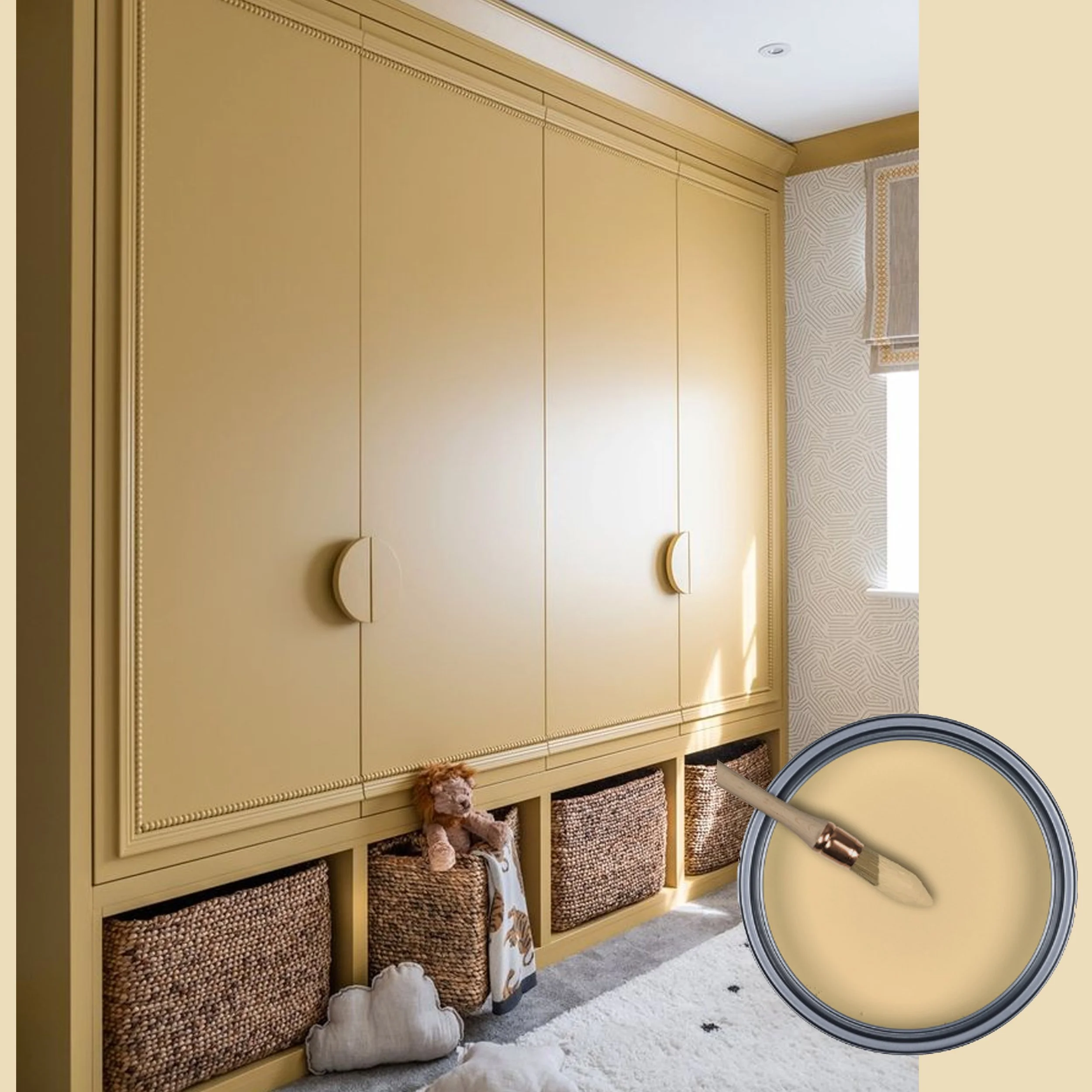
Hay will be a perfect color for the kid’s room. Often nurseries and kid’s room are painted in certain pastel colors according to the age or gender of the child. This hue fits both and is not linked to a certain age group, so a color perfect to stay with them as they grow from baby till teenager. And yellow is a color that increases the concentration, so is the best color once they need to focus to study.
Interior by Mathilde Cavé
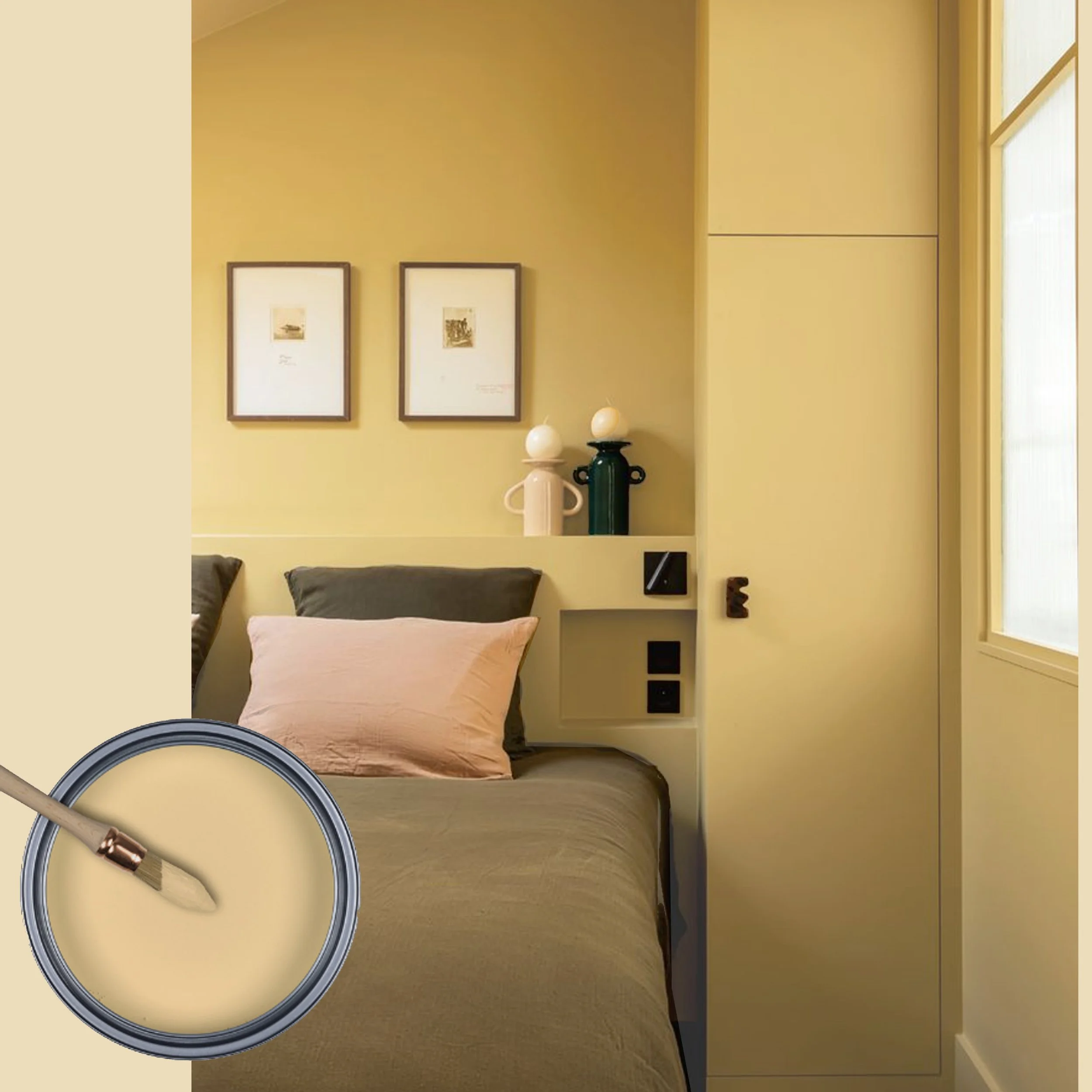
But not only for their bedroom. Hay is a color you can easily pair with all other colors from nature. This tone of yellow is soft on the eye, it is light, but not a pastel yellow, it has some green in it but is far from a bright lemon or lime tone. It will bring the sun in your bedroom each morning, you can’t have a better start of the day.
picture via Pinterest
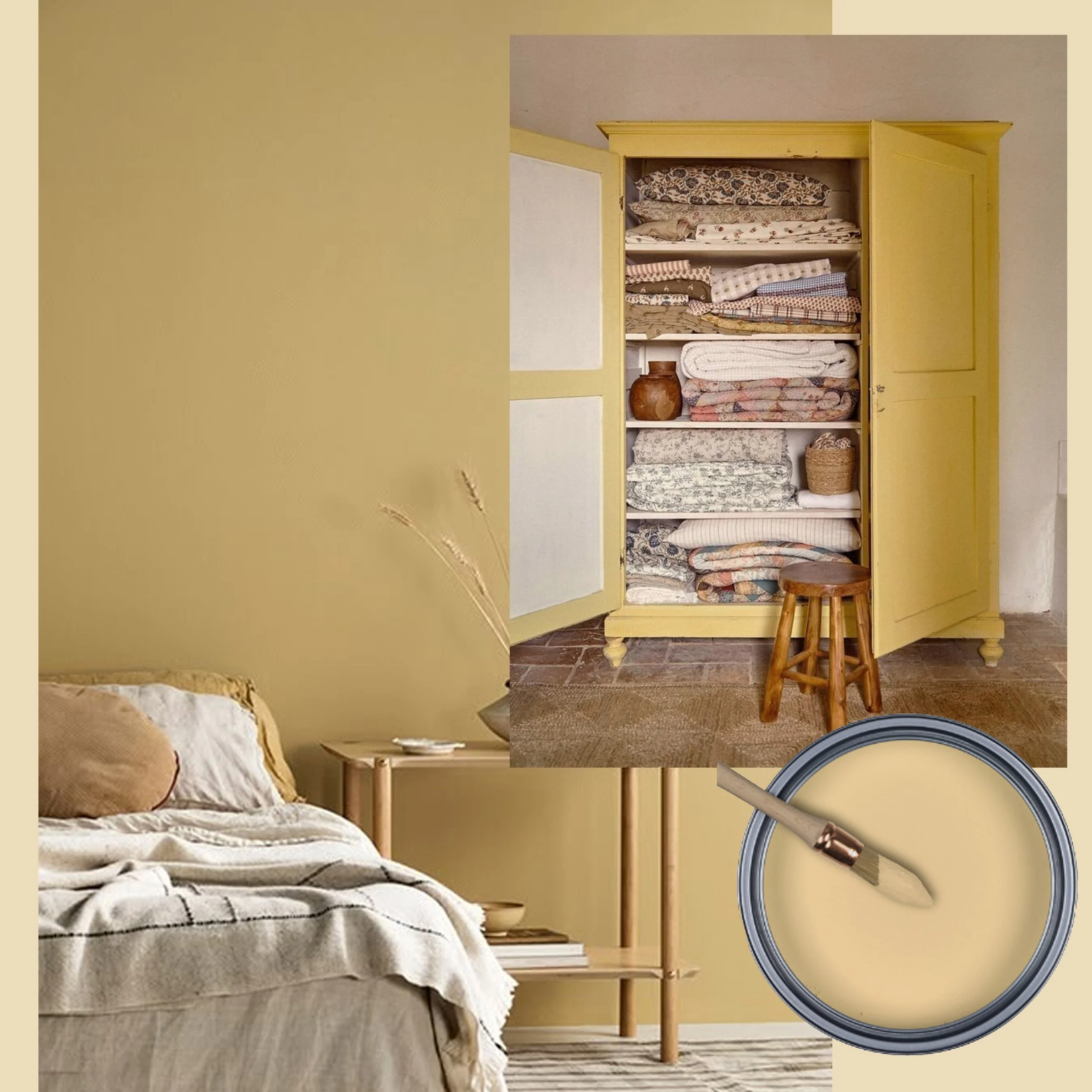
Hay is a color to be used simply on the walls, however also furniture will look great in this pleasant color. I can even see a kitchen in this yellow tone. I’m still hesitating if I will paint my corridor or my kitchen in Hay.

picture via Pinterest
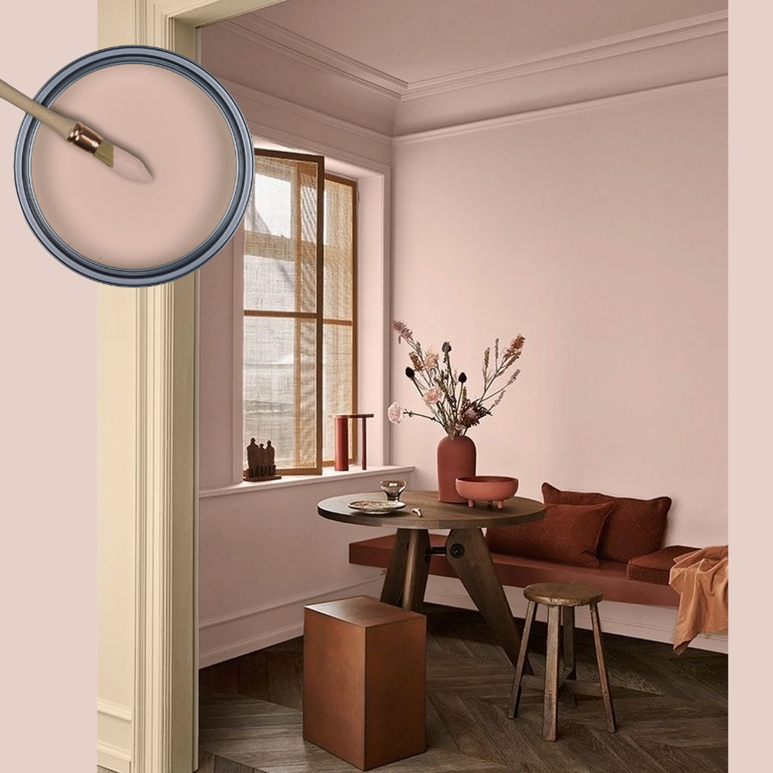
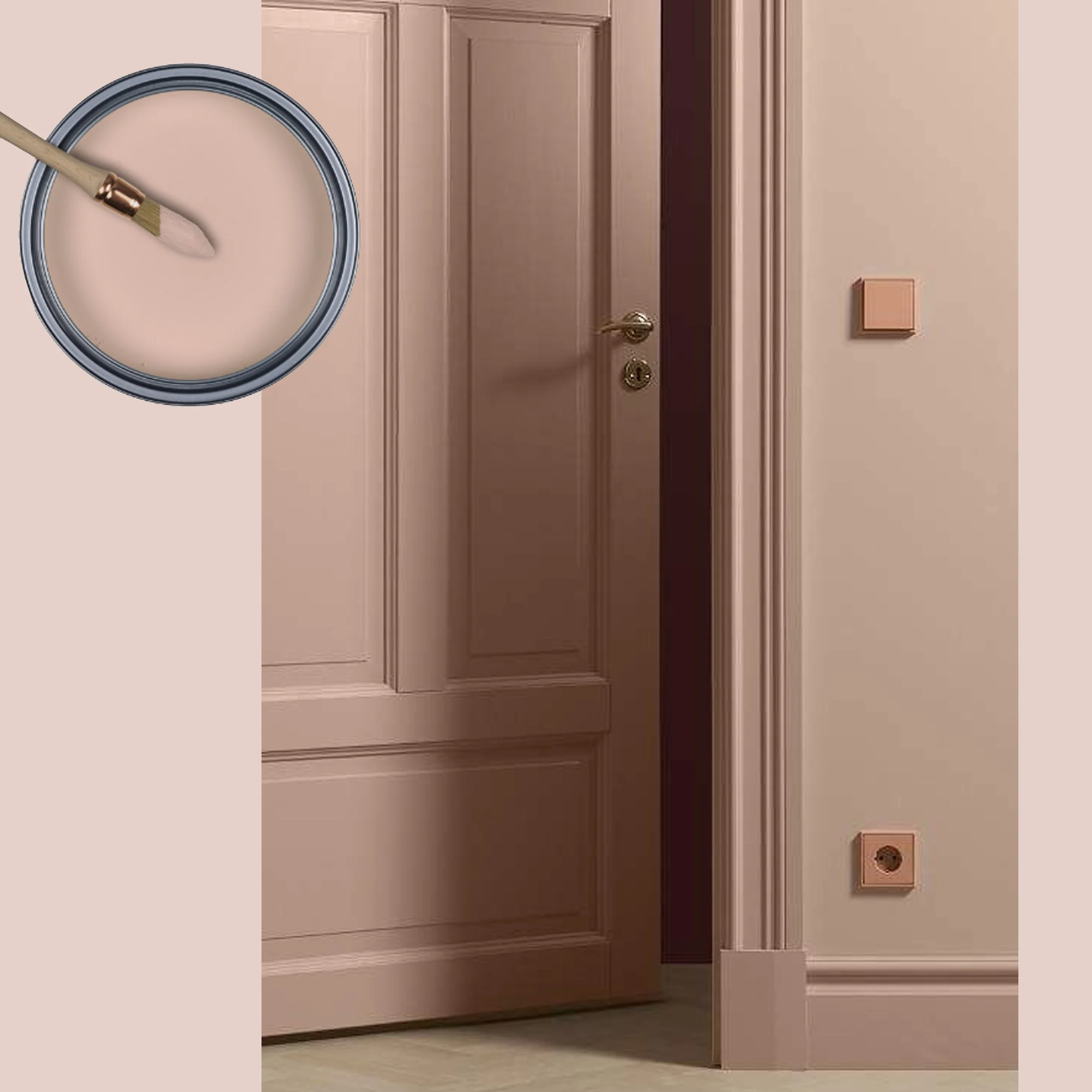
Once Upon a Time is another of my favorites. This is a color that got inspired by the facades in Viscri too. When they paint their houses with the traditional lime paint, the color is fading over time, from there Once Upon a Time. Already the name is suggesting a more romantic mood, memories of the past. A color that will comfort you.
picture via Pinterest
Once Upon a Time is a hue that is not striking. It is a color that is present, in a way, in the background. It is a soothing tone, that brings a relaxing ambiance. This is a color that is not pink neither terracotta, a color difficult to define, but easy to combine with neutrals, or a warm wood tone. You can combine it with some darker muted tones for a refined interior.
picture via Pinterest
Once Upon a Time fits well a classical style, it even adds some authenticity it. If you have had enough of your wood work in white or ivory.

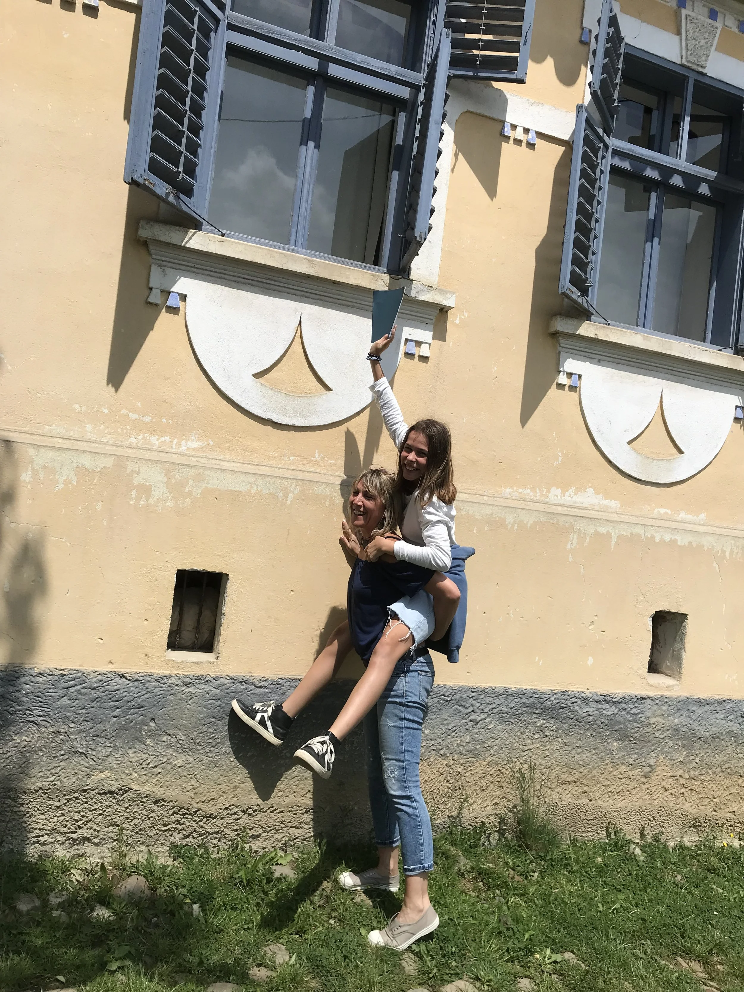
Every time I visit Viscri I have my color samples with me and is every time it is exciting to see how they match the inspiration.
picture via Pinterest
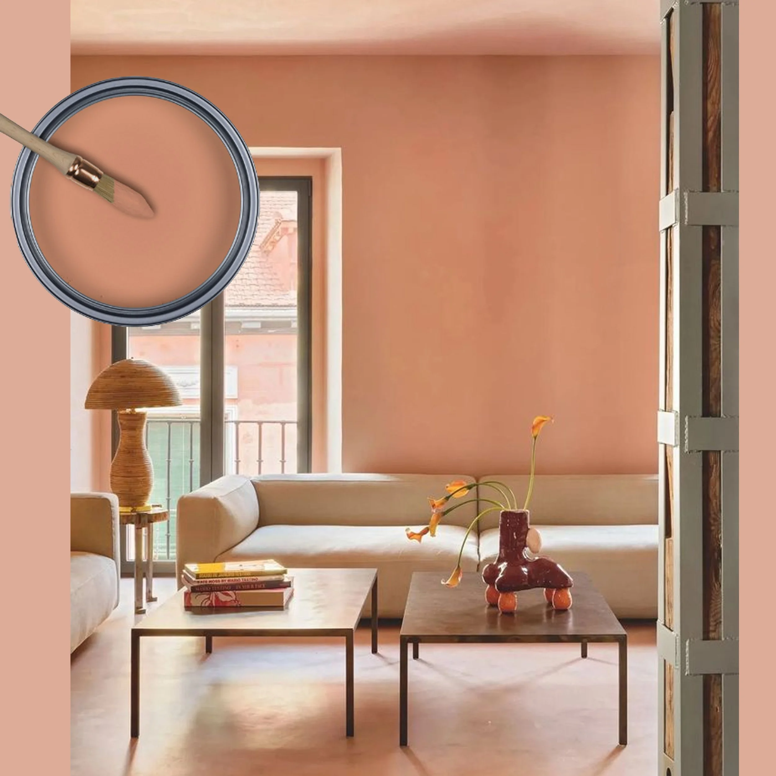
Terracotta is a color that is quite trendy the last two years. It is a warm color that makes us dream of holiday, the Mediterranean countries have this color all around. It is a warm color that gives energy. It is quite a strong color, however not agressif.

image via Kolorat
Imagine to get dressed every morning in a room painted in a Terracotta. It would bring me in a good mood, what about you? I have my bedroom painted in this tone, is a relaxing color that brings me in a positive mood even on a rainy day.

picture via Pinterest
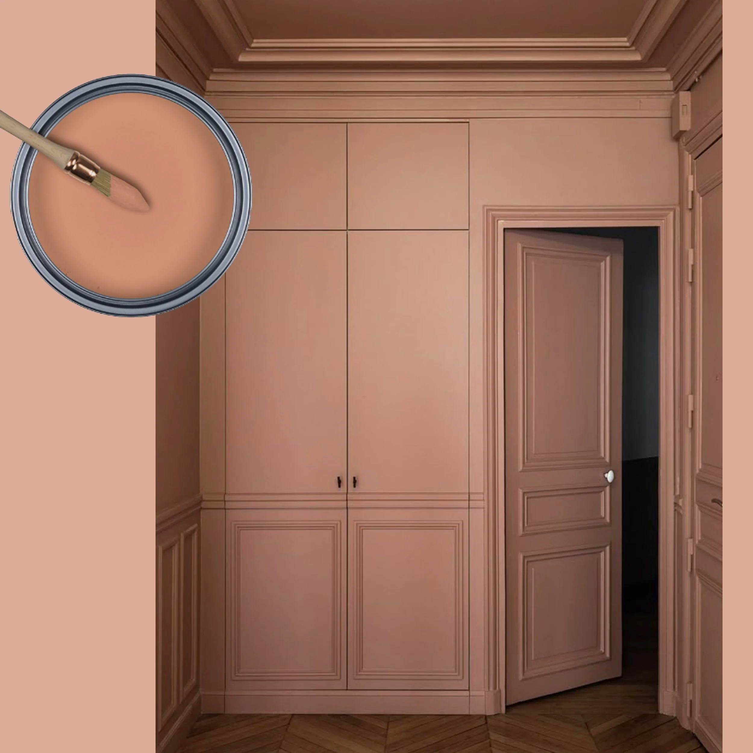
When we think of Terracotta we are automatically associating it with Southern countries. I can see it very well in a countryside home with some more classical furniture in a dark wood. A winning combination.
interior by Agathe Convert
We can compare this picture with the one up here where I show the wood work in Once Upon a Time. It is even more daring to paint all in Terracotta, a great base for the Color Drenching trend.
Peany is a color you won’t see all year round in Viscri. But if you go in May you will see peonies allover the village, in front of the houses. Me, a city girl, know this beautiful flower as a bold, elegant flower in the flower shop. Discovering them growing wild on the street was such a revelation that I really wanted this color in the collection.
picture via Pinterest
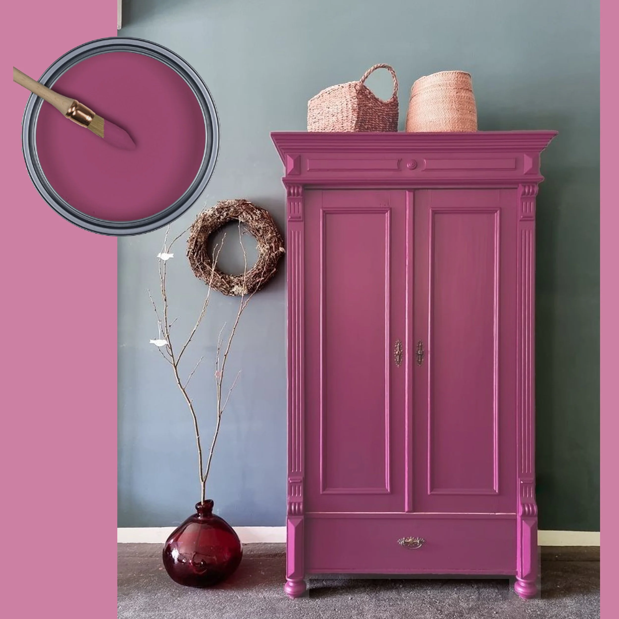
I always saw Peony as an accent color in the collection, important in the total of the collection. So use this color to paint a piece of furniture. Can be a classical or a modern piece, it will always look amazing.
picture via Pinterest
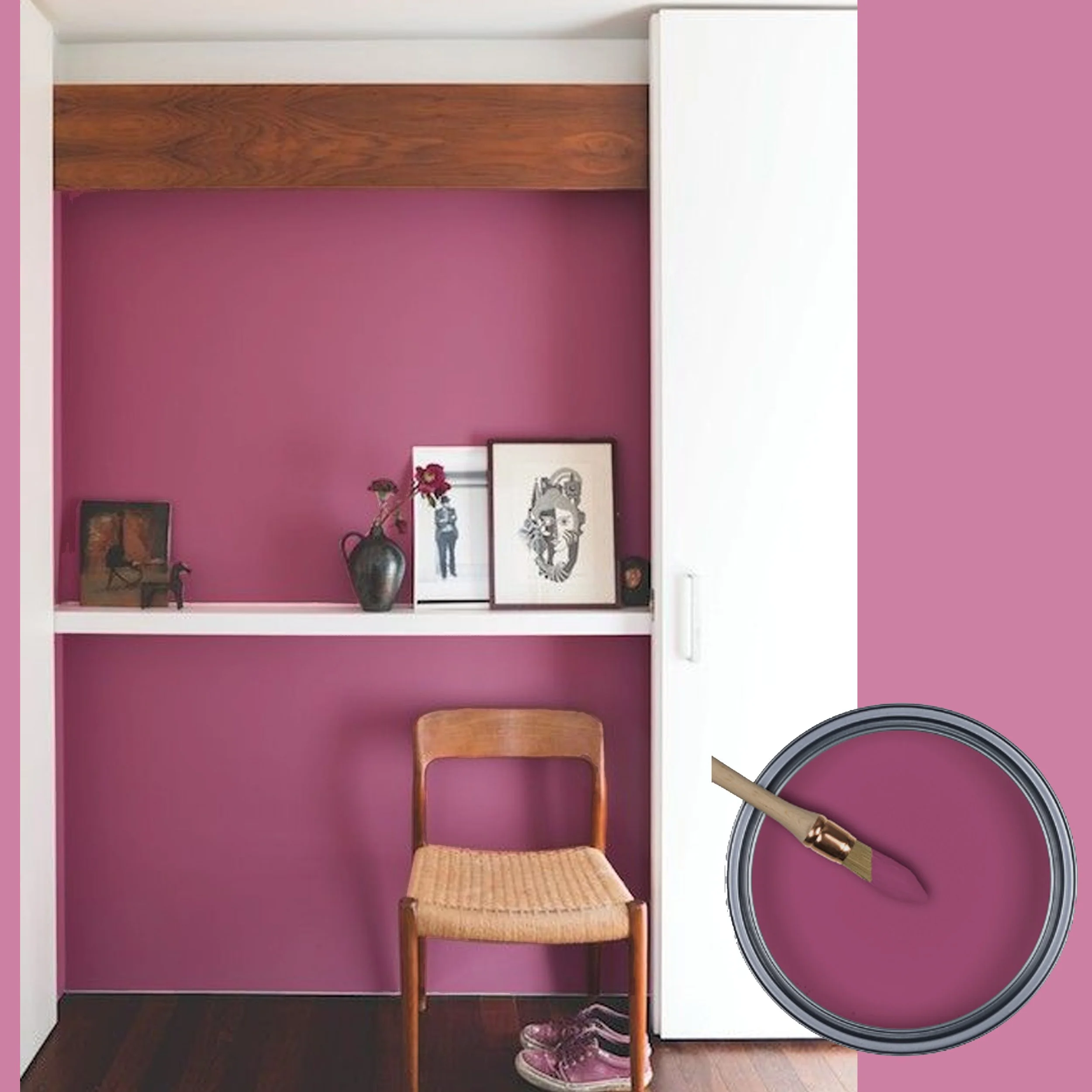
You love Peony? Paint an accent wall in the color, it will look great. It will bring you joy every time you enter the room.

image via Apartment Therapy
You really fell in love with Peony? Ok, just go for it, your home will look bold, vibrant and you will impress each visitor. You see here on the picture it can also amazing with terracotta. Just go for it, be bold.
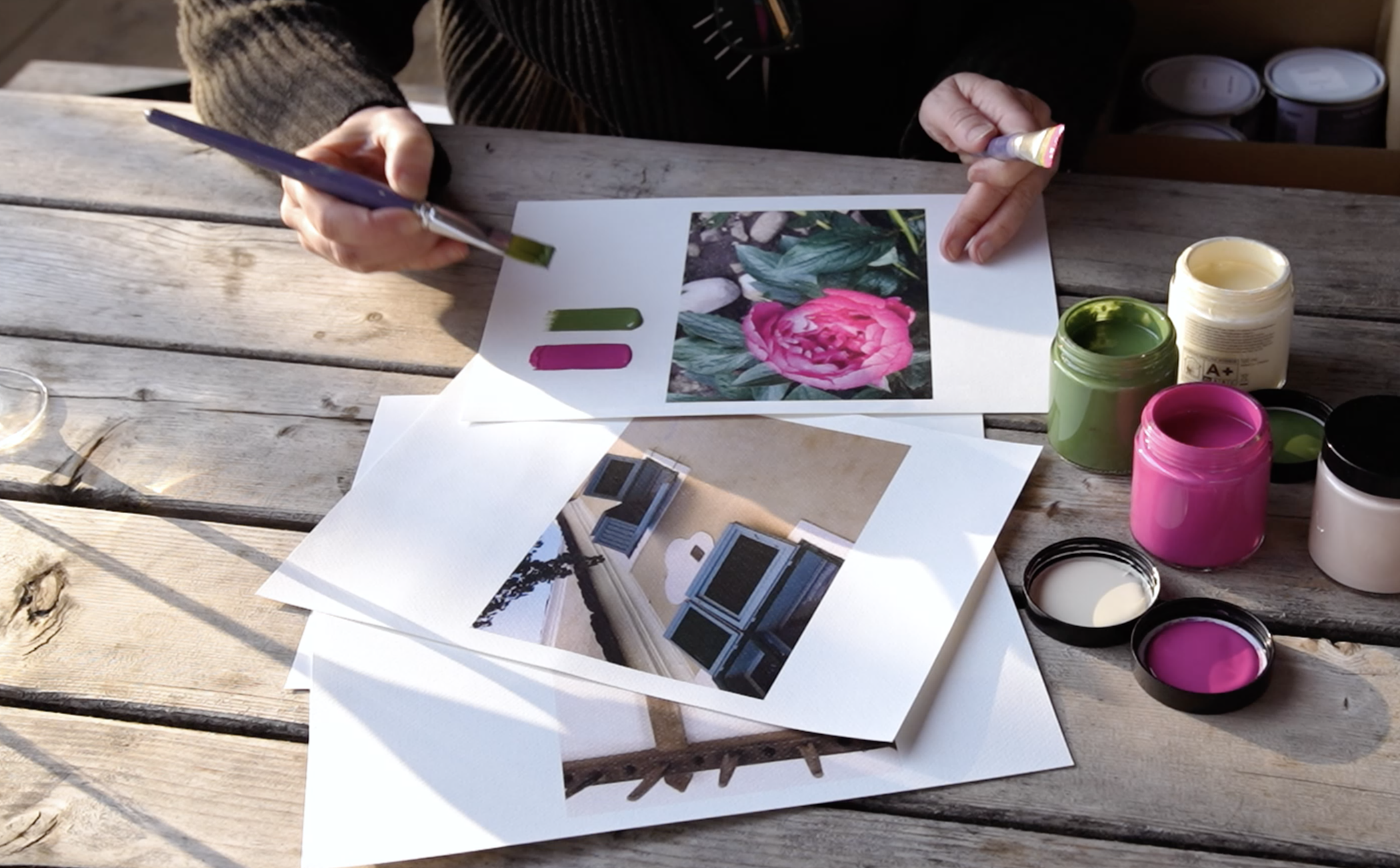
picture from workshop
During one of the workshops in Viscri I organised a color hunt. Each participant had to paint some swatches to go around afterwards in the village to find their colors back.
color hunt
In different ways, those colors always bring joy,
Now that spring is there and summer will arrive soon: are you re-decorating, re-painting? Get inspired and bring joy into your home.
Take a look for the complete collection
Don’t miss any of my blog posts! Follow me on my FB page, Instagram or Bloglovin' or even better subscribe to my newsletter and get tips for travel, exhibitions, recipes and things I discovered during the week.