Viscri, a small and charming village in the heart Transylvania has inspired me to develop a collection of paint colors for TonCorner. TonCorner is a beautiful paint shop selling high quality Ressource paint from France. I’m visiting Viscri at least once a year, whether to unwind and relax or to organise creative workshops. The streets are not paved, the cows leave in the morning to the meadows. It truly feels as if time has stood still.

Viscri
The facades of the houses are paint with a traditional lime paint. It is very interesting to observe them after the rain, as the colors get more intense and vibrant. Over time the colors fade gradually, adding a unique charme to the village. You can certainly use the Viscri paint colors as a lime paint, but in most cases, the paint will consist of a washable base, which can range from eggshell to even glossy finish.

The Viscri collection consist of a total of eighteen colors, a diverse range that includes the characteristic Viscri blue and Viscri green. The collection also features a variety of neutral shades and a selection of off-whites.
In this blog I aim to inspire you to use one of the four colors from the collection. The remaining colors will be featured in upcoming blog posts. The pictures I used for this blog post are meant to be illustrative examples; they are not in the exact Viscri paint color, and may not represent the precise tone either. They are intended solely as a source of inspiration for you to incorporate them in your home projects. So, let’s explore how you could effectively use them.

Viscri blue VSC01 - image via Bonnie & Claudie
Viscri blue is a vivid blue with a subtle red undertone. This particular shade is the first color you will notice upon entering the village. Not all houses are painted with this typical and iconic color. There is a colorful play when you see all the houses together in the street. The Viscri blue, when used for the facade, is frequently combined with the Viscri green for the shutters, often with an accent of Elderberry Flower, creating an enchanting visual harmony.
This color can be used allover the entire room, covering both the walls and the build-in furniture, creating a cohesive aesthetic. When in combination with contemporary accessories and strong graphic elements, this color gets a modern appeal and doesn’t make you think of a small village in the middle of Romania.
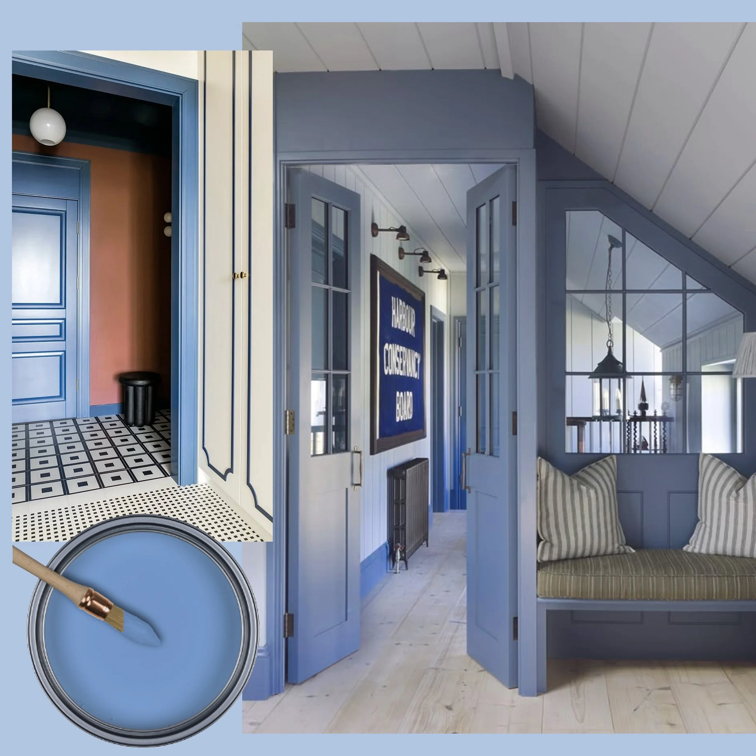
Viscri blue VSC01 - image via Domina and Homes & Garden
Viscri blue will be an excellent match to paint your doors and framework. This shade will stand out in combination with both white and coloured walls. It is a perfect choice for doors in your summerhouse or cottage, and why not consider it for the entrance door of your apartment as well?

Viscri blue VSC01 - image via Pinterest
Perhaps your laundry room is situated in the basement, and the furniture simply white. Or you have it linked to the mud room. Ever thought of adding a vibrant color? Play around with the design of the floor tiles. Those adjustments can transform doing the laundry in a more joyful task within your home. Same for the pantry or other small, hidden places in your home. Give them also some attention.
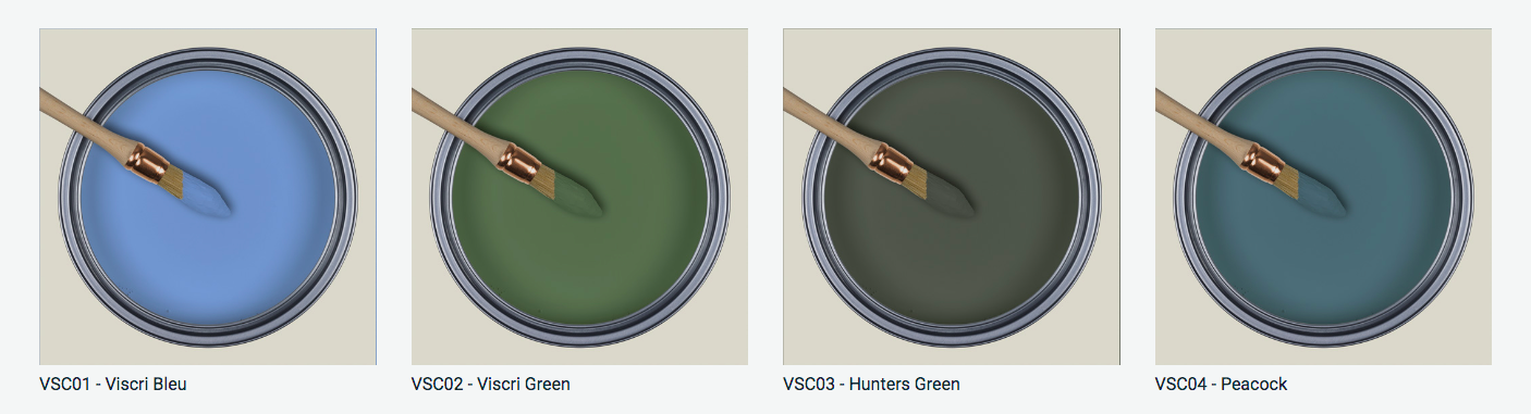
Lets explore in this blog post the possibilities for using Viscri blue, Viscri green, Hunters Green and Peacock. These hues all belong in to the colder colors of the collection. Stay tuned, the next blog post dedicated to the Viscri colors will focus on the warm tones. So don’t forget to subscribe to my newsletter.

Viscri Green VSC02 - image via Corriere de la sera
In general, I love all shades and tones of green. Viscri Green is a relaxing color, evoking the feeling of bringing the beauty of nature indoors. It is as calming as blue, but it has more energy. Green represents new beginnings and is powerful symbol of healing. For those reasons, green is an ideal choice for decorating the bedroom.

Viscri Green VSC02 - image via Pinterest
Color drenching is one of the trends for 2025, By playing with various shades and tones of green, you can transform your living room into a calming green oasis, that invites relaxation and tranquility. Color drenching creates a harmonious atmosphere and can elevate the overall mood of the space. Start by painting your walls in Viscri Green

Viscri Green VSC02 - image via Pinterest
What about incorporating a classical library in this Viscri Green tone? It brings a refreshing modern touch to the overall aesthetic of the room. This is an idea that can be explored also with a variety of other strong colors. In an eclectic home setting, a carefully chosen classical piece of furniture in a bold color will just fit perfectly and create a visual interest in the room.

You will often see this Peacock color in harmonious combination with the warm tone Hay in the Transylvanian villages. It is a classical combination that has stood the test of time. Is it blue, is it green? I believe it is the perfect balance between both of them, creating intriguing hue. It is a deep and rich color that captivates the eye. It will also complements well with brown tones, and I can see it well paired with bordeaux, a color that is making a comeback in contemporary design and fashion.

Peacock VSC04 - image via The Glam Pad
We see more often now that darker colors are gaining popularity for kitchens. When you choose to paint them with a high gloss paint, the light will reflect much better in the room. However, if the idea of an entirely dark kitchen is too much for your taste, try it out in the pantry. I’m sure Peacock will impress also your guests.

Peacock VSC04 - image via Homes & Garden
Peacock will bring a moody atmosphere to your study space. There will be minimal distraction, allowing you to fully concentrate on the work you are engaged in. I think this is a very intimate color, that feels comforting and embracing.

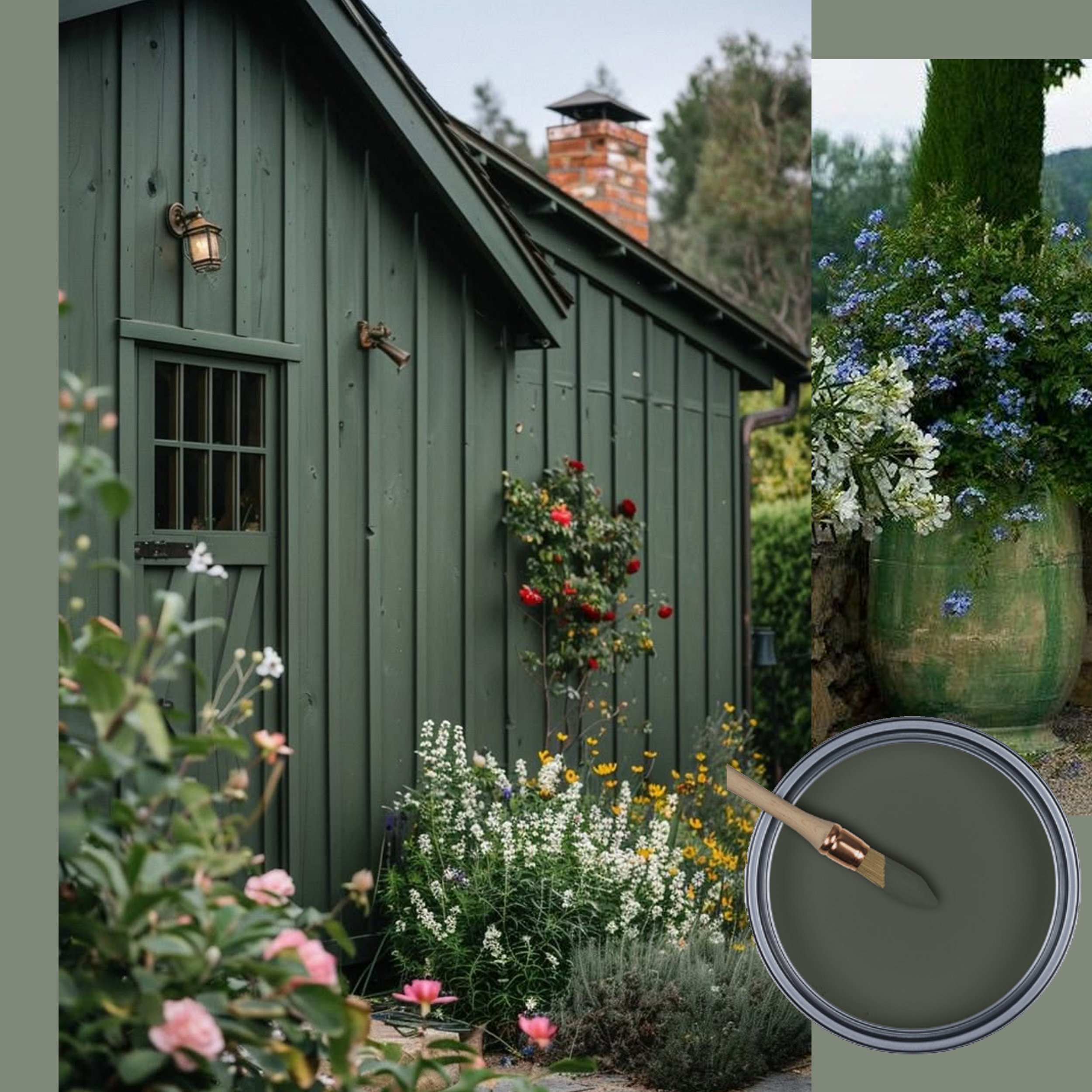
Hunters Green VSC03 - image via Est Living
Hunters green is a more classical dark green tone, a bit muted. This versatile green color will fit a wide variety of design styles. When used in an entrance hall with a floor in green and white marble it will set the tone for the entire house. When choosing Hunters green you will be happy even after a few years as it is a timeless hue.

Hunters Green VSC03 - image via Everyday Inspo
Probably not your first choice for a nursery, this Hunters Green may initially seem unconventional, but I think this can be a very good sooting color for the room. Its depth have the potential to create a tranquil environment for your kid’s room. It will fit perfectly with the pastel colors of your little princess as well as the stronger colors of you adventurous boy.
Hunters Green VSC03 - image via Pinterest
Hunters green is an excellent choice for your garden house or even for the facade of your picturesque countryside house. It will blend in with the environment and visually create more space in the garden.
How to use the Viscri colors? Easy… it works for big surfaces as well as for accents. All those blue and green tones will make your home relaxing and they will revitalise you.
Which color is your favorite and how would you use it?
Take a look for the complete collection
Don’t miss any of my blog posts! Follow me on my FB page, Instagram or Bloglovin' or even better subscribe to my newsletter and get tips for travel, exhibitions, recipes and things I discovered during the week.