Color drenching basically means painting every surface in the room in the same hue. Subtle variations in shade will add depth to the room, preventing it to feel flat. For example, a cotton velvet on your sofa will reflect the light different compared to a lacquered furniture piece. Color drenching is not new but is still ranking high on the scale of trends.
Choose well, colors are influencing how you feel. They can alter your mood, impact your behavior, and even affect your health. It can lift your spirit, or bring a feeling of sadness. So let’s take a closer look at how colors can visually transform your living space and explore some facts about color psychology .

image via Pinterest
Red is the color of passion, vibrant and full of energy. A color that encourages us to take action and make bold choices. However, it is not a color recommended for the trend of color drenching, except when you are decorating a theatre. Remember those old-fashioned movie theatres with the seats in red velvet, heavy curtains opening before the movie or theatre play would start. I still love to visit those old places, they adds so much to the experience. A bar or restaurant can get very sophisticated in this dark tone. Imagine some smooth jazz music playing in the background and you are ready for a great evening. Despite being a color of passion, take care: avoid red when decorating your bedroom when you want a relaxing space. Red tends to raise your blood pressure and you won’t get a refreshing night sleep. As with every color, red has also some negative sides: it can trigger feelings of aggression.

restaurant Daphnes via View the Vibe
Color drenching is not for everyone, nor is it suitable for every room. It can easily become overwhelming, it can feel to dark and claustrophobic. When dining in a trendy new restaurant where orange is the dominant color, you are likely to have an enjoyable evening. However, once you get home, you might regret indulging in that sweet dessert. Yes, orange is a color know to stimulate your appetite. So for restaurant orange is a perfect color. Why do you think you see so much orange in fast food restaurants? So a no-go for your dining room. At the end the impact of orange depends on the shade you choose. For instance, if your orange has a bit more of brown in it, resulting in a warm cognac color, this can create a refined atmosphere for your home bar. Pair the orange with gold and bronze tones to make the room stand out.
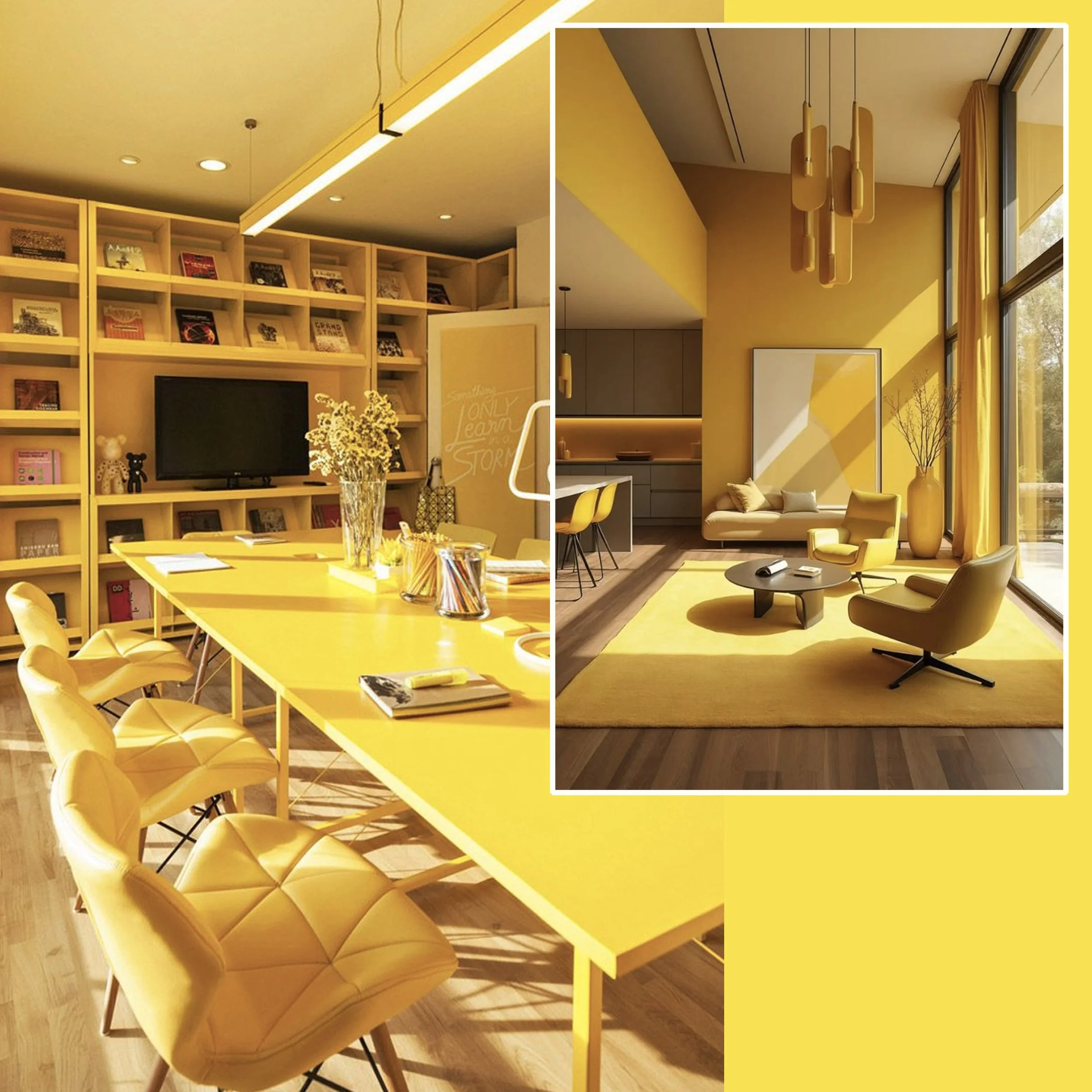
image on the left via Designboom - on the right via Pinterest
Yellow office, you think I’m crazy to suggest such thing? Yellow is a happy and uplifting color that has the power to bring everybody in a sunny, positive mood. A color that gives energy and vitality, just think of a bright, sunny day and how it makes you feel. Yellow is a color that helps you focus more effectively on the task in front of you, enhancing clarity. It is also a great color for memorising information, as it stimulates mental activity. When a brainstorming session is on the agenda, this bright color will open up the mood and encourages creativity. However, too much yellow can be overwhelming. Use it with moderation.

Color drenching, when done well, can be truly amazing. It will create an exceptionally sophisticated and luxurious atmosphere. Using a single color throughout a room can make the space feel larger. Additionally, it can bring a very calming and relaxing feeling to the room as your eyes are not constantly shifting from one side to another side.
Green is as relaxing as blue, but it has a bit more energy. This is because of the yellow that is mixed with the blue. Green is a color that symbolizes re-birth, renewal, all we find in nature. Green gives us some feeling of security and is associated with growth, harmony and freshness. A very versatile color, easy to incorporate in various settings.
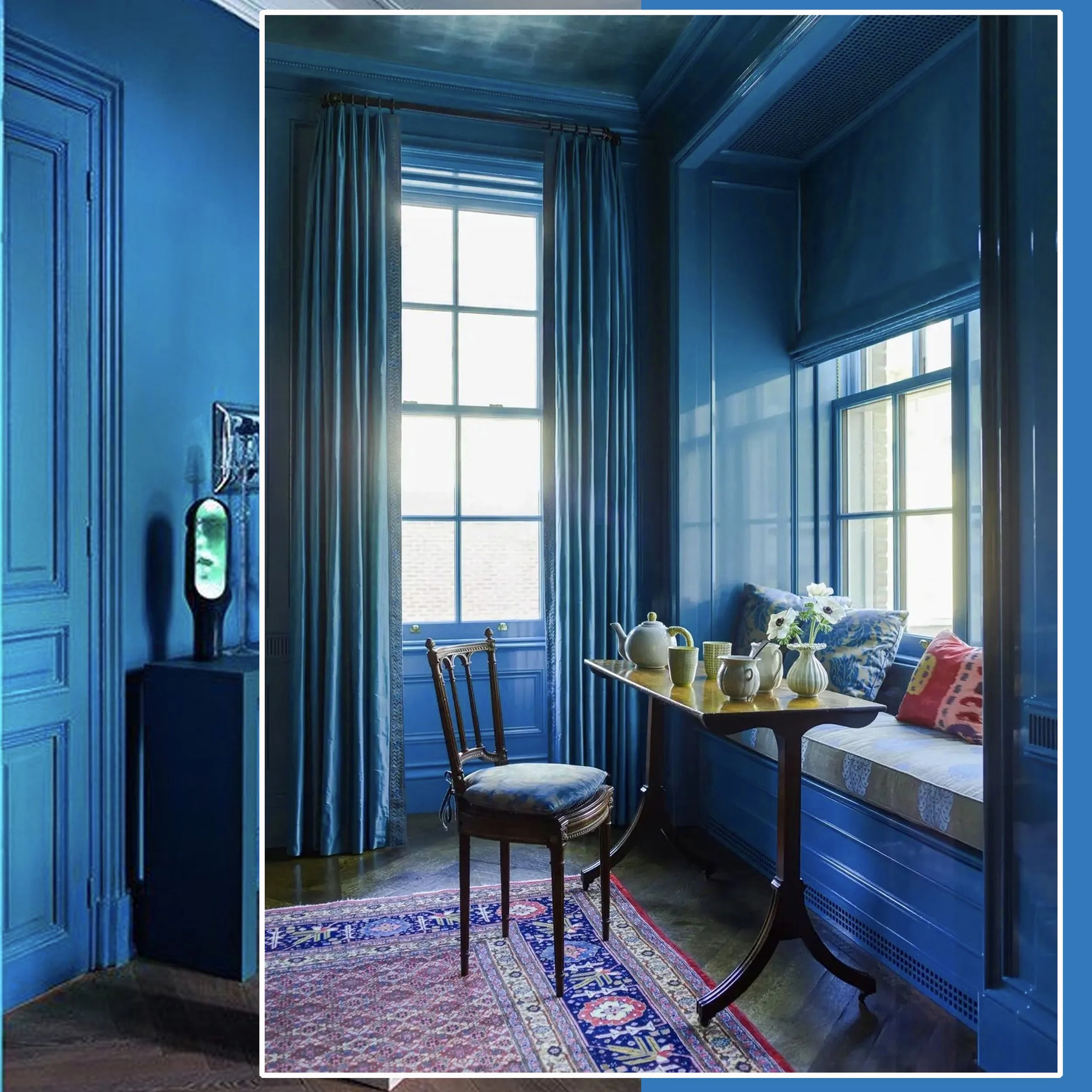
image via 1stDibs
Blue is one of the most popular colors in the world. Why? It often makes us think of places like the beach and a clear blue sky, all images that evoke a sense of calm and relaxation. So no wonder that so many people go for blue. However, take care, as using to much blue in a space can make the room feel colder and less inviting to stay for a long time. Blue is a more masculine color. When re-decorating the home office, blue can be a perfect choice for the color drenching style, because it is know to enhance focus and boost productivity. A color that always will be around, never really going out of style.

image via IG
Darker tones are a great choice for color drenching, as they create a warm and cozy feeling. Purple, in particular, brings in a calming and zen-like feeling. This color is the perfect balance between the passion of red and the relaxing influence of blue. It is a very creative and artistic shade, admired by some, disliked by others. When you want to meditate or practice yoga at home, incorporating this color into your space can enhance your sense of calm.
bedroom via Run to Radiance
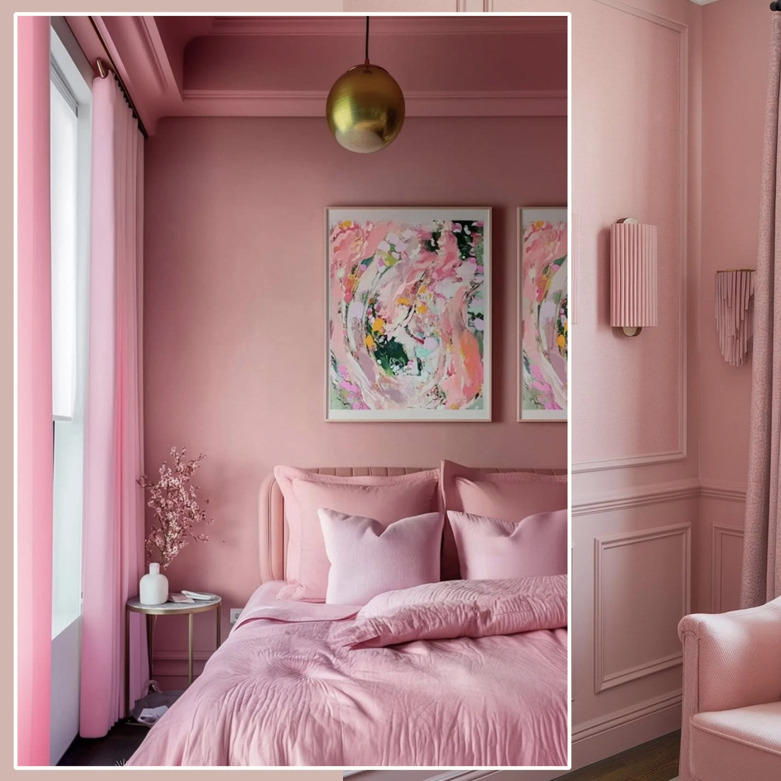
What could be more enchanting than a little girl’s dream of having a complete pink room? Pink is a color of love, but not the passionate love we have seen with red. Instead, it represents a sweet, gentle and innocent kind of love. This delicate hue is fragile, yet comforting. Pink is also a color that will lift up your mood when you feel a bit down. It will embrace you with warmth and tenderness.
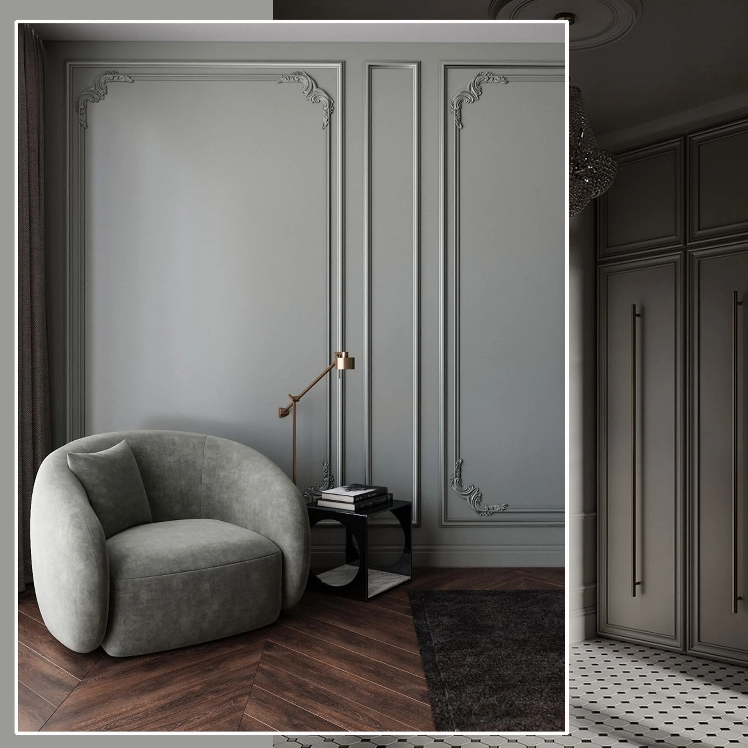
Grey has been and continues to be present all around us. There are cool, crisp greys and warmer, softer tones. This color we have seen used often in the minimalist style and has an understated elegance. When used for color drenching, grey can look very refined. However grey is known to take away your energy rather than giving you a boost. It will make you feel as just sitting around waiting for inspiration to strike.
color drenching is a good idea when you want to
create illusion of a larger room
create a more intimate, cozy feeling
add drama to the room
make a color statement
have a trendy interior, however, knowing it won’t look out-dated in a few years
Is color drenching something for you? which color would you apply?
Don’t miss any of my blog posts! Follow me on my FB page, Instagram or Bloglovin' or even better subscribe to my newsletter and get tips for travel, exhibitions, recipes and things I discovered during the week.