Summer is officially here, and with temperatures skyrocketing around the globe, we can only think of a relaxed holidays. When we slow down, the inspiration often strikes and we want to bring the same easygoing feeling into our homes. Is it truly wise to bring that holiday aesthetic home with us, or should we pause before painting our living room Mediterranean blue? Decorating your home based on a vacation mood can work beautifully, yet there is a fine line between a space that feels effortless right and one that comes across as out of place. Let’s explore how to capture that summer atmosphere without regretting it in a few months.
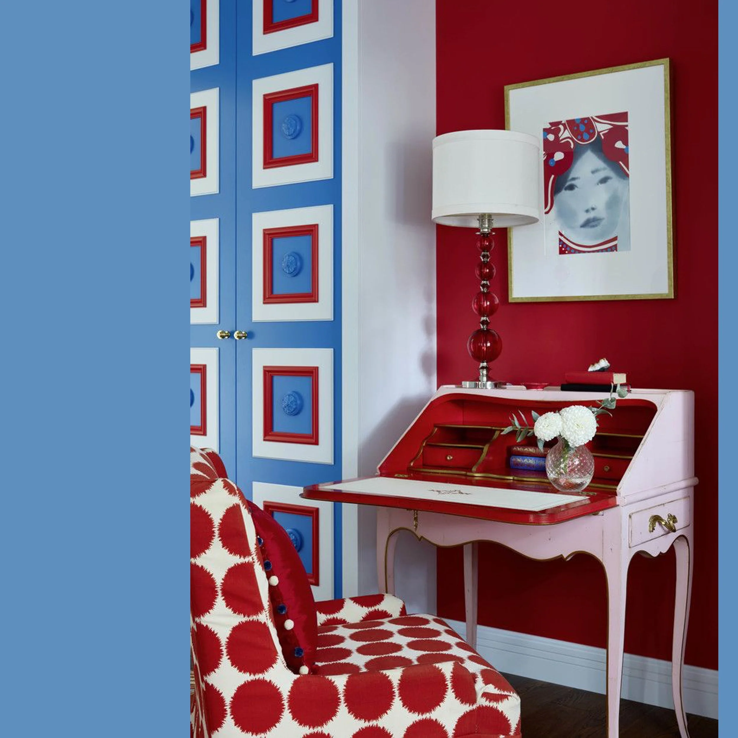
Blue - White - Red: a Classical Color Combination

Some color harmonies are easier to adapt for use in your home without getting the feeling you made a mistake. To start, it helps to know wether a scheme truly fits your personal style. Are those colors genuinely you, or is it simply recalling the relaxed moody enjoyed during the holidays? This blue-white-red combination is a genuine evergreen; you see these pairings return every year in fashion because they form the classical summer mix of colors. The interior inspiration shown here above is a more classical setting, updated through the use of those hues. The blue and red are slightly muted and applied in a graphical way, which is precisely what makes this room feel contemporary..
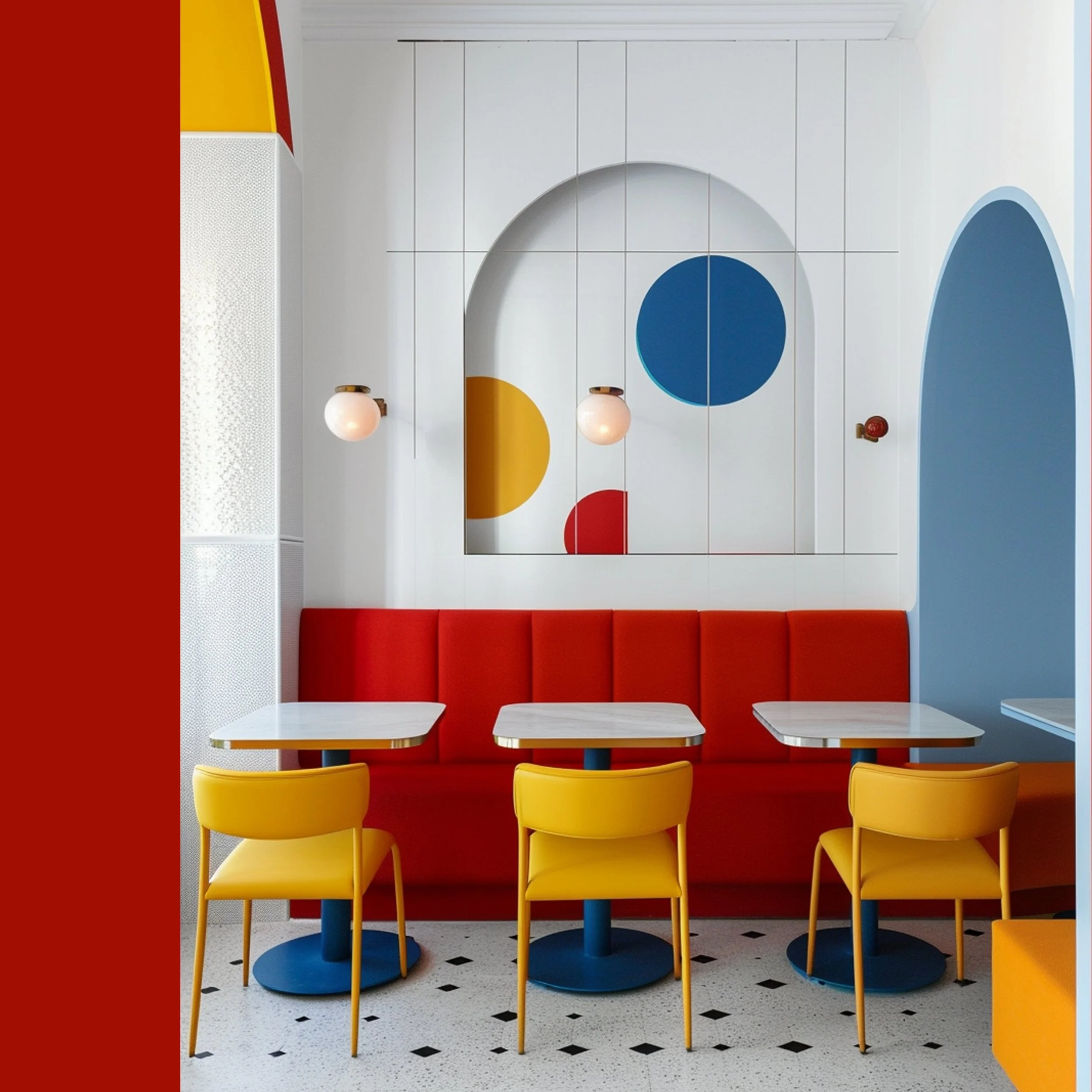
White Paired With Primary Colors

This color combination feels incredible modern, making it a great starting point for a small modern city apartment or a holiday home. This interior reminds me of a Mondriaan painting, balancing sharp, clear lines with playful blocks of color. To make this work, you need plenty of crisp white space as a backdrop. The white acts as a blank canvas, allowing the bold hues to pop and filing the space with a sharp, contemporary energy.
Would you go bold with color blocks in a small space?
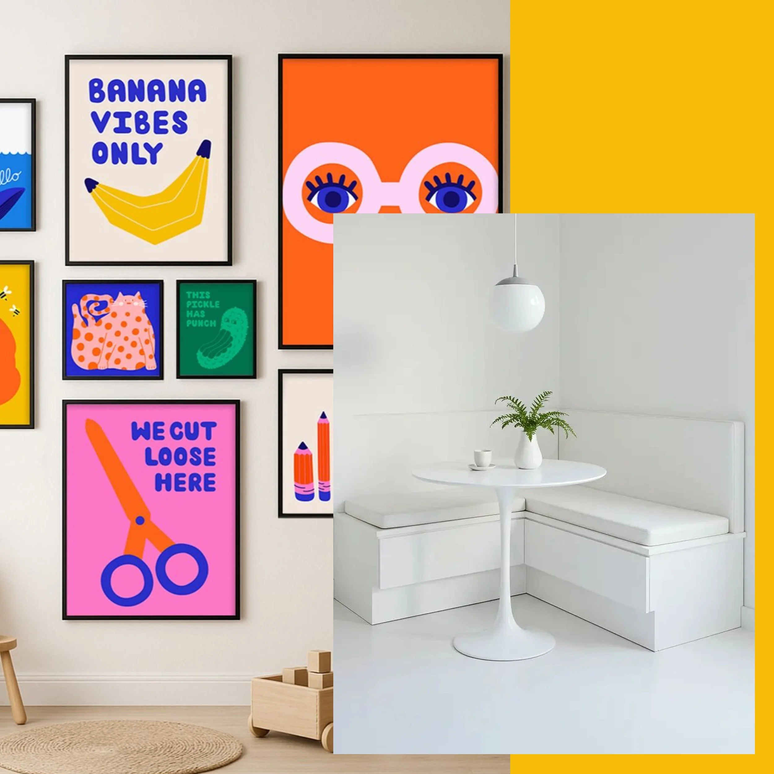
art wall via Etsy
Mix of Bright Colors to Bring a Minimalist Room to Live

Maybe you are afraid of using so much color, lets start small.
Creating an art wall is one of the easiest ways to introduce color into your home without committing yourself to repaint the whole room. Easy to install, and if your inner minimalist starts feeling like it is a bit too much, you can eassily scale it back. The best part? An art wall I can evolve with the seasons, giving you a rotating gallery matching your mood or the mood outside. You can apply this exact low-commitment strategy to your living space by swapping out neutral pillows for bold, colourful cushions that instantly upgrade your living space.

image via The Olive Branch Nest
Black and White with a Splash of Color

While black and white interiors are undeniable stylish and elegant, they run a high risk of feeling sterile or boring. Instead of letting this black and white room feel cold, treat it as the perfect background to showcase your personal style with intentional splashes of color. This can be done on a budget, no need of major renovations, either, to make an impact. A few colorful throw pillows, a striking piece of artwork, or even a fresh bouquet of flowers can instantly have a big impact, transforming a boring room into a dynamic space.
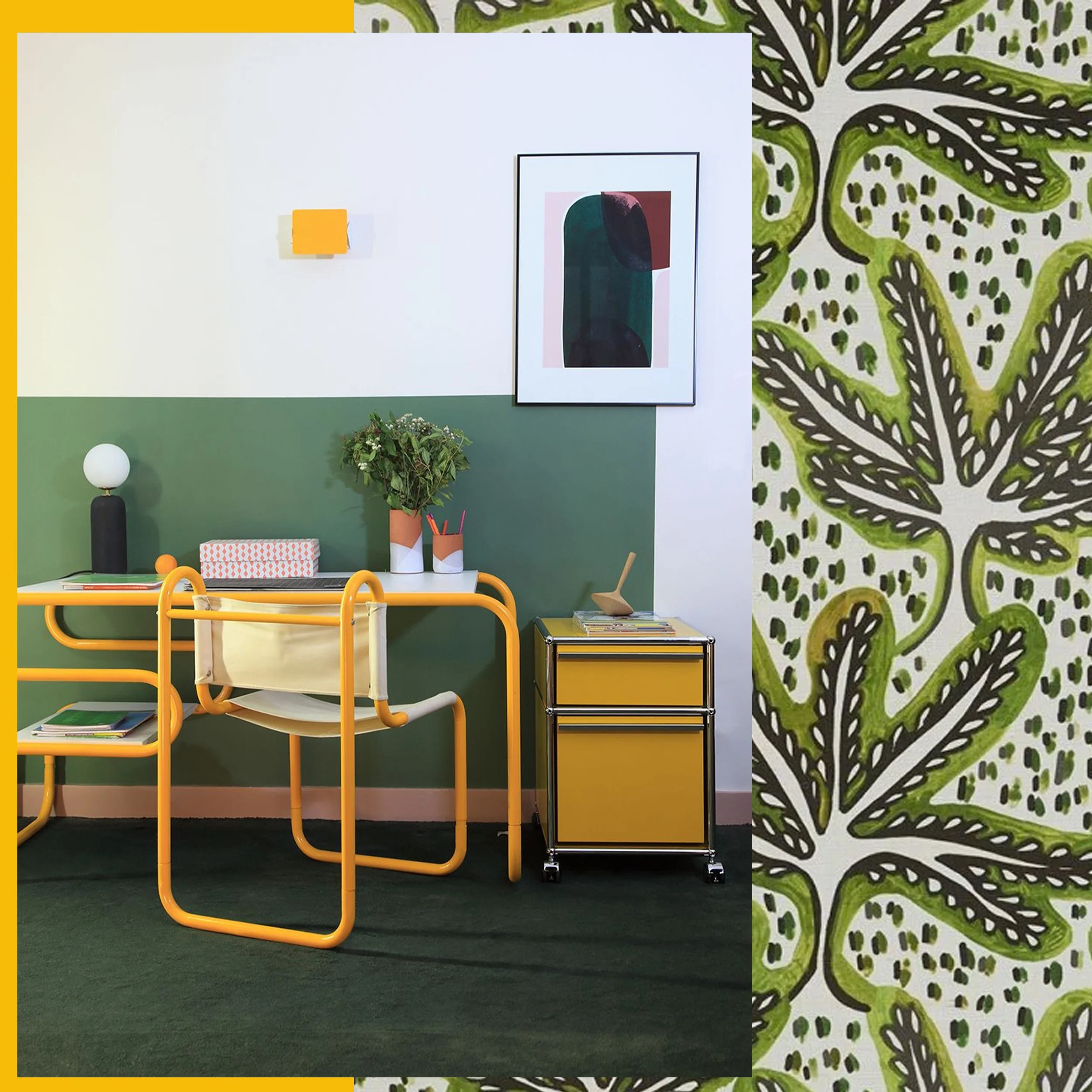
interior image via Goodmoods - Bonsai wallpaper Pierre Frey
Green - Yellow in Combination with a lot of White for an Exotic Touch

Green is one of those colors that brings immediately a sense of calm and relaxation to your interior. When pairing it with yellow you will instantly inject energy into the room, creating a space where the sun shines all year round. While green is very versatile and works in almost any tone, from bold emeralds and muted sages to soft pastel, yellow requires more care. Yellow can easily become overwhelming, so use it intentionally as an accent, or opt for a softer yellow tone.
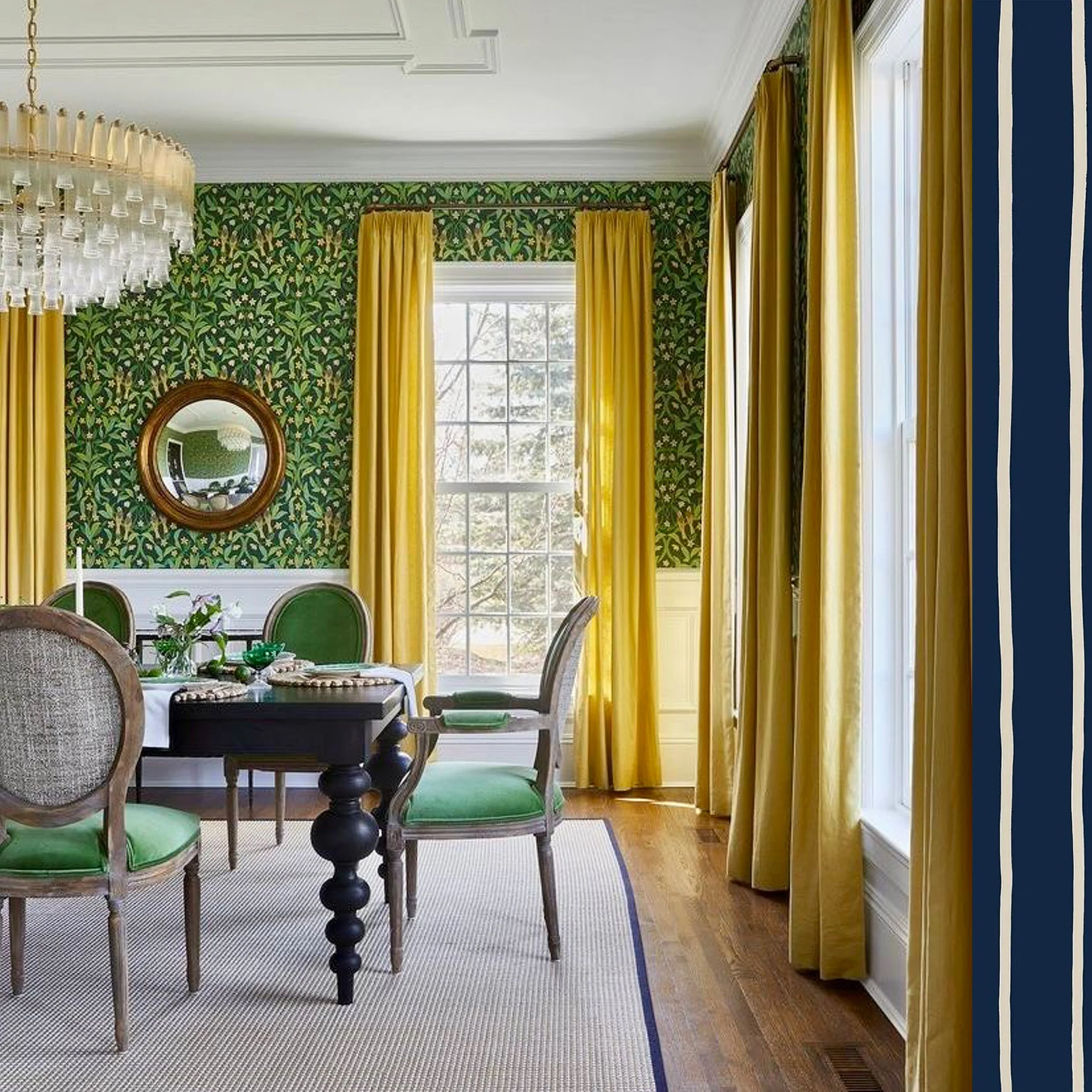
image via Decorpad
We often associate bold colors with modern spaces. Yet, as the image above proves, a classical setting can look absolutely spectacular in a bold color palette. While a dramatic color combination might feel unexpected at first glance, it creates an instant statement and makes for a fantastic conversation starter around the dinner table. Here, a delicate floral wallpaper brings a more romantic, traditional touch, while the vibrant yellow silk curtains inject a bold, contemporary note that brings the whole space to life.
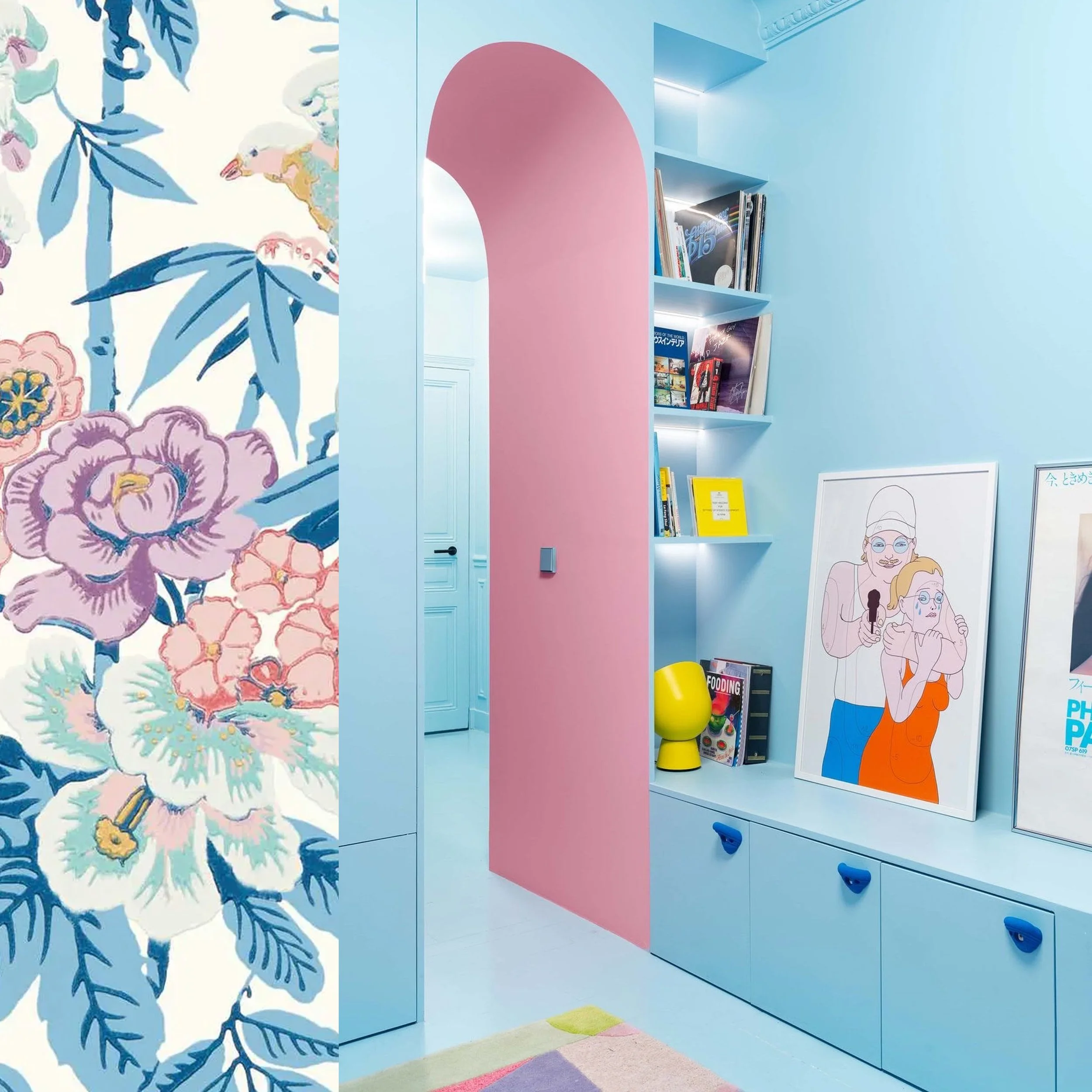
Pastels for a Fresh Summer Feeling

Pastels offers a soothing, refreshing alternative to all the bold colors, though they aren’t always the first choice for homeowners. While soft hues are a classic choice for creating a sweet, youthful space, they are incredible versatile depending on how you style them. You can make it deeply romantic by pairing pastels with floral wallpaper. You can keep the look firmly rooted in the modern era by applying the pastel tones to well-defined areas and grounding them with a few bright color accents.
Some final tips
be sure it is you and fits your personal style
you don’t want to create a feeling of summer holidays, it has to work all year round
don’t be afraid to use bold colors for a classical interior, it can look spectacular
use bold colors as accents: throw pillows, art wall, floral arrangements. Easy to change in case it is not really fitting you
Which of the palettes resonated most with your personal style?
Don’t miss any of my blog posts! Follow me on my FB page, Instagram or Bloglovin' or even better subscribe to my newsletter and get tips for travel, exhibitions, recipes and things I discovered during the week.