Every time I take out the samples of my Viscri paint collection, nice memories are coming back. Viscri still holds a warm spot in my heart, and collaborating with Lia from Ton Corner was a dream come true. At first glance it can be challenging to imagine how the colors work together, but when you look at the pictures of Viscri, you see immediately the combinations reveal themselves.
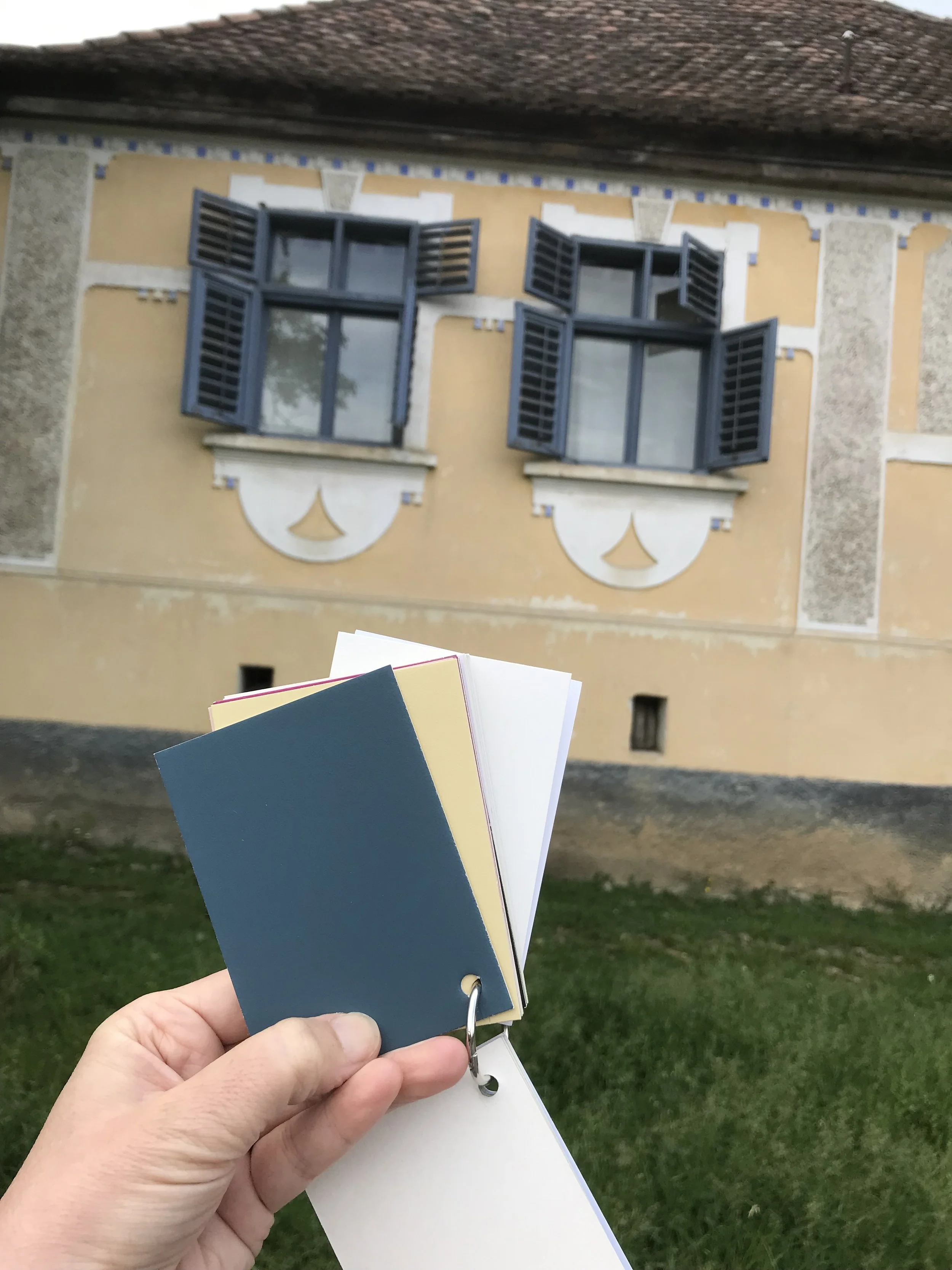
Viscri
I wrote several blog post about my Colors of Viscri paint collection, now let me inspire you with ideas on how to combine them.
Viscri Colors - Part 1 - the cold colors
Viscri Colors - Part 2 - the warm colors
Viscri Colors - Part 3 - the neutrals
Viscri Colors - Part 4 - the pastels and off-whites
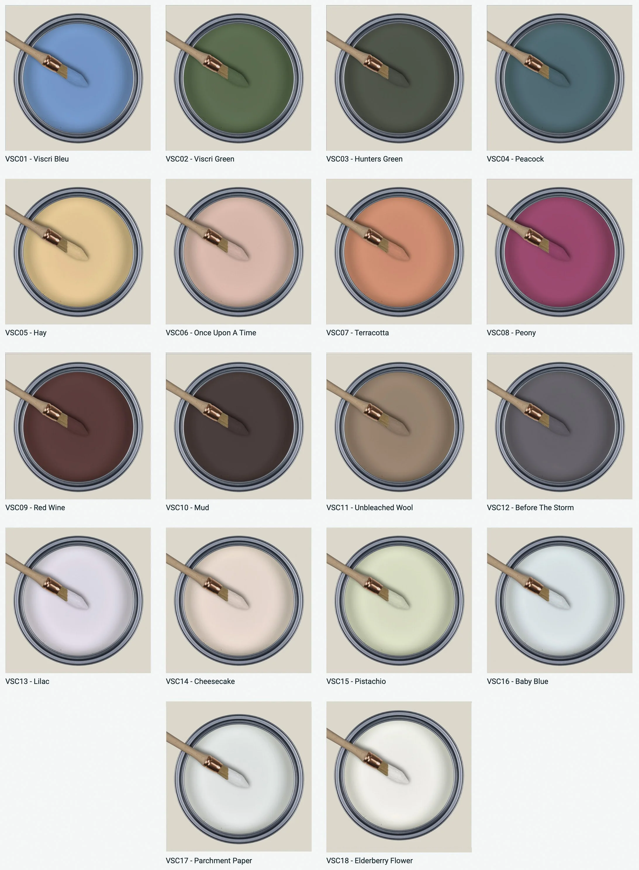
18 Viscri colors Ton Corner
The images are illustrative and some have been subtly modified in Photoshop; they are presented here purely as inspiration. They give you an idea of how to combine the colors, and you’ll notice that altering the proportions or the way you use them can make a significant difference.

image via AD - Viscri colors: Wine - Once upon a time - Viscri Blue
Viscri Blue and Wine is certainly a wining combination. In the picture above, Once upon a Time sets the mood for the room, the Wine shade is used as an accent while the door is painted in Viscri Blue to introduce a cooler note the the overall ambiance. You will notice the ceiling is not painted white either, Cheesecake would be a perfect choice, suggesting that the Once upon a Time hue is reflected there in a softer, lighter version. The floor is in a dark wood, but painted in the deep red of our Wine shade could be a great idea.. The overall look is inviting, enhances warmth, and cool and warm tones play together harmoniously.

mage via Pinterest - Viscri colors: Baby Blue - Viscri Blue - Wine
When we replace the warm Once upon a Time color with a much cooler Baby Blue for the walls, you immediately sense how the atmosphere shifts from cozy to fresh and airy. In this arrangement you will also notice the Wine color when opening the door, since the door is painted in two contrasting tones. This is a striking design choice, but be careful to ensure the colors really work together when the door is opened and both hues are visible together. The wood floor tone bring a warm touch, while the black of the metal window frame and switch plate introduces more modern edge to this room.
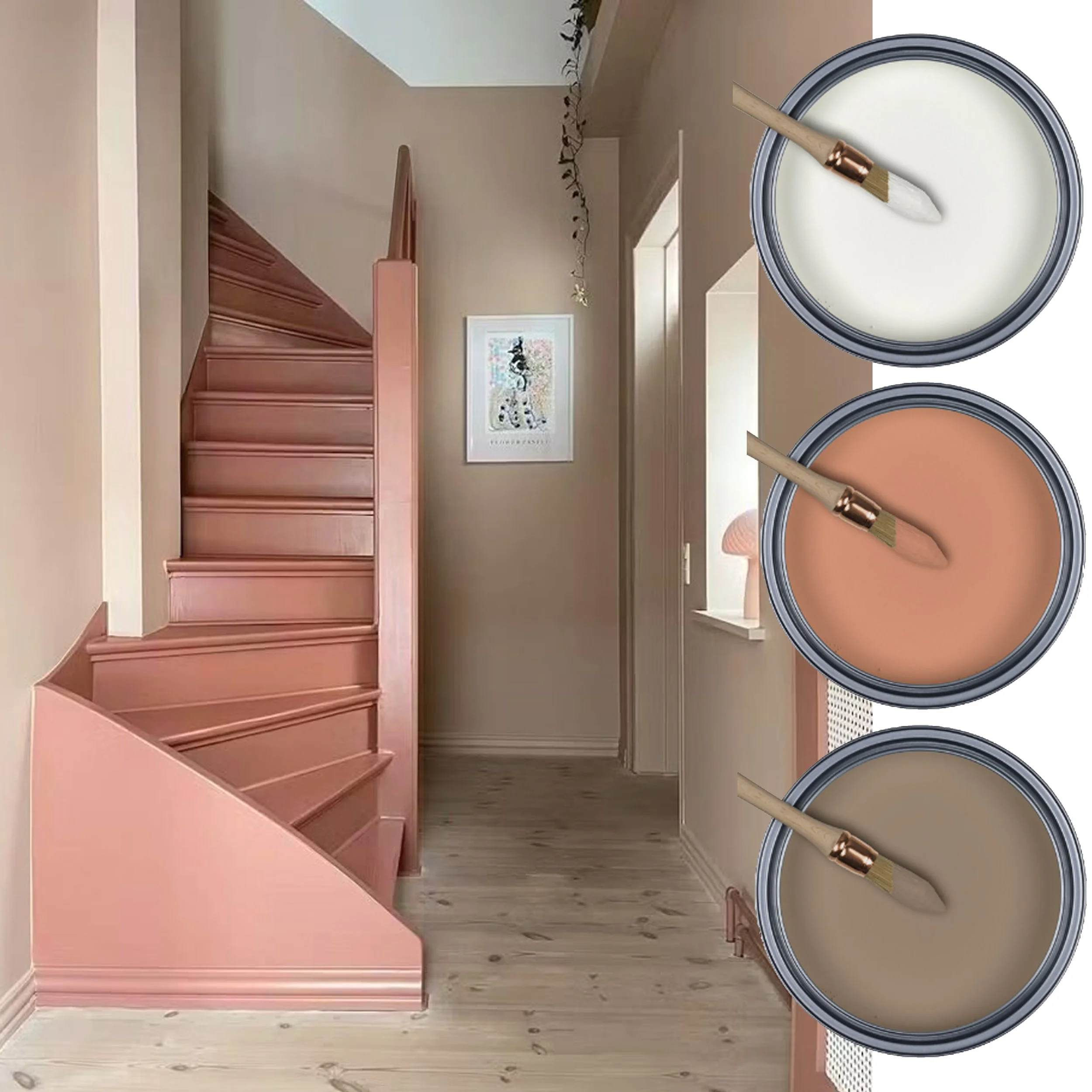
mage via Pinterest- Viscri colors: Elderberry Flower - Terracotta - Unbleached Wool
Elderberry Flower is the perfect off-white, with a subtle yellow undertone that makes every room feel sunny and inviting. It works beautifully with every palette you choose. The greyish wood floor compliments the Unbleached wool on the walls. When renovating a staircase there is the option to keep is neutral, preserve the existing wood, or paint it white if the wood is not in great condition. Selecting a color for the stairs is a bold decision that will transform the space: rather than leaving the hallway plain, it will become a striking part of the home.

Image via Pinterest - Viscri colors: Once upon a time - Viscri Blue - Before the Storm
And this also counts for doors. We paint them in off-white because that neutral base will coordinate with all the different colors we plan to use on the walls; painting your door in Viscri Green is refreshing, and green remains an evergreen choice that will stand the test of time. When we look into the flower shop we notice that every flower, whether a delicate pastel, or a strong fuchsia, harmonise beautifully with green. You can paint the skirting in the same green for a cohesive look or pair it with the Before the Storm hue to create more contrast. Choosing Once upon a Time for the walls, or alternatively Cheesecake, will introduce a feminine warmth to the space.

Image via Bo Bedre - Viscri colors: Viscri Blue accent - Parchment - Pistachio - Hay
Let’s combine some fresh pastels and see that the result does not have to look like a kid’s room. The subtle green of Pistachio will add freshness to the space. Paired with the warm tone of Hay and brining a touch of Viscri Blue, the scheme will introduce sophistication. It is a soft palette that, rather than shouting, gently enhances the room the moment you enter.

Image via Pinterest - Viscri colors: Hay - Terracotta - Pistachio
When we paint the ceiling in Hay and combine Pistachio and Terracotta for the walls, you see the impact is much stronger as both Pistachio and Terracotta have an equal part in the room. A cool color in combination with a warm tone creates a balanced atmosphere. The warmth of the yellow makes that the space feel feel inviting and sunny, while the cool green of Pistachio brings a fresh, calming contrast.

Image via The Spaces - Viscri colors: Elderberry Flower - Cheesecake - Terracotta
Maybe this is all a bit to much to start with; you can keep it simpler by pairing Cheesecake with Elderberry Flower for the ceiling and doors. Cheesecake is my favorite neutral-like color: it isn’t beige, neither off-white, and it is not peace, it carries a subtle pinkish undertone. It is a shade that’s difficult to describe - almost neutral, but a touch more interesting and warm than a standard neutral. Use Terracotta as an accent to add depth and contrast without overwhelming the overall softness.

Image via Rebbel Walls - Viscri colors: Pistachio - Wine - Terracotta
Pistachio paired with Terracotta has a retro feeling, and the Wine accent makes the palette feel even more vintage. It is a more challenging combination that feels very feminine and timeless. This pairing could work beautifully in a relaxed, bohemian interior, and also pairs well with ethnic influences.

Image via Pinterest - Viscri colors: Mud - Unbleached Wool - Before the Storm
If you prefer a more moody atmosphere, try combining several dark neutrals for a layered look. Here the ceiling and skirting are finished in the same tone to create continuity. One room’s walls are painted in Wine while the other is in Unbleached Wool, with Before the Storm used as a transitional color between the spaces. When you choose darker shades for your interior, it is important to paint radiators in the same color so they blend into the background, if painted in a contrasting hue they will become too prominent and act as an unintended focal point.
There are still other combinations: Viscri Blue and Viscri Green with Elderberry Flower as accent to gently lighten the room. The dark neutrals paired with soft pastels…… I could go on, but I hope this blog post has inspired you to explore and create your own combinations.
In you feel uncertain, send me a sign and I will gladly help you find the perfect match for your space.
Do you have a favorite one, or how would you combine them together? Let me know!!
Don’t miss any of my blog posts! Follow me on my FB page, Instagram or Bloglovin' or even better subscribe to my newsletter and get tips for travel, exhibitions, recipes and things I discovered during the week.