Here is already the third part of the Viscri paint collection, inspired by a small traditional village in Transylvania. In part one we explored the typical colors of Viscri that you will notice immediately upon arriving in the village; the Viscri Green and Viscri Blue. In part two I talked about the warm colors that can be found throughout the village, the colors of the facade, the terracotta roofs, and the faded shaded of the painted facades.
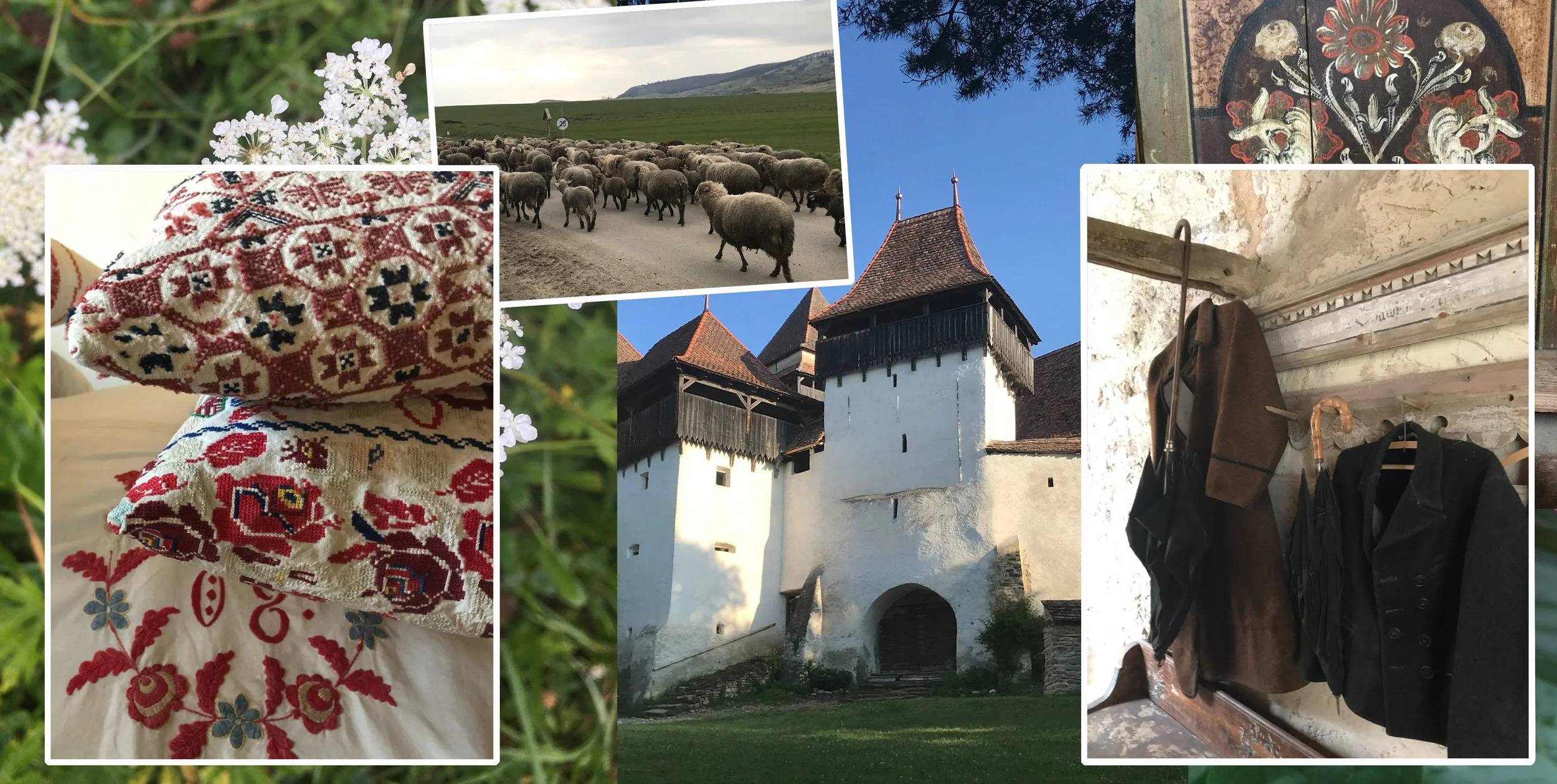
Viscri - fortified church and pictures from museum
You can find a lot of history in the village. The fortified church is a Unesco monument, and within its walls, you will also find a museum dedicated to the Romanian traditions. You will find a lot of those fortified churches in Transylvania. King Charles acquired several years ago a house in the village, it originally served as a study center and is has since been transformed in a museum. You can discover how people were living in the past and still are, in some remote areas in the country. Learn how terracotta tiles were made, and explore in a the barn exhibitions related to Romanian traditions and craftsmanship. In the museum shop you discover the work from young Romanian designers who got inspired from their cultural heritage to create some unique design pieces. You can go home with a handmade candle, or teas picked from the flowers growing on the nearby meadow. You see, you should put Transylvania on your travel list.
Viscri collection TonCorner
Part three focuses on the darker colors of the collection: Wine, Mud, Unbleached Wool, Before the Storm. These hues can be a good foundation to pair with all the vibrant colors we explored earlier, or make a striking statement when used as the main color in the room. Dark paint colors are quite trendy these days, appealing not only to those who like country style or rustic interiors, even more to those who like very contemporary interiors. You will discover soon in this blog post.
The pictures I used for this blog post are meant to be illustrative examples; they are not in the exact Viscri paint color, and may not represent the precise tone either. They are intended solely as a source of inspiration for you to incorporate them in your home projects. So, let’s explore how you could effectively use them.
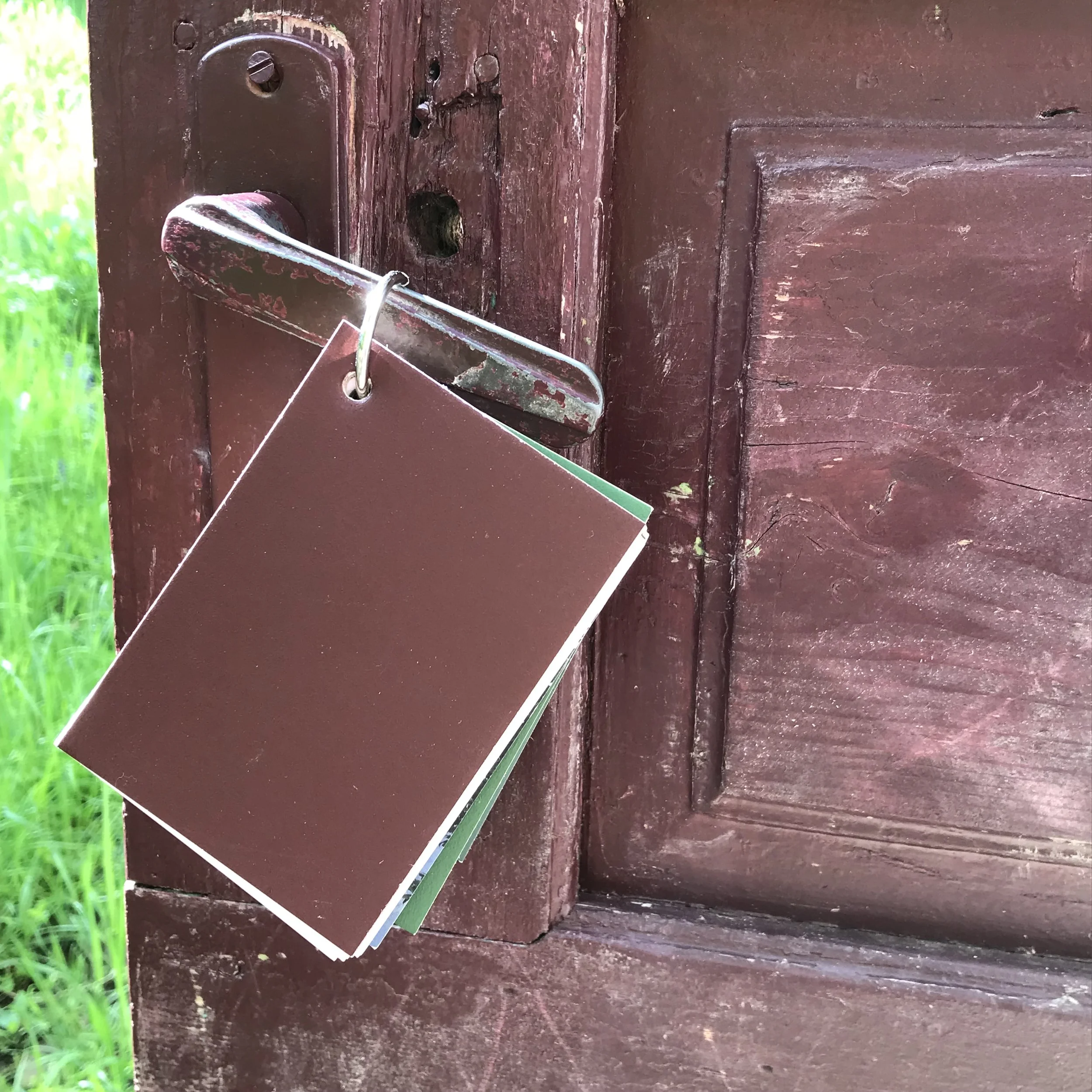
Red Wine sample - Viscri collection TonCorner
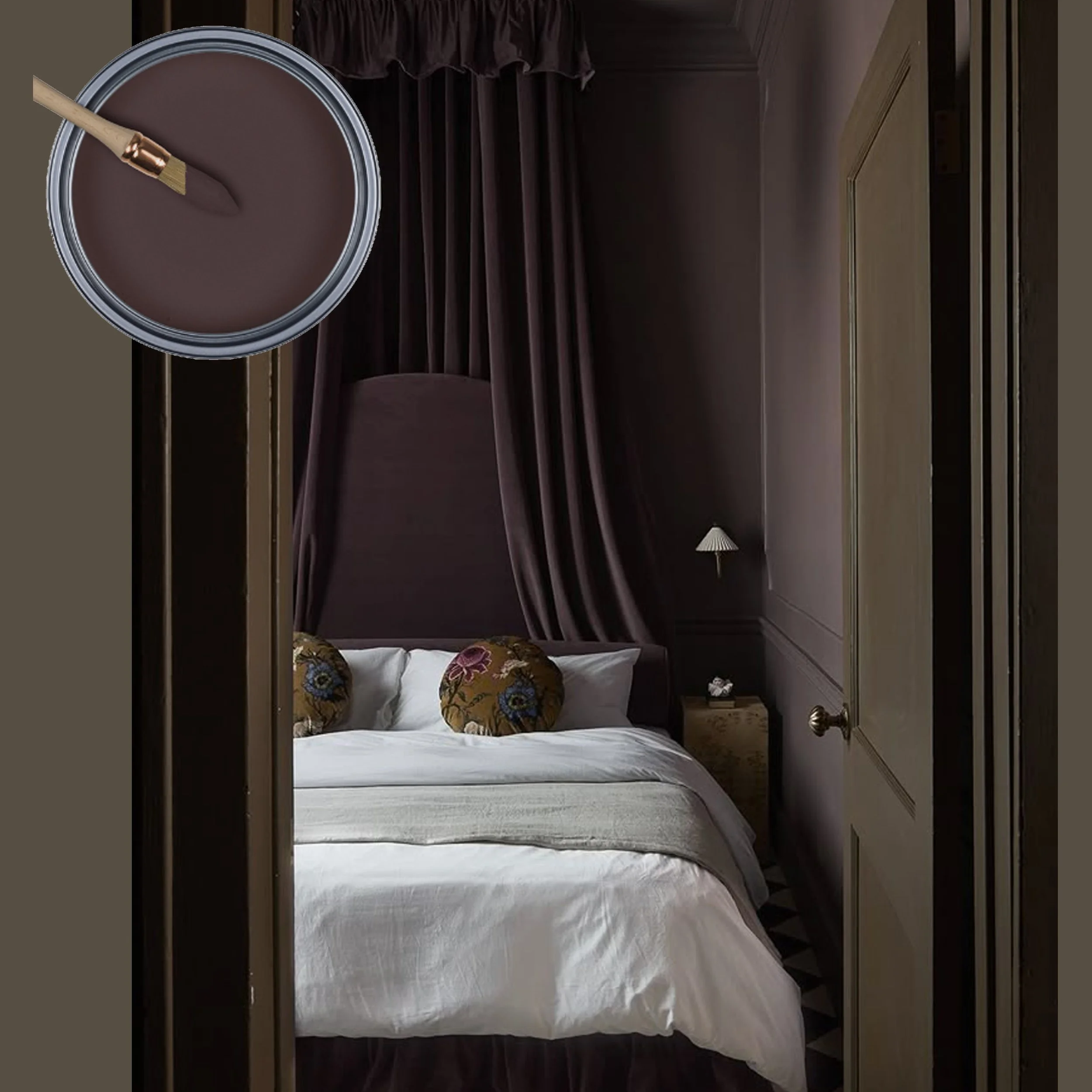
This dark red tone, Wine, was inspired by the entrance door to the garden surrounding the fortified church. It is a deep, saturated red tone with a brown undertone, which makes that it can almost be categorised as a neutral. When applied in a lacquered finished, this color will look very contemporary and bold, while maintaining a sense of sophistication that prevents it from being overwhelming.
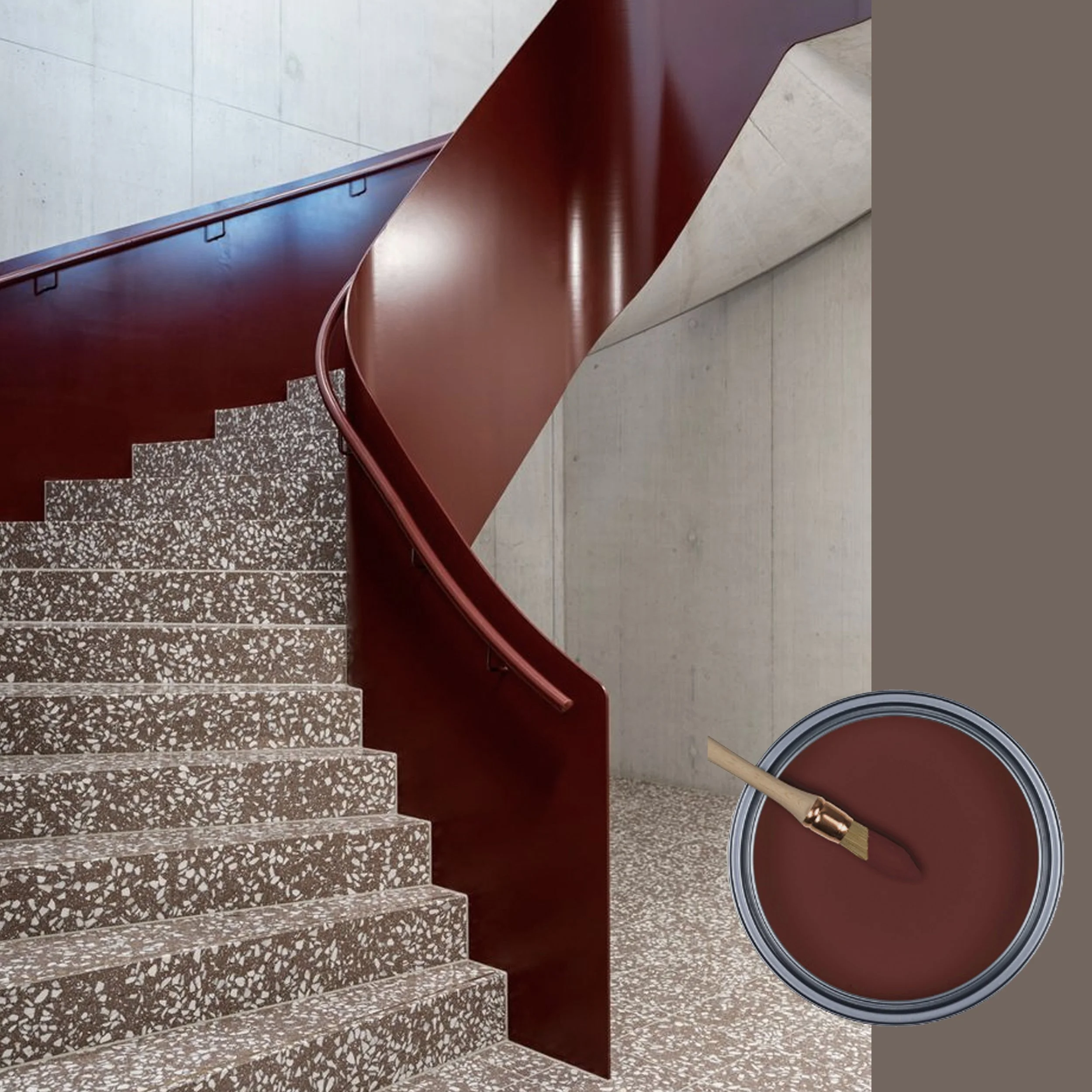
This metal balustrade painted in this rich Wine tone, when combined with grey terrazzo, creates a modern aesthetic. While grey can sometimes appear a bit too cold, this warm red hue makes it a classical combination that is both timeless and undeniably very contemporary. The pairing of the warm red tone with the cool grey color elevates this design to new heights.
picture via BauNetz
This Wine is a red tone, quite warm, going into a brown direction. The color red is associated with energy, vitality and passion. Brown is a grounding color that promotes stability This combination will make you feel comfortable at home, creating an inviting atmosphere. Whether applied in a matte finish or as a lime paint, this hue will bring back some exotic travel memories.
picture via IG
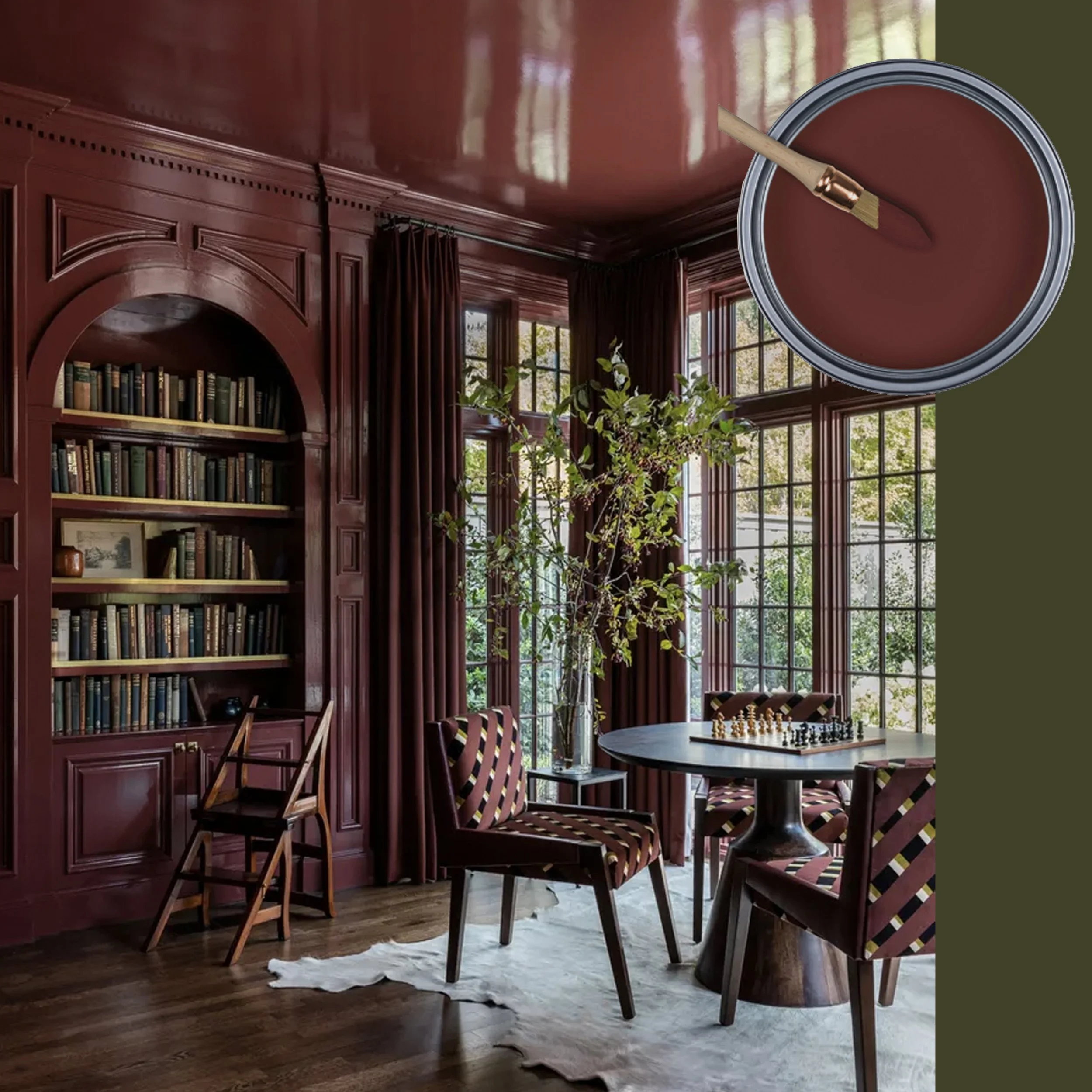
Try this Wine color with a luxurious lacquered finish, and you create an incredibly elegant and sophisticated room. Use a bold dark color for some classical bespoke furniture to create an outstanding interior. It genuinely adds something extra to the overall aesthetic. Additionally, using the same color on the ceiling will bring in the wow effect.
picture Homes & Garden
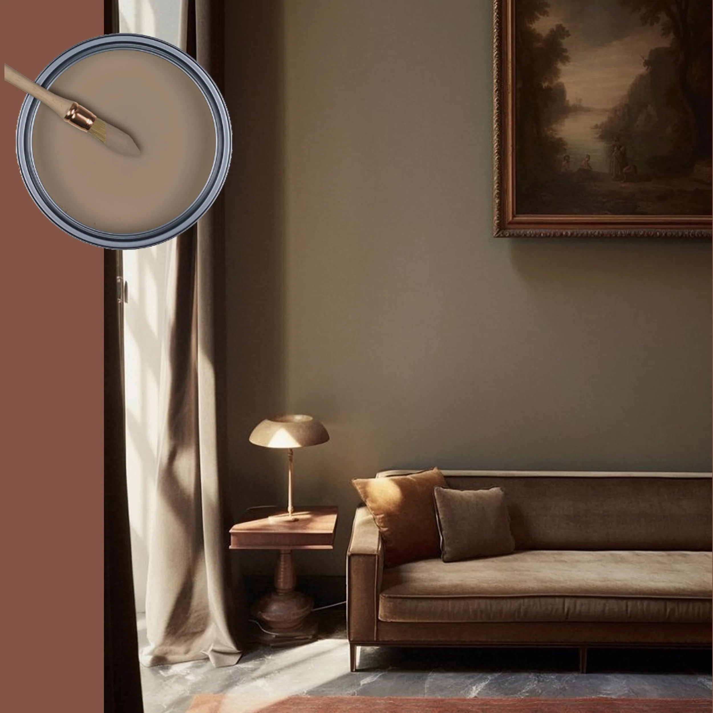
Mud doesn’t really need an explanation regarding where the inspiration came from. The roads are not paved in this rustic village. Each morning, the cows venture out to the meadow. So you can easily imagine how, after a heavy rain, the streets can look like. Exactly: Mud. All the colors of this section are derived from nature: the deep tones of dried wood, the earthy browns of mud, the natural beige and greys of sheep’s wool, among others.
Viscri
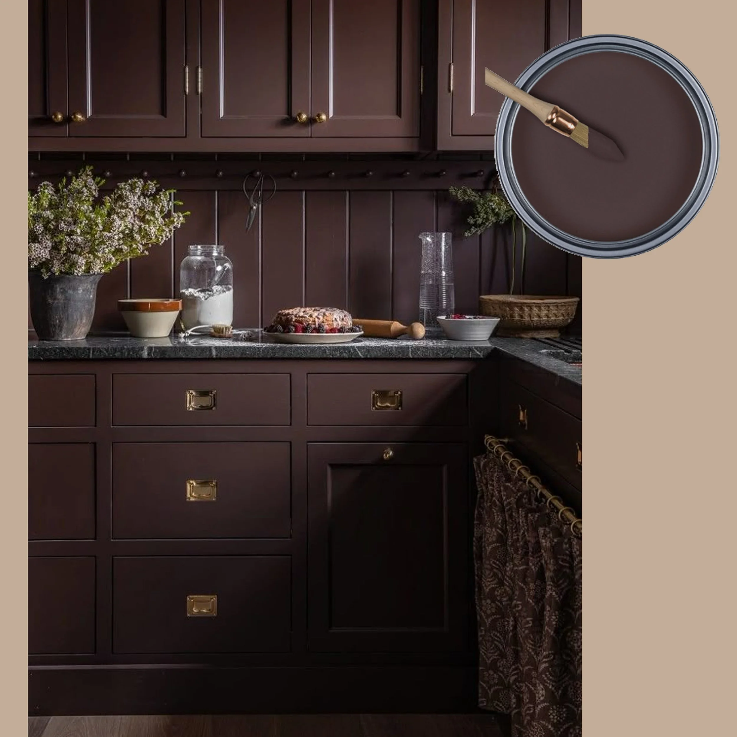
This undefined color, Mud, can be a perfect choice for the bedroom to create a moody ambiance. This dark tone will slow you down and prepare you for a good night sleep. It pairs exceptionally well with all darker colors of this collection, but is also a great fit too for the lighter shades we will explore in part four. This versatility makes it an ideal option for a variety of design preferences.
picture via Domino
This Mud color has a subtle red undertone, but quite different from Wine. It serves as an excellent choice to give your classical kitchen a contemporary flair. Dark kitchens are still trending, however this dark tone you can use without having the fear that it will get out of fashion.
picture via IG
You have a home bar, perhaps a stylish corner in your living room or even a dedicated a men’s cave within your home? Consider pairing Mud with elegant dark wood and luxurious velvet upholstery to create a sophisticated and inviting dark mood. Brass element will bring a touch of elegance and a light coloured marble will lighten up the room.
picture via 1stDibs
Nature will provide a wealth of inspiration for the colors we can use and combine harmoniously. With those soothing natural colors you can’t go wrong when aiming to create a homely interior. Those rich brown hues and soft beige tones ground you and evoke a sense of comfort. Elements we need to feel secure and at ease in these challenging times. These colors serve also the perfect base upon you can playfully mix and match stronger or pastel shades, depending on the mood you wish to create or the personality you want to express.
Unbleached Wool was inspired by a batch of raw wool I received from a friend. Later, during a visit back to the village I saw a shepherd with his flock of sheep making their way out to the meadows.
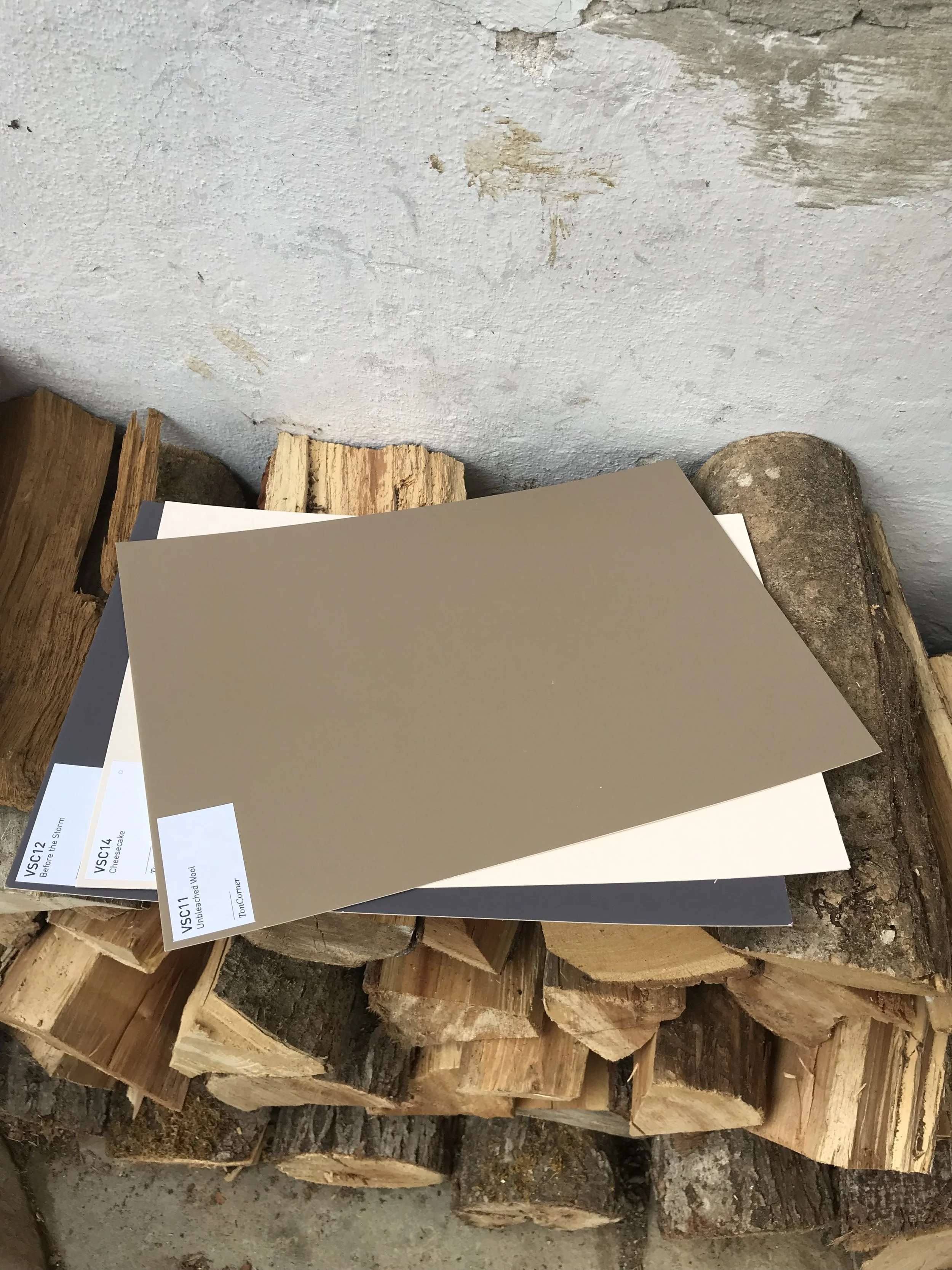
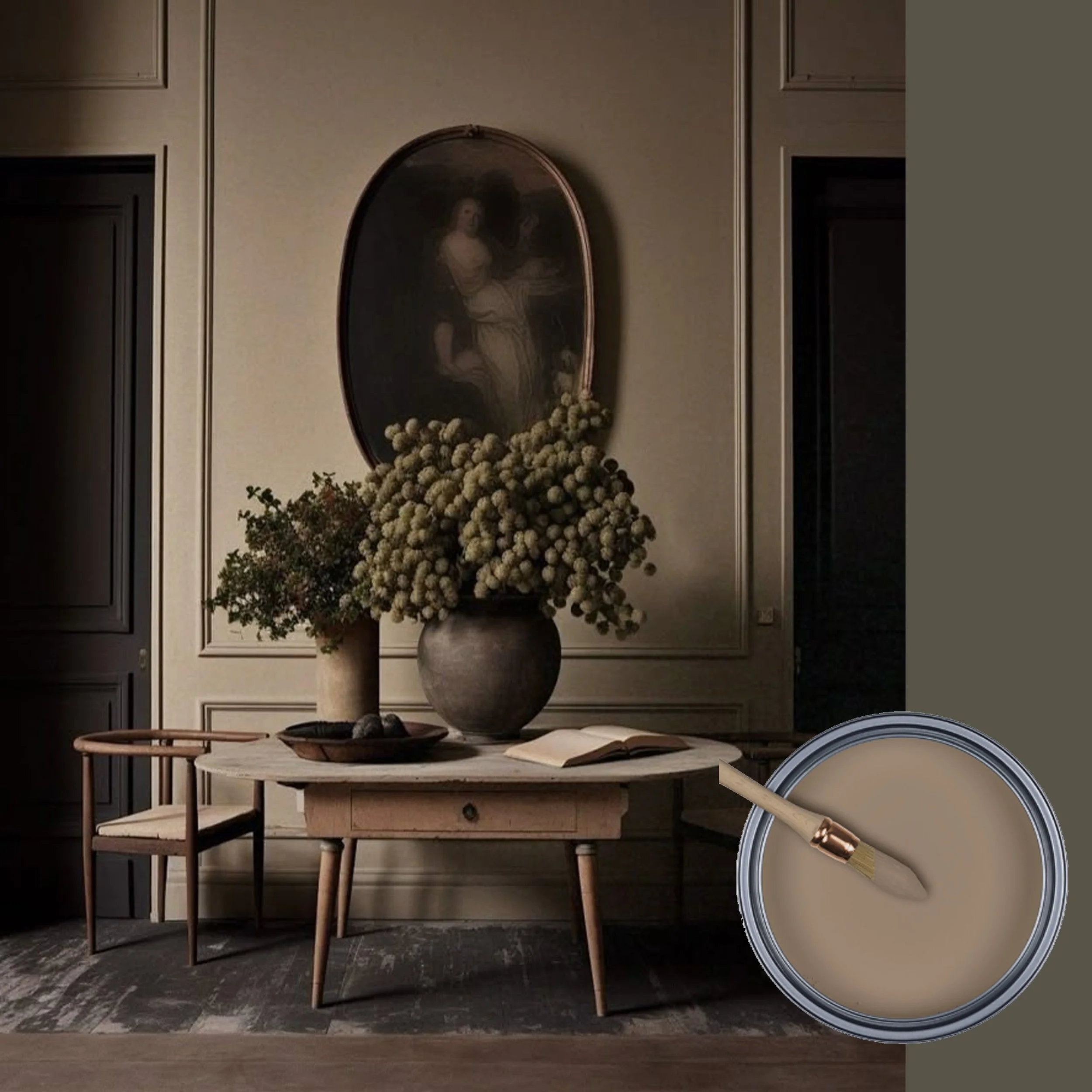
Unbleached Wool is a unique color to use in a variety of projects, as it embodies a natural warm tone with a greyish undertone that makes it is not to sweet. It will enhance any design.
Viscri collection TonCorner
Use this Unbleached Wool tone in a lime paint to create a look that appears weathered over time. This soft, neutral hue serves as an ideal background, allowing your furniture and decor to stand out beautifully against it.
A modern take on a classical still life. Now that there are so many beautiful spring flowers available on the market, this is the moment to create your flower bouquet, inspired by the Flemish baroque painters. Presenting this flower arrangement against a background in Unbleached Wool results in an astonishing look. Unbleached Wool paired with soft pastel colors is a wining combination.
picture via IG
You remember for sure the trend for this year, color drenching. Unbleached Wool is a perfect choice for this design trend, as it stays within the range of neutrals and will create a soothing effect in any space. When you combine it with a greyish oak wood, it will stay in same tonal family, however it adds more depth and richness to the final result, enhancing the overall aesthetic.
picture via Pinterest
Unbleached Wool paired with bronze and soft olive tones contributes to a very refined and sophisticated ambiance. When the warm sunlight gently enters the room, it creates a very relaxing atmosphere, bringing in the glow of a warm late summer day. Play with different materials such as a natural linen and a mohair velvet, in combination with natural wood elements, to enhance this feeling.
picture via Pinterest
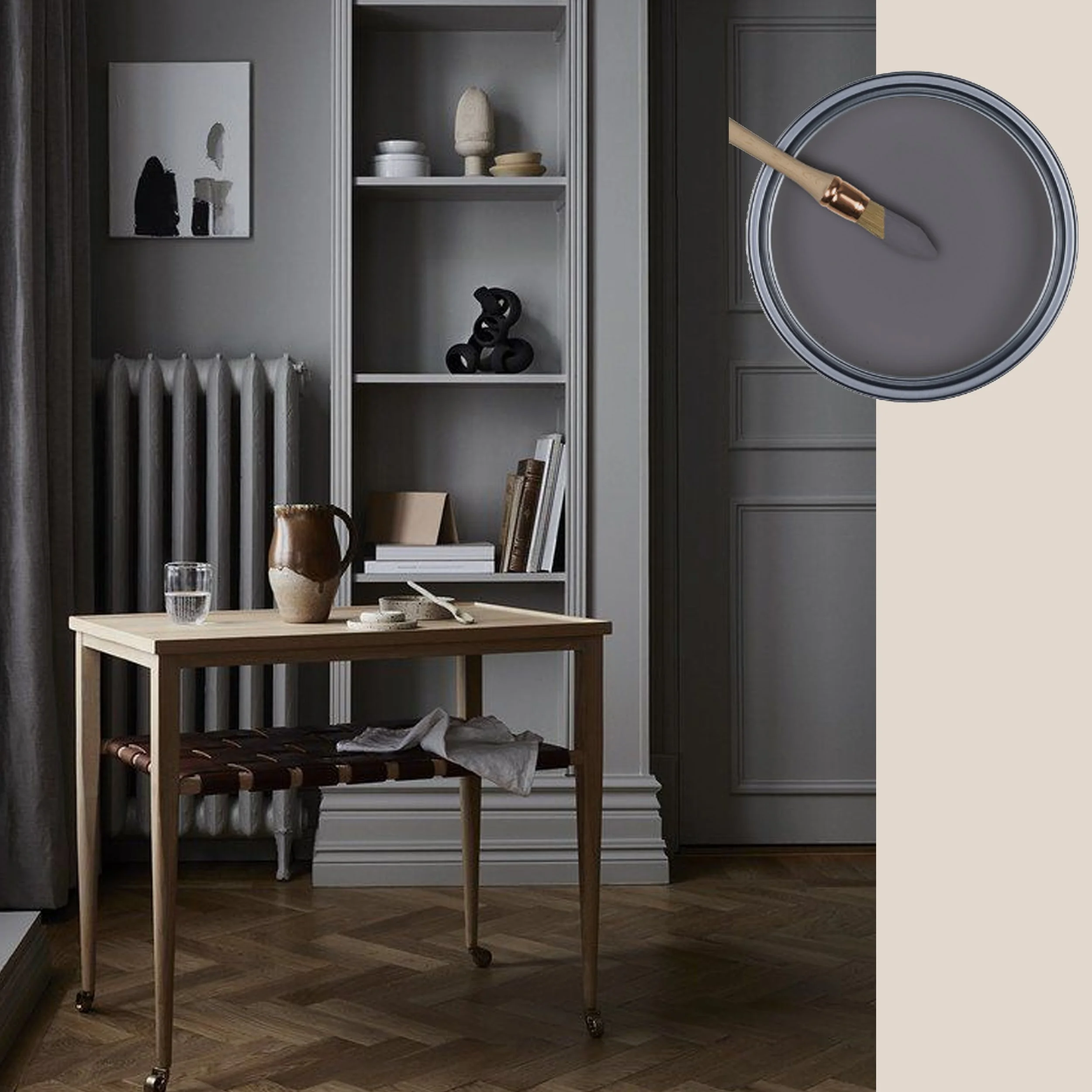
After the Storm is the last color of this darker range in the Viscri paint collection. It is a grey tone with a slight violet hint in the back. The houses in Viscri typically feature a big painted stripe in a deep dark grey at the bottom of the facade. It has a practical purpose: it helps to protect the coloured facade from appearing dirty or stained after the first rain. Interesting, this grey will appear even darker once the rain has passed. The lime paint used for the facades becomes darker when wet. This is the inspiration behind the name After the Storm.
picture via Houzz
After the Storm is a great color option for a powder room. A powder room can be darker or more colorful, seen it is a room where you won’t spend a lot of time. As marble and porcelain tiles with marble look are all present these days in contemporary and classical bathroom designs, this color enhances their aesthetics, making them stand out even more. This hue compliments the elegance of these materials.
picture via Nordic Design
Grey tones have been omnipresent in recent years in the Scandinavian interior design. This moody look, which originates from the northern countries, incorporates natural materials alongside darker wood elements. You don’t need more to create this look.
picture via Hunker
Grey is generally not regarded as the ideal color for a study room, as it is not a hue that will give you energy or inspire creativity However, when I see this picture, it gives me a serene feeling suggesting that I could work when feeling stressed as it will slow me down. It is crucial to ensure there is enough light falling in the room. If you like a foggy atmosphere, than After the Storm can indeed be perfect for your space.
Let me know how those neutral colors make you feel? I can’t choose, I like them all.
Wish you a colorful week.
Take a look for the complete collection
Don’t miss any of my blog posts! Follow me on my FB page, Instagram or Bloglovin' or even better subscribe to my newsletter and get tips for travel, exhibitions, recipes and things I discovered during the week.
