Part four of the Viscri paint collection features a selection of pale pastels, inspired by the faded facades in this rustic village. These colors add a delicate touch in your home. Alongside those pastels, there are two perfect off-whites to seamlessly fit into each interior.
In this blog post, we bring the Viscri paint collection full circle: we began with the cold colors in part one, moved on to the warm colors in part two, and explored the deep dark neutrals in part three. Now, we conclude with the soft pastels that offer a gentle contrast to the previous palettes.

Viscri collection TonCorner
Lilac will fit every little girl’s room, but not only. Cheesecake comes with a nice story that you will discover later in this post. Pistachio and Baby Blue are colors inspired by the faded facades in the village of Viscri.
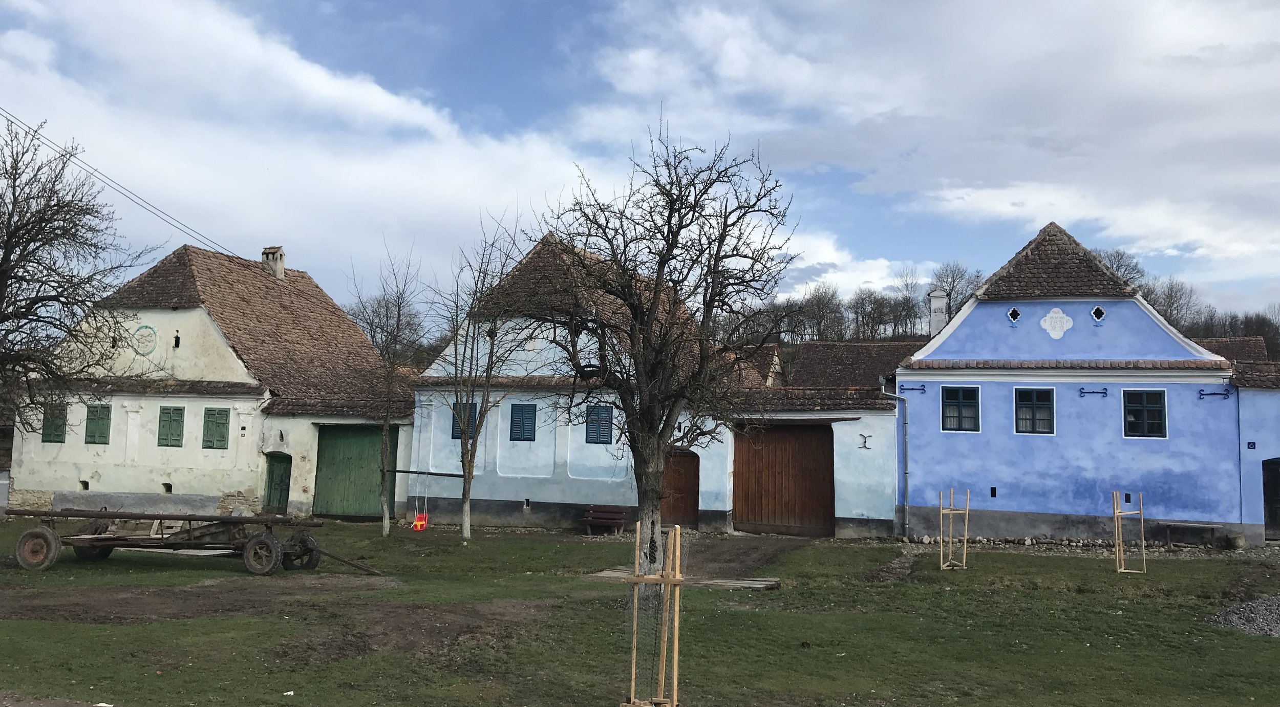
Viscri
The pictures I used for this blog post are meant to be illustrative examples; they are not in the exact Viscri paint color, and may not represent the precise tone either. They are intended solely as a source of inspiration for you to incorporate them in your home projects. So, let’s get inspired to use some pastel tones even in your living room or kitchen.

I’ve often been in Viscri in spring, depending on which month, or even week, there will be a variety of flowers in full bloom. Lilac is one of my favorite flowers, as it also brings back some childhood memories. We had one lilac tree in the middle of our garden and we would get around it with our bicycle. It is a delicate flower and comes in different shades of white and lilac. Lilac is a subtle color, romantic however you can use it in a modern way and for all ages.

entrance door via Pinterest - wallpaper Versailles Grand Folie Cole & Son
It will undoubtedly be every little princess’ dream, at a certain moment, to have a lilac decorated bedroom. However it is a very friendly color for you to consider using in your own bedroom, but not only there. Imagine the entrance door in such a soft and pale color. You could add a colorful wallpaper in the entrance hall to create a contrast and turn this romantic hue into a very modern tone.

kitchen via Pinterest - copper pot The Cook’s Atelier
Lilac may not traditionally be considered a first choice for a kitchen, however, it will be a bold choice, and I can guarantee you that the end result will look astonishing. To create a more classical inspired kitchen, with a charming countryside touch, consider pairing the Lilac with some copper pots. Some crisp white tiles can enhance the overall aesthetic, resulting in a modern interior.

bedroom via Karwei - silk kimono and plaid Fabric Copenhagen
If you are looking for a feminine, romantic and very relaxing bedroom, then Lilac will be the perfect choice. Do your morning meditation here and you will feel zen through the entire day. This soft and soothing color will pair exceptionally well with a beautiful silk velvet, choose a greyish tone and the lilac will transform the overall ambiance into something very relaxing.

As I mentioned earlier: Cheesecake comes with a story. A few years ago, just before leaving our guesthouse Viscri 125, after a weekend workshop, Viorica, who take such a wonderful care of all the guests, surprised is with this special Transylvanian cake. It wasn't really a cheesecake in the traditional sense, it was even better. As we were almost on our way out, she asked if she could serve it to us just it as it was, right on the parchment paper. It was such a beautiful and natural gesture that left a lasting impression. Still hoping every time I go there that it will be on the menu.

The color Cheesecake is hard to describe: it is not a soft pink, neither a muted soft yellow, but rather a neutral tone with a pinkish undertone. A room painted in this tone will exhibit a very interesting atmosphere, you will be surprised to see the subtle nuances of this color emerging in different lights. Combine in the bathroom with some antique brass faucets and your bathroom will look elegant and you create a serene and relaxing environment.
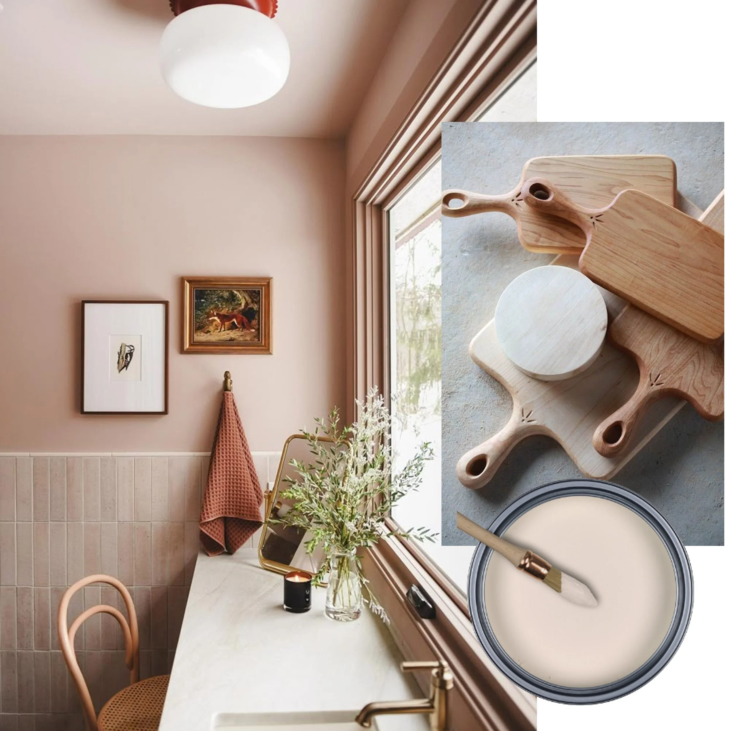
interior via Yellow Brick Home - wooden cutting boards
In the kitchen you can combine Cheesecake with the warmth of natural wood and some hand-painted tiles to create an inviting atmosphere that can transport you even to more a Mediterranean feeling. The use of natural materials will pair extremely well with this hue, creating a sophisticated and cozy interior.
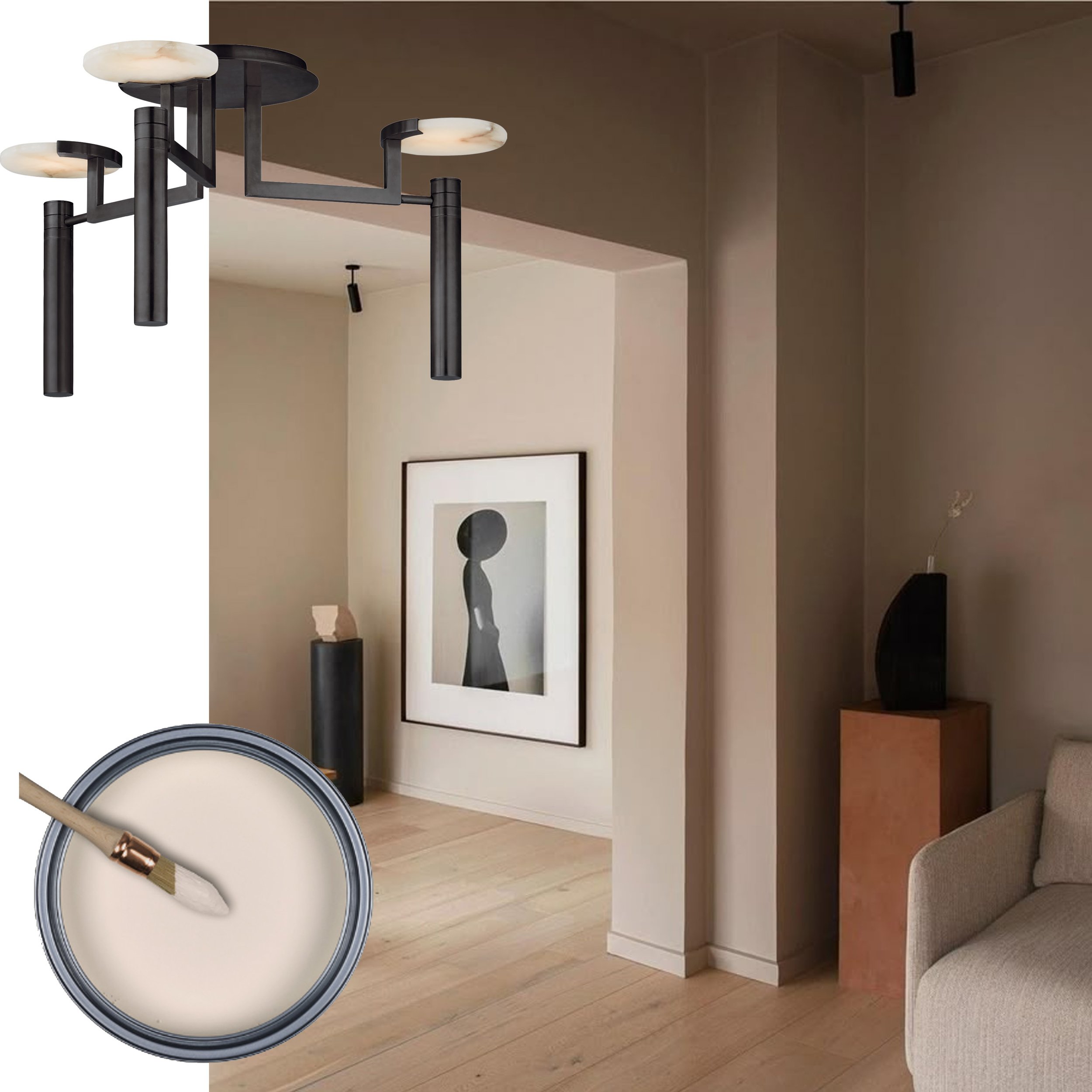
interior Etui - hanging lamp
In a minimalist interior, Cheesecake paired with black elements will look very modern and chic. It can be a simple spot, a black frame or a more important ceiling light. This warm and interesting neutral will add the right amount of warmth to your interior, specially since minimalist interiors often tend to feel a bit too cold, and maybe even too impersonal.
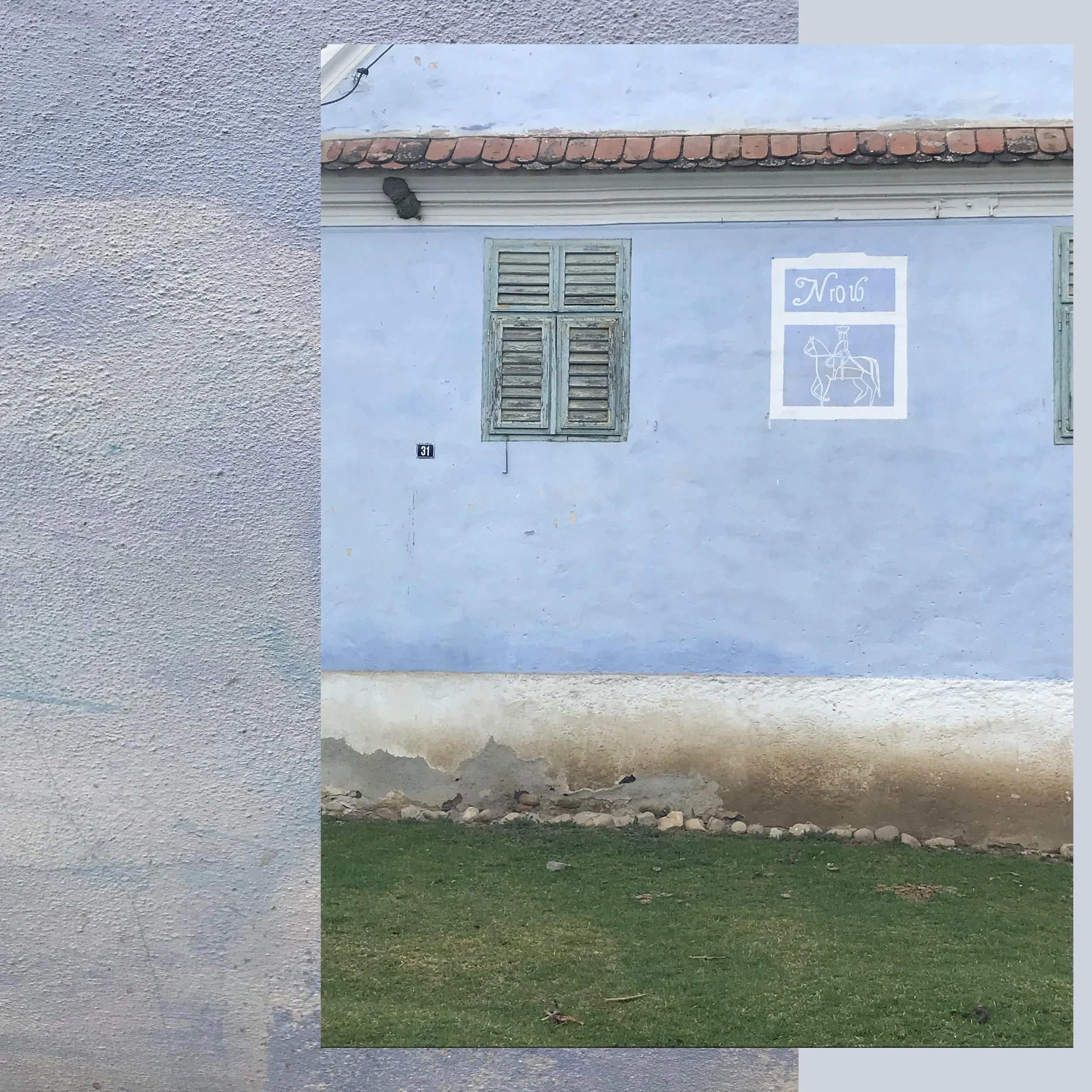
The lime paint they use for the houses is gradually fading over time. It is a more natural material in which they mix the coloured pigments. Even after a rain shower, the colors will look different, more vibrant and intense. Over the years, the pigments will inevitably diminish. When you walk around the village, you clearly see a difference between the houses that have been painted with lime paint and those coated with a regular paint. The lime paint for sure has much more charm.

Pistachio offers the freshness of green, complemented by a subtle hint of yellow. This very pale tone will illuminate any space. It is specially well-suited for those who are looking to bring color into their homes without being to present. Picture your bedroom, bathroom, or dressing area, wherever you imagine it, this color will fit beautifully. Green is a very relaxing and calming color and the touch yellow, that is in it, will also bring you in a sunny mood.

You have an attic that is just waiting to be decorated, ready to transform it? This space in the house has in general multiple functions: playroom for children, relaxing room for quiet moments, guest room, and much more. The color Pistachio will lighten up this area, specially as attics often have little natural light coming in. Paint the floor white and you can really breath in the room.

living room via Learn California
Pair Pistachio, as a color for the living room, with a variety of natural materials such as a textured rug crafted in jute, soft linen fabrics, and warm natural wood flooring. Decorate with a lot of plants to enhance the space further. You will feel filled with energy when you spend time in this room.

nursery via Inspired Home - wardrobe via Decor Hint
Baby Blue, indeed, will be a fantastic color choice for the nursery. This soft hue is almost a neutral, appearing quite light with a subtle greyish tint and a blue undertone. It will even suit a little girl’s room. Incorporate plenty of white throughout the room to create a clean and crisp appearance. You can bring in warmth by adding an antique wooden wardrobe, it will create a beautiful contrast and charm to the room.

Your bathroom is in a pure palette of white and light Carrara marble. Introducing a touch of Baby Blue will subtly add a gentle tint on color, making this bathroom more elegant and interesting. An antique crystal chandelier will make you feel as living in a grand castle and you are the princess.

home office via Rose Pixel
Over the summer months is the perfect time to re-decorate or refresh your home office. The soothing shade of Baby Blue will create a very calming atmosphere so you can stay focused and productive while working. You can bring in a creative touch by painting your desk in a stronger tone. Even the color Viscri Blue can be a wonderful option to consider for adding personality to the space.

Two off-white tones that will perfectly complement and fit in any interior style. You may dream of having white walls, but white can often feel too cold, and quite frankly, a bit monotonous. Parchment paper is an off-white with a greyish undertone. This is an ideal choice if you appreciate cooler colors or depending on the light that will enter the room throughout the day. For this reason, it is always important to conduct a test before purchasing the quantity you need to finish the room. Each color can appear completely different based on the room’s orientation and even the time of the day.
Elderberry Flower is a tone I use in nearly all of my projects when we are in search for a very comfortable off-white hue. It is a cheerful off-white seen it has some yellow pigments in the mixture. You truly can’t go wrong with this color.

Parchment Paper will provide you a crisp finish, creating a refreshing tone that is ideal for the hot summer months. Its elegant appearance makes it not only functional but also a perfect and contemporary background for various projects.

Elderberry Flower will transform every open space into a warm, cozy and inviting room. Even on the greyest of days, its warm and calming presence will give you the feeling as the sun is shining inside. This versatile tone complements all design styles effortlessly. It serves as a perfect background to pair harmoniously with the natural woods of your choice, as well as all the other colors that you will incorporate in your design project. You simply can’t go wrong with this color.
Take a look for the complete collection
Let me know if you have a favorite color that you enjoy more than others.
Don’t miss any of my blog posts! Follow me on my FB page, Instagram or Bloglovin' or even better subscribe to my newsletter and get tips for travel, exhibitions, recipes and things I discovered during the week.