Did you ever enter a room and feel your mood change in an instant? Color can strongly influence your mood, emotions and the way you perceive the space. Warm tones will give you an energy boost and create a sense of warmth, while cool colors are perfect when you want a room that helps you unwind. Light neutrals shape the overall sense of space and light, making the room feel more open and airy.
The images shown below are renders from various projects I work on in collaboration with La Maison.
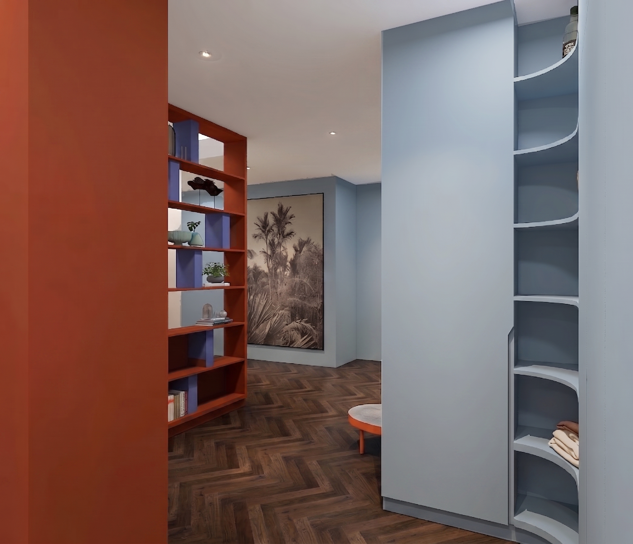
This first example is a render of a hallway leading towards an entertainment room. The library on the left blocks the view of the staircase in the back. The color palette here includes a muted greyish-blu and a red tone. The warm hue paired with a cool one to balance the energy the red might bring. The entertainment room will have some social interaction, but the primary purpose is relaxation. The blue tone sets the mind at ease, reduces the tension after a long day at work.
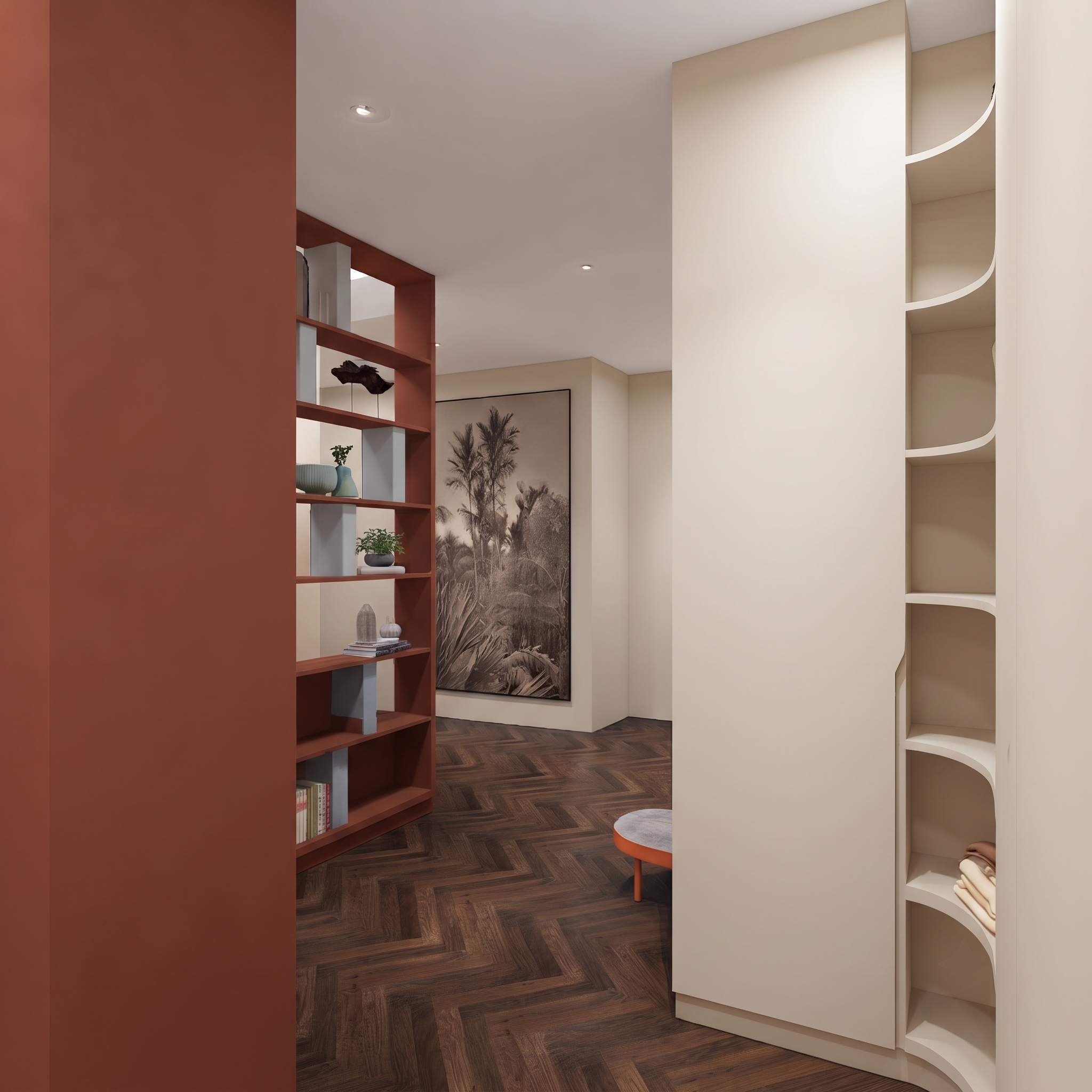
When we replace now the blue with a warm neutral and we lighten up the red by using a dark terracotta we feel a more grounded environment. Especially with the wallpaper in the back, it creates for me a feeling of an elegant Mediterranean holiday, relaxed and slightly nostalgic. The colors as they are used here could almost be seen as warm neutrals, warm and grounding tones that provide a sense of safety and calm. There are no colors that stand out to much, yet still having enough character to keep the combination interesting rather than flat or boring.
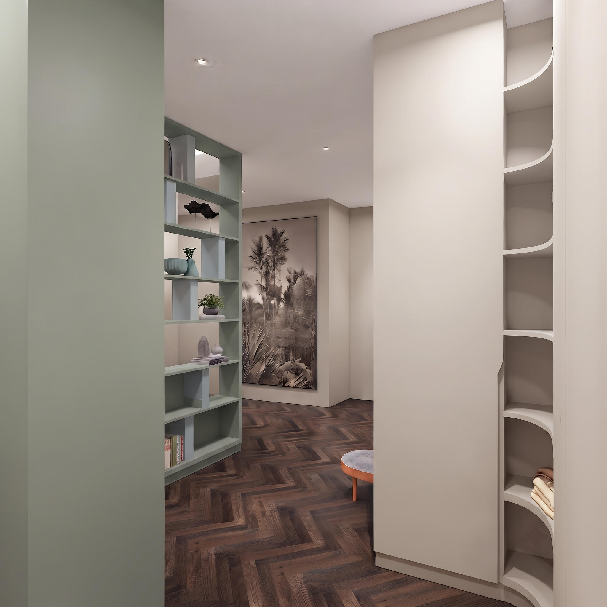
Let’s get a cooler breeze come trough now. The warm off-white is replaced here with an off-white that has a cooler undertone, brining in a more crisp feeling. Paired with a muted green tone, you immediately sense the room starts to feel cooler. Color can also influence how we perceive the temperature of the room. The soft almond green make the space feel airy and fresh. We bring a touch of the outdoors inside, creating an organic, natural impression that fits well the curved lines of the furniture and enhances to rooms flow.
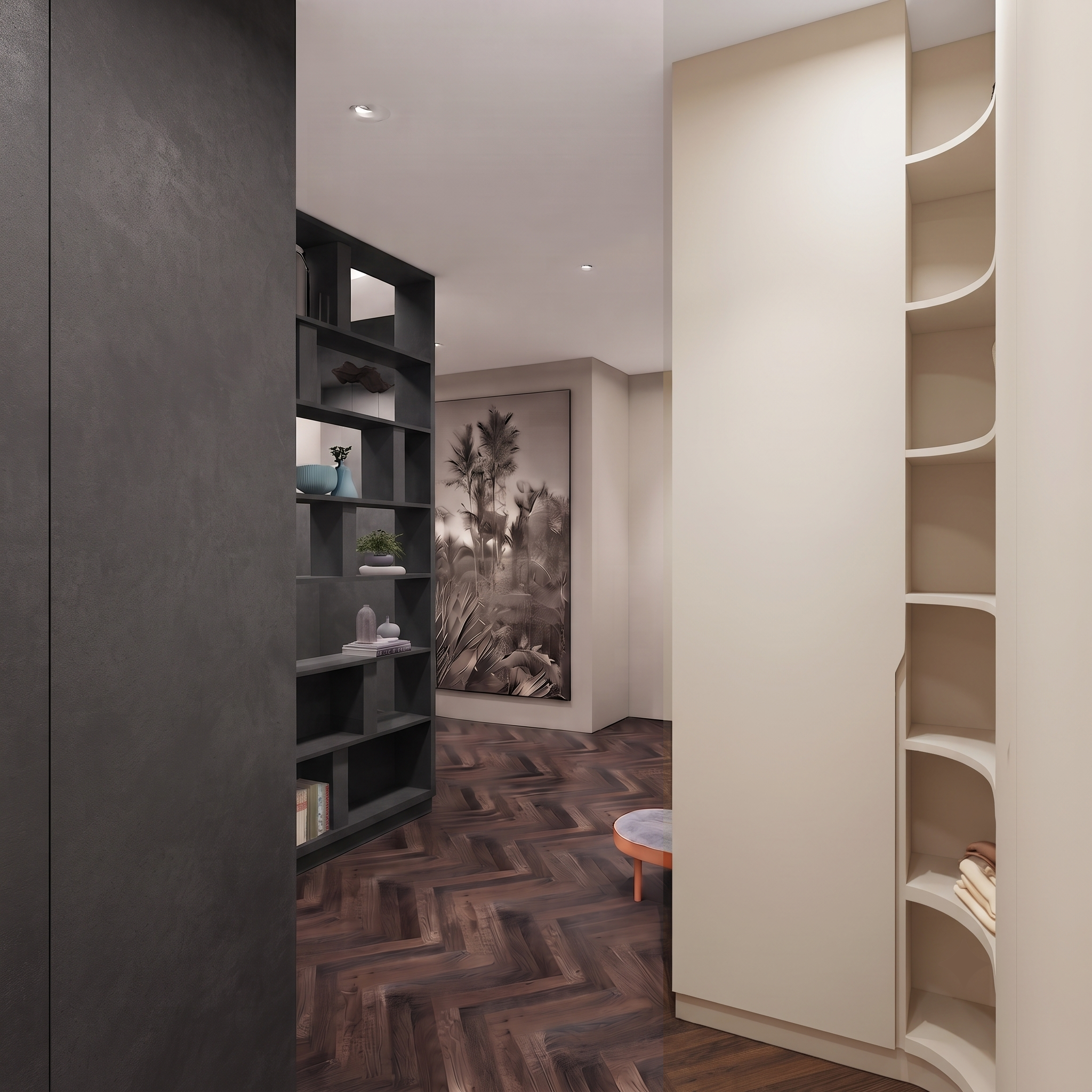
And finally, when we remove the colors and opt for a very light neutral paired with a warm anthracite grey, the mood shifts and I feel we need here a warmer light to make it feel cosier . Grey is a color that feels sophisticated and suits perfectly a modern interior design style. It has a calming effect, however, it can also drain your energy. The light fixtures you choose will also influence the color, so it always very important to make a paint test in the actual room as a shade can change completely depending on the natural light falling in, and the same color will look different again under the artificial evening light.
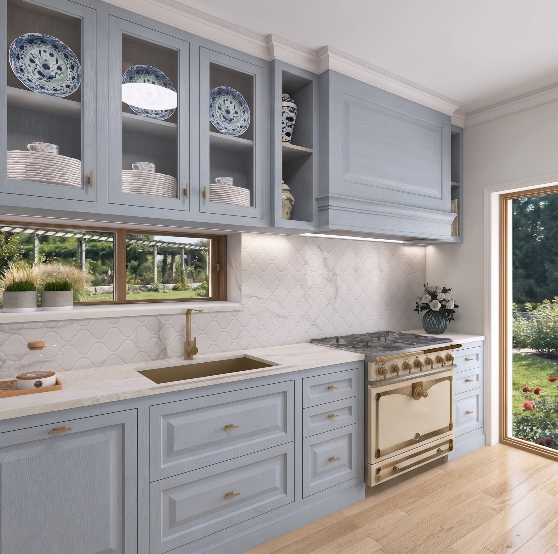
One of my recent blog post focused on finding the perfect color for the kitchen. The conclusion was that there is no single perfect color, but there is definitely a perfect color for your own kitchen. It all depends your preferences, and factors as the room’s location or the overall style can also influence your choices. For this project I transformed a render of the kitchen project, originally shown in a cool blue tone into warmer hues and finally into a white kitchen with a slightly glossy finish. The muted blue felt somewhat cold, so I explores different options to find the most fitting color for this kitchen. Generally, blue isn’t considered an ideal kitchen color, because it can suppress the appetite and may not encourage you to cook. Yet blue works beautifully for a seaside home where it brings a fresh breeze to cool the atmosphere when temperatures climb.
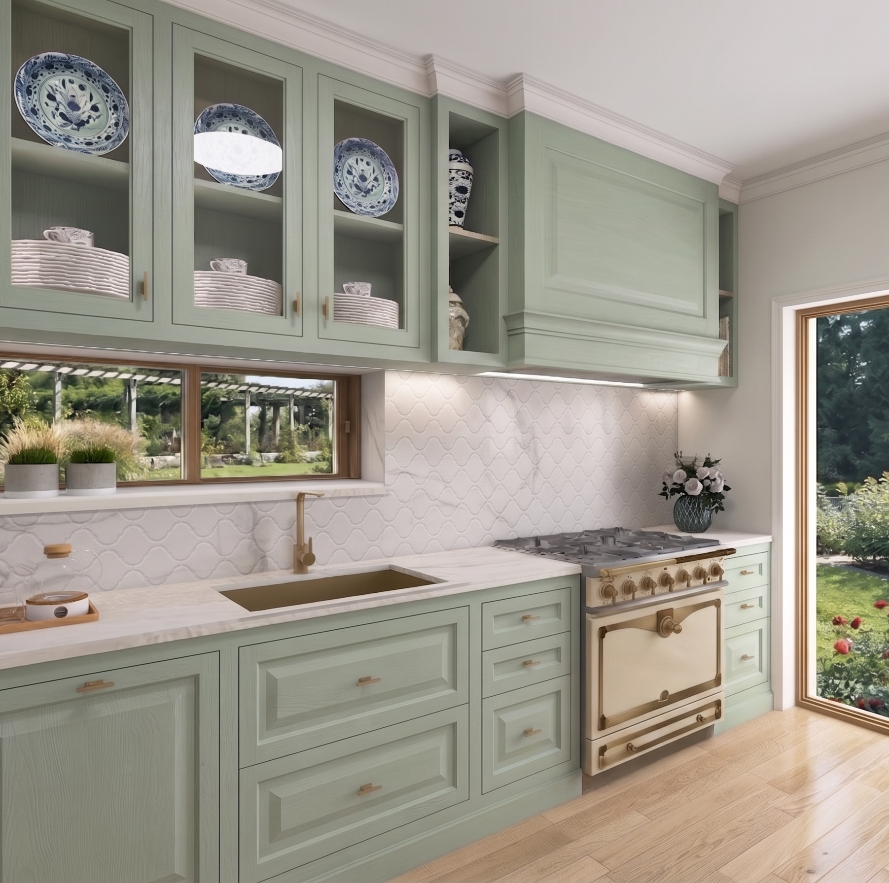
Seen that the large window opens the view towards the garden, the soft sage green tone of the kitchen gently brings the outside in. It creates a fresh look that encourages a relaxed mood while preparing meals. Although green sits among the cool tones on the color wheel like blue, so what makes the difference with the blue? Green is as relaxing as blue, it differs by carrying hints of yellow, a tone that adds a subtle boost of energy. Green is highly versatile to use in interior. and the organic character can also inspire to prepare healthy meals.
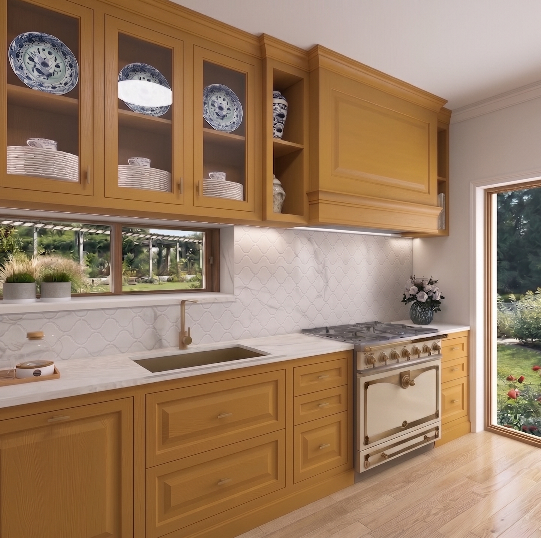
Yellow tones stand for happiness, it is a feeling we want to welcome each day. Yellow can be challenging to use in interiors, but it doesn’t have to be the bright lemon shade neither. What about an ochre tone? It evokes spices and mustard, and carries the comforting warmth those flavors bring to food. The yellow tone will sheer up the room, even on a greyish rainy day.
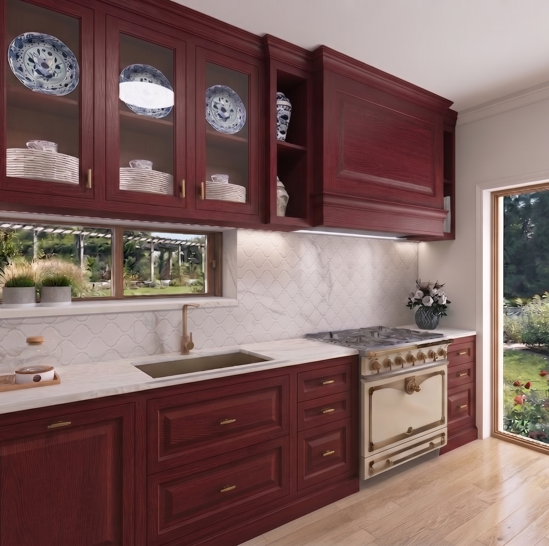
Quite trendy at the moment are the burgundy-coloured kitchens. They are a rather classical choice, with a touch of English countryside inspiration that feels refined. In this example I would change the countertop and backsplash, as the light color of the marble and tiles creates to strong a contrast with the color of the cabinetry. Imagine instead a wooden countertop paired with cream coloured tiles for a more harmonious look. If you prefer a stone top, a light Emperador marble could be a good alternative.
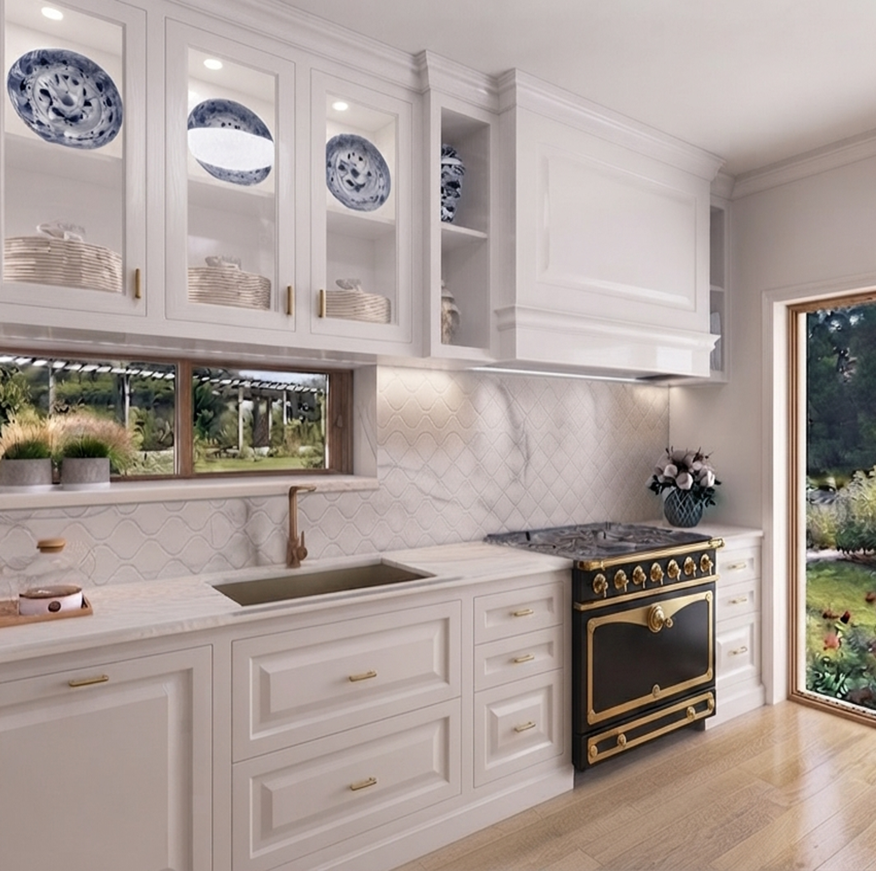
A white kitchen is timeless and perfectly pairs with a black La Cornue. However, here it feels slightly out of space for me, as a missed opportunity to better harmonise with the surroundings. This stark white-and-black combination seems more fitting in an urban setting. Still, tastes vary and we all have our own preferences.
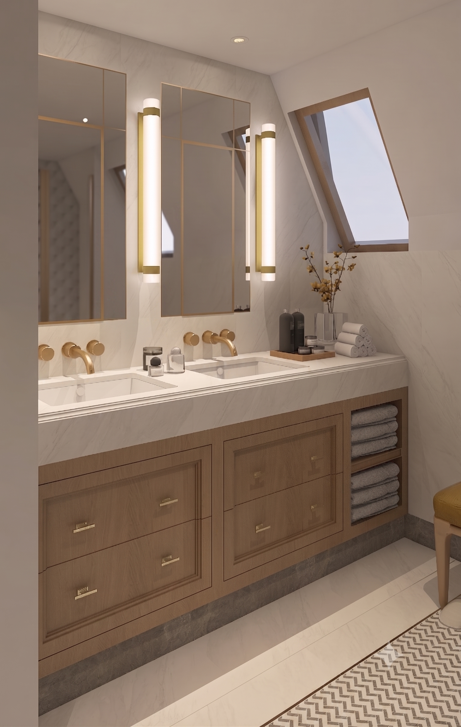
A very tiny bathroom in the attic where the warm wood tone, in combination with light-coloured marble for the countertop and a soft warm grey for the skirting, creates a contemporary, refined look. The wood finish helps this small space feel elegant and cozy.
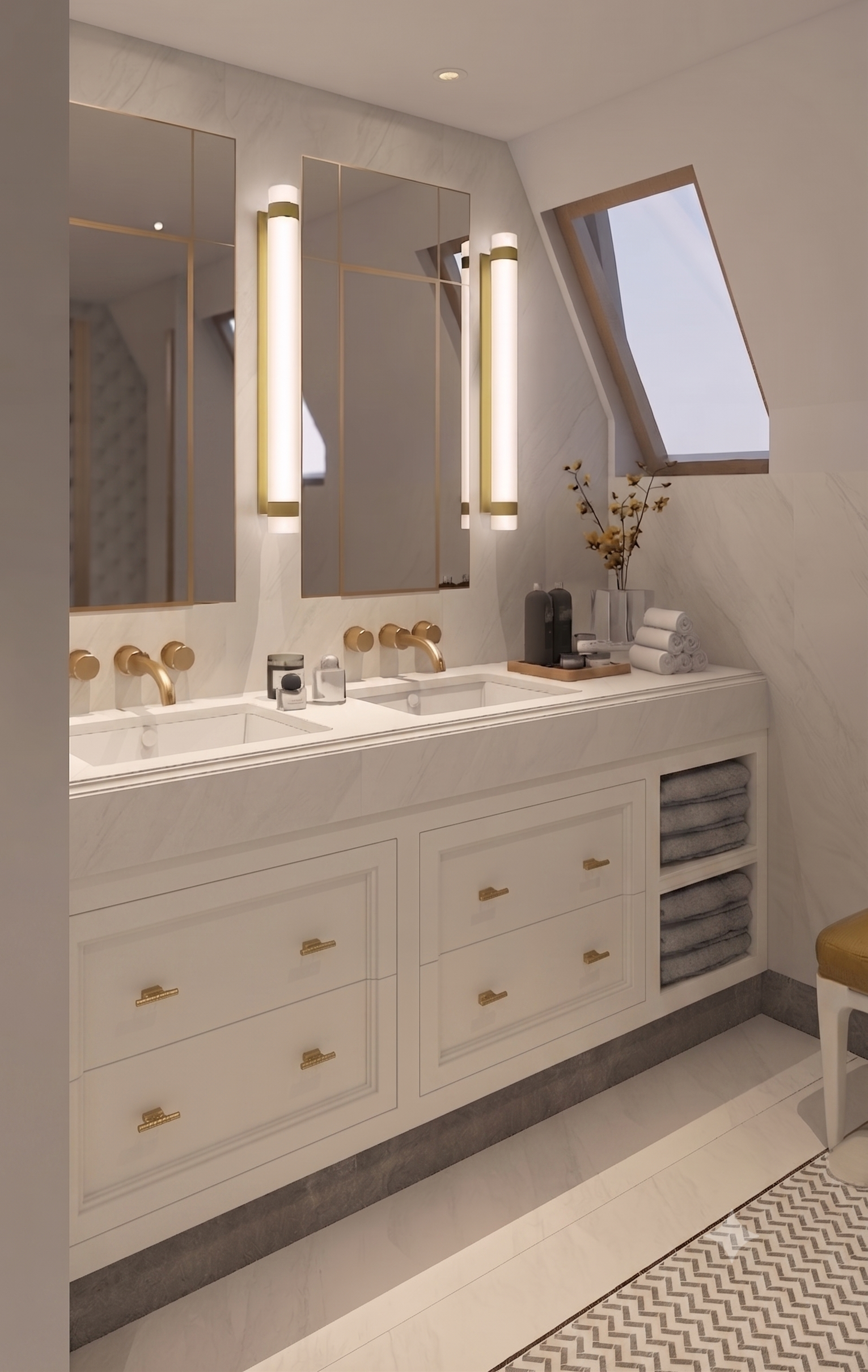
When we replace the wood finish with a white lacquered finish, we immediately notice that the room feels larger, which, in the case of a very tiny bathroom like this, can be very welcome. The first version looks more modern, while the white introduces a more classical touch to this space.
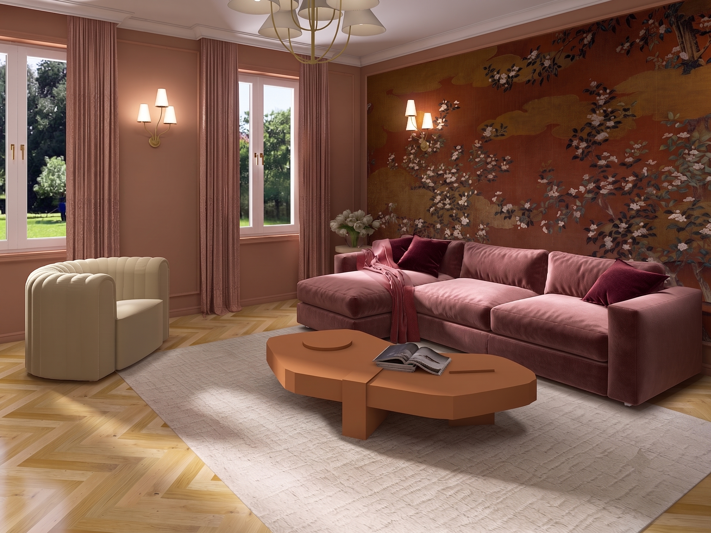
A moody coloured living room in an apartment of a young lady, where the velvet sofa melt in very nicely with the wallpaper, creating a luxurious background. The armchair in a soft cream colored boucle brings in a touch of contrast against the deeper tones. A modern coffee table in a burned orange hue ensures the mix of light and darker terracotta shades never become dull. These colors together evoke a sense of passion and intimacy while remaining balanced. The overall atmosphere feels welcoming and radiates warmth an ideal setting for a relaxed evening with friends.
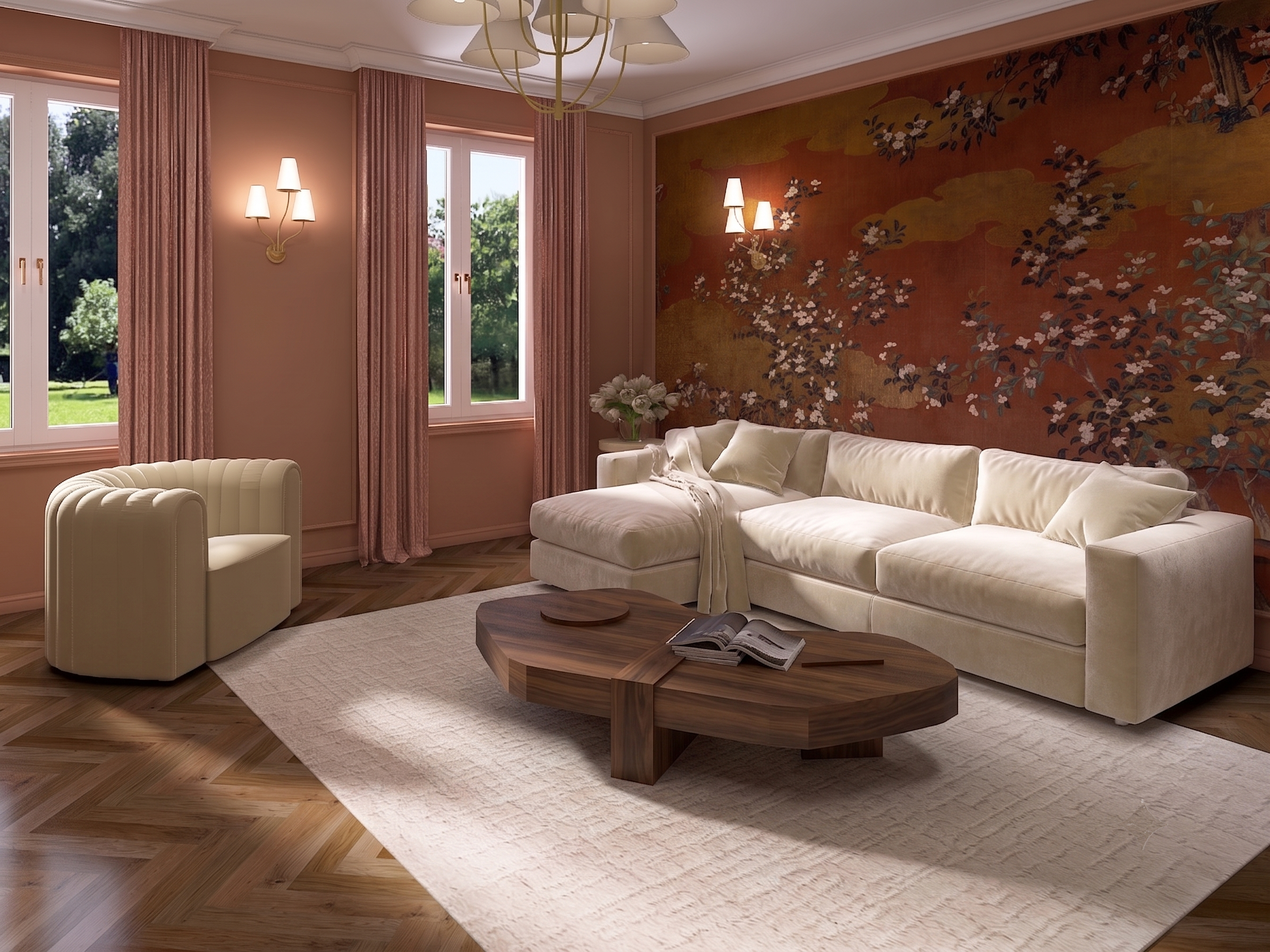
When we change the color of the sofa from a dark blush tone into an off-white velvet, we feel we loose some of what made the room so intimate. The coffee table in this configuration feels to classical, even though its shape is very modern. I would certainly choose the first option and not be tempted to leave my home often. This is a subtle play of tones that you can as well achieve with cooler shades, a gentle variation on color drenching that avoids becoming overwhelming..
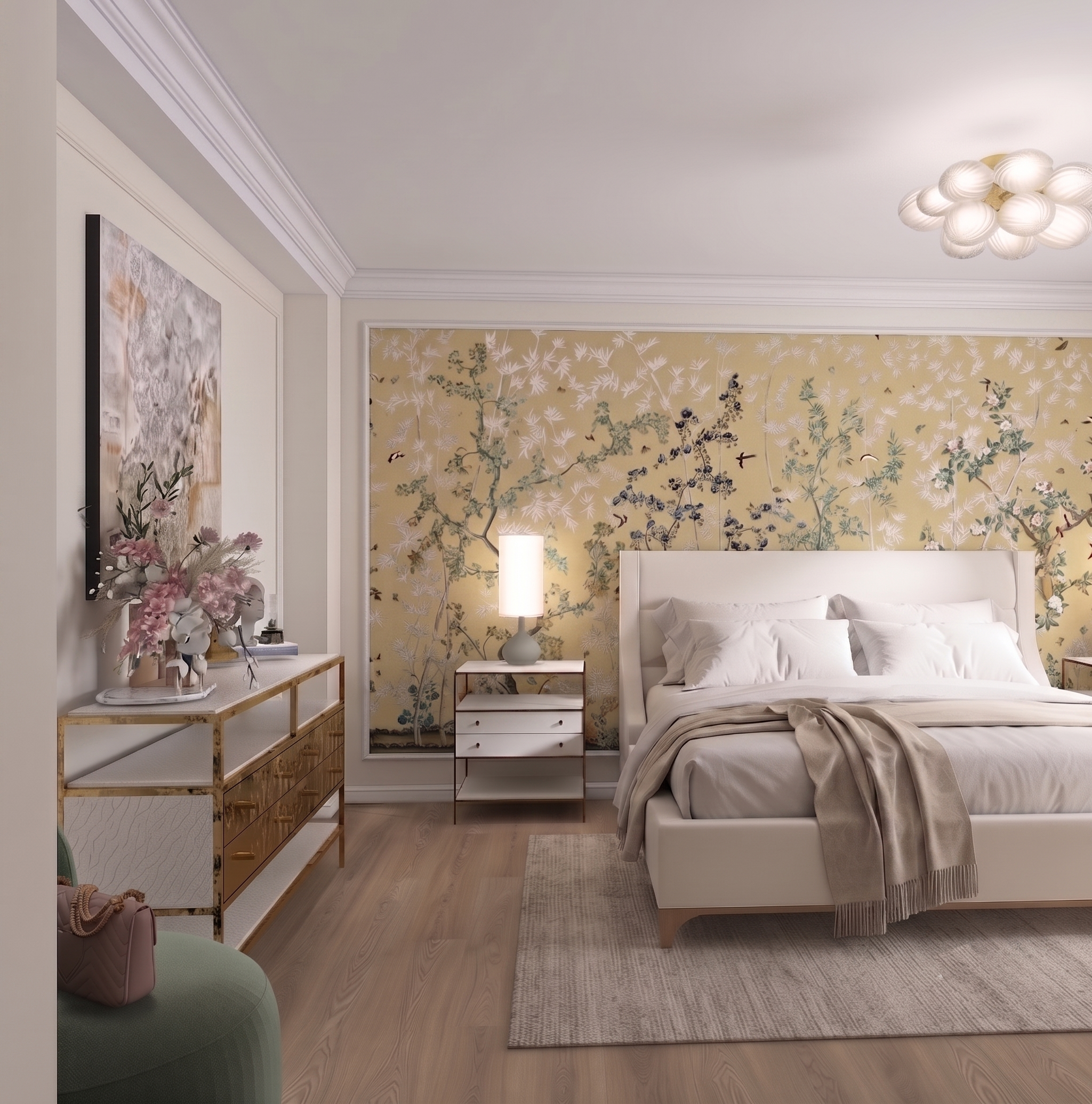
To finish, let’s still look on a few options for working around or with a more prominent wallpaper. The bedroom is painted in very soft off-white tones with a warm undertone. Yellow reflects light and it has the ability to create an uplifting mood. Who doesn’t want to wake up and start the day feeling bright and joyful? The gold touches on the furniture introduces an elegant and contemporary accent. The wallpaper makes a statement and will naturally attract your eye when entering the room.
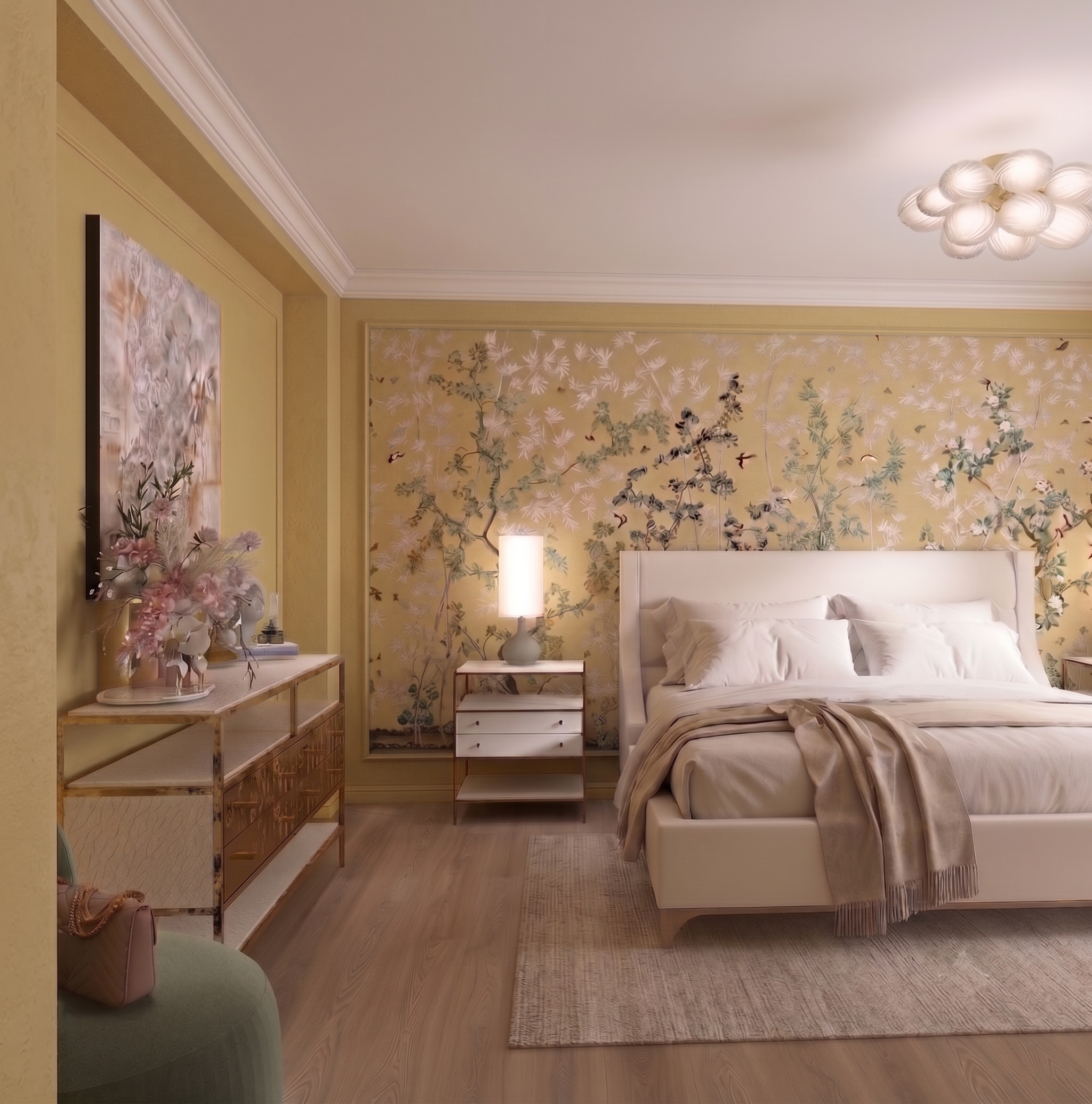
If we now continue to paint the room in the same tone as the background of the wallpaper, we notice that the rooms feels smaller compared with the lighter tone in the first render. It also feels more intimate, as if it would embrace you when entering the room. The wallpaper is more integrated in the rest of the room, and it is not longer the main character in the story. We can keep the bed and furniture in the off-white tone to keep a fresh contrast.
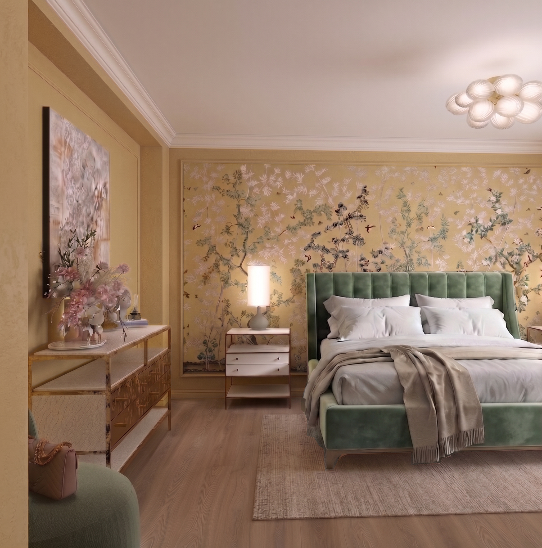
And what if we were to change the bed to a eucalyptus green tone that echoes the leaves on the wallpaper? If you enjoy color, experimenting with the different tones and shades found back in the wallpaper is an excellent way to begin. In this case you achieve an elegant bohemian touch, a room with more personality as you combine additional colors.
It can be useful to understand the essence of color psychology, how colors can affect one mood. It can help you when knowing more about the benefits of colors to make a choice. Red would not be a good option for the bedroom as it would give you to much energy, a room where you want to do your workout can benefit of an orange tone that gives you energy, here blue would slow you down.
I hope this blog post helped you to understand a bit more of the effect of colors and how that can change the perception of a room.
Don’t hesitate to give me a sign in case you feel blocked when choosing some colors for your project.
on’t miss any of my blog posts! Follow me on my FB page, Instagram or Bloglovin' or even better subscribe to my newsletter and get tips for travel, exhibitions, recipes and things I discovered during the week.