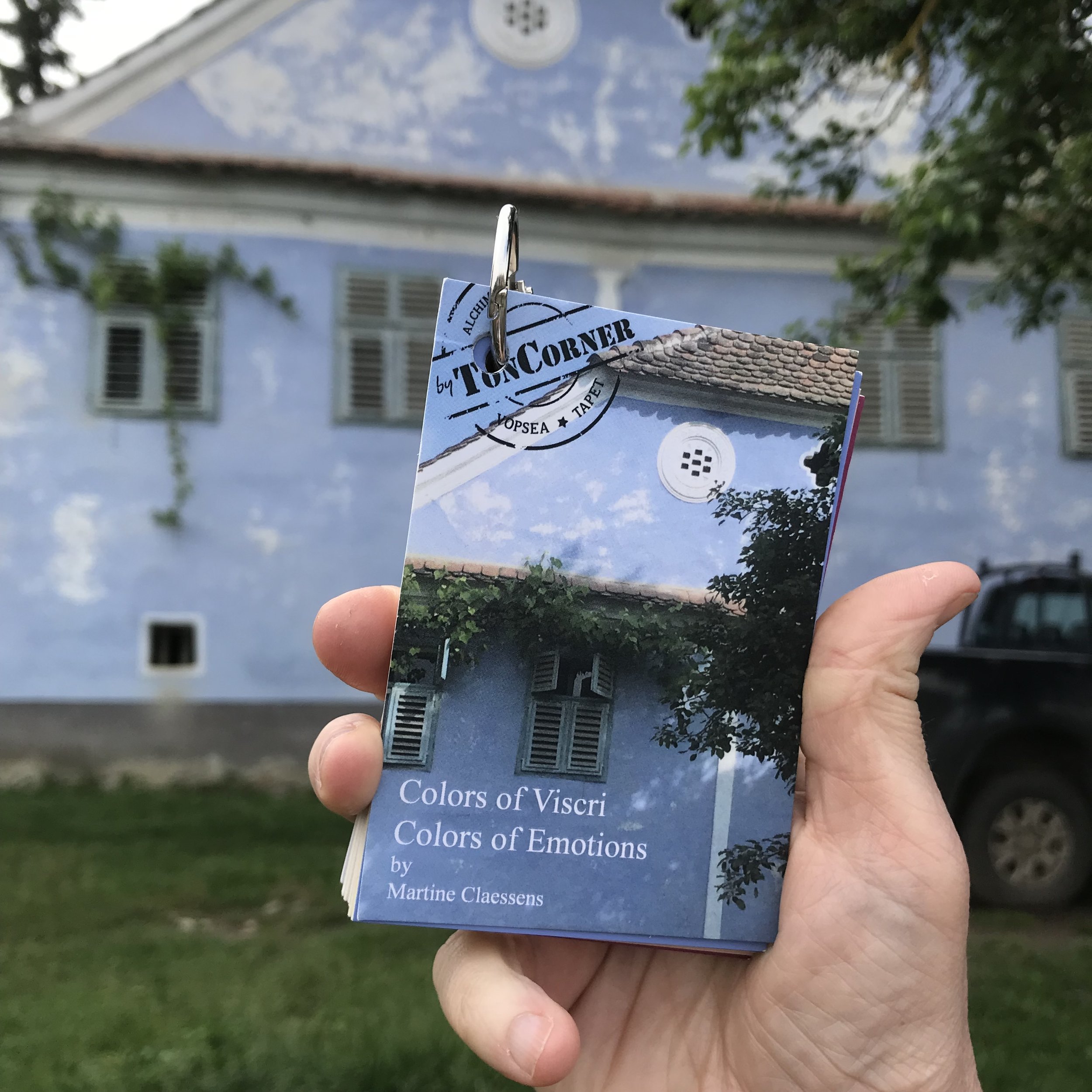
I love colors, I love to work with colors. Since quite some time I dreamed of developing a color harmony for somebody. So when Lia of Ton Corner asked me last year to create a color harmony for them, inspired by Viscri it was a dream come true.
Summer comes to an end and we feel that autumn will arrive soon, the sun goes down earlier. The mornings and evenings are getting cooler. Autumn is the season of memories, as souvenirs of a beautiful summer.
Green is trendy and not only as a color. Mint green, olive green, emerald: there will be one or another green tone that will fit your home or your wardrobe.
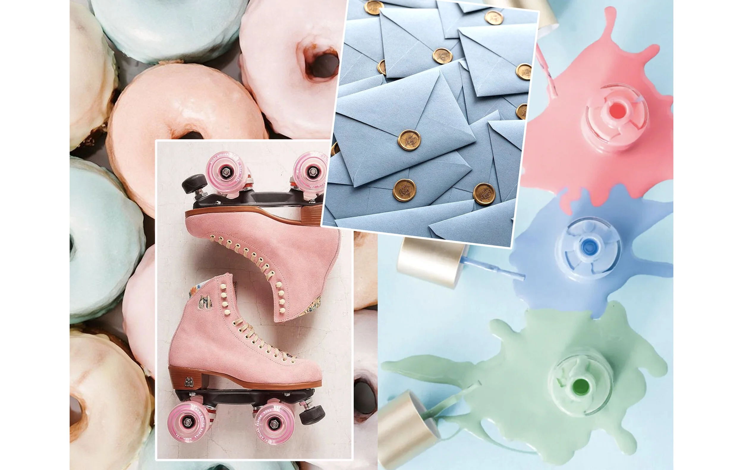
Pastels are to sweet for you? Pastels are a sign for better things to come, associated with spring, innocent love. But not only, they make me think of the 50’s, where those colors were introduced in the home.
When we think of pastels we think of spring, right? Use some pastels for your interior and make a nice transition from summer in to autumn. As if you would see the colors through the fog on an early autumn morning, that is the spirit of the autumn pastels; muted and grayish.
We still feel the glow of the summer heat, but the end of summer will arrive soon. Terracotta, a shade between orange and brown, reflects perfectly this feeling. It is a cozy color that helps to bring a warm feeling in your home.
Yellow, the color of sunshine, hope, and happiness. Yellow, a color giving you confidence and bringing creativity, joy to our hearts and lift up our spirits. As the color of the sun it is associated with warmth, as the color of light it is associated with knowledge and wisdom.
It was on my mind since quite some time to write a blog post about color. Color is a complex subject as there is so much to tell about, so I decided to make a series about it: The Power of Color.
So what is color? Color is what we see when the light strikes an object and is reflected to the eye.