Summer is officially here, and with temperatures skyrocketing around the globe, we can only think of a relaxed holidays. When we slow down, the inspiration often strikes and we want to bring the same easygoing feeling into our homes. Is it truly wise to bring that holiday aesthetic home with us, or should we pause before painting our living room Mediterranean blue?
Every time I take out the samples of my Viscri paint collection, nice memories are coming back. Viscri still holds a warm spot in my heart, and collaborating with Lia from Ton Corner was a dream come true. At first glance it can be challenging to imagine how the colors work together, but when you look at the pictures of Viscri, you see immediately the combinations reveal themselves.
Soon the Holiday season will arrive, and we are getting ready to bring the warm Christmas atmosphere into our house. With dark evenings and cold outside, in the best cases it will even snow and your Christmas holiday will be just perfect. You can decorate in the traditional way or keep it in your personal style.
Color drenching basically means painting every surface in the room in the same hue. Subtle variations in shade will add depth to the room, preventing it to feel flat. Color drenching is not new but is still ranking high on the scale of trends.
Magenta is a striking color that combines the energy of red and the tranquility of blue, it holds a delicate balance between these two opposing forces. It evokes feelings of creativity, passion, and energy, a color full of life and expression.
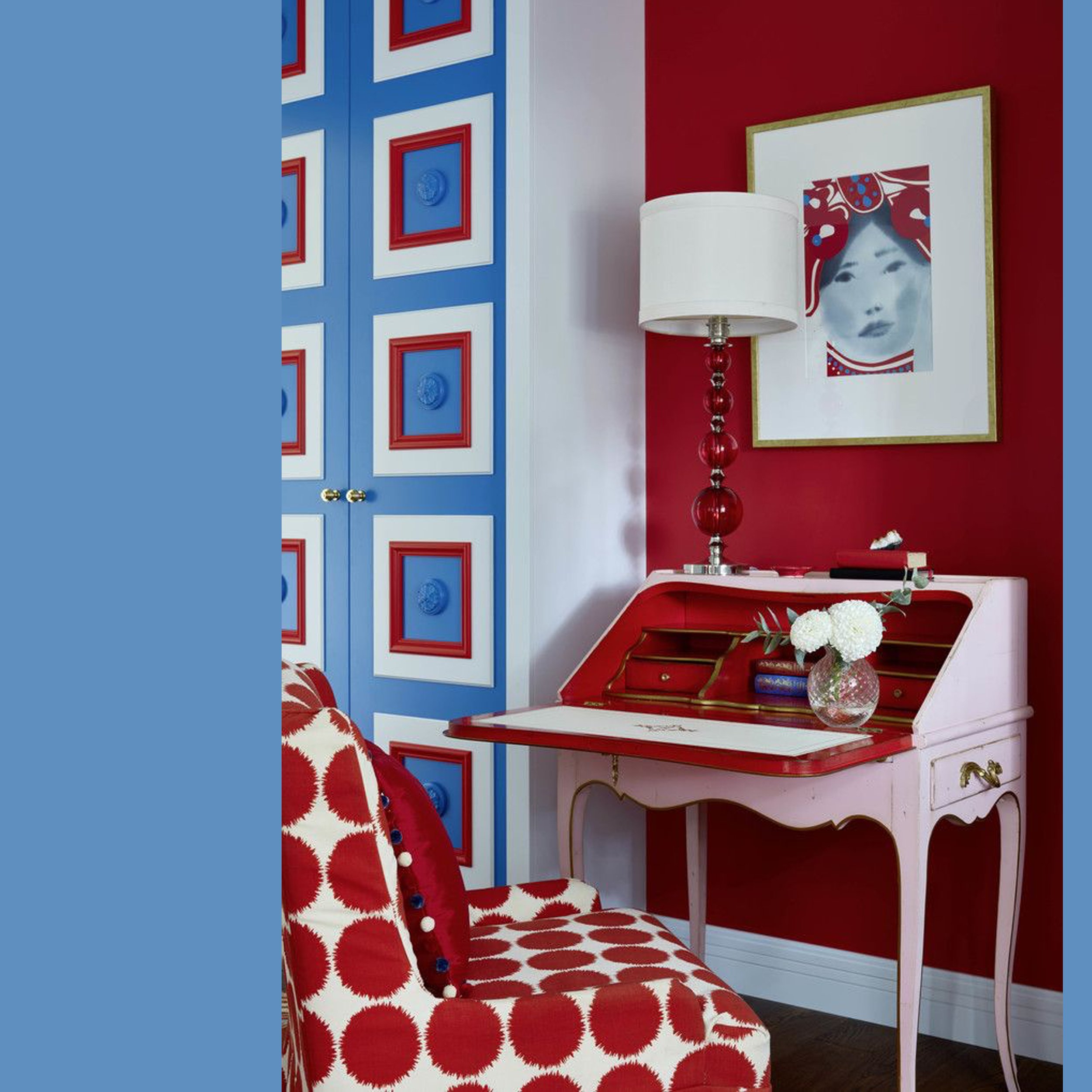
Relaxing time, enjoying a meal al fresco on a warm day, or long evenings with friends. Summer has arrived, and we start to slow down as the holidays approach. Bleu, white, and red is such a summery combination that instantly transports us to the seaside. Already our memories of sun, beach, and ocean breezes brings us in the right mood.
Part four of the Viscri paint collection features a selection of pale pastels, inspired by the faded facades in this rustic village. These colors add a delicate touch in your home. Alongside those pastels, there are two perfect off-whites to seamlessly fit into each interior.
Here is already the third part of the Viscri paint collection, inspired by a small traditional village in Transylvania. Part three focuses on the darker colors of the collection: Wine, Mud, Unbleached Wool, Before the Storm. These hues can be a good foundation to pair with all the vibrant colors we explored earlier, or make a striking statement when used as the main color in the room.
A few weeks ago I was telling you about how this Viscri paint collection was inspired by a small traditional village in Transylvania. I showed some inspiration for the cold colors of the collection: Viscri blue, Viscri green, Hunter’s Green and Peacock. This time I want to inspire you to apply some of the warm tones of the collection of Viscri paint colors.
The Viscri collection consist of a total of eighteen colors, a diverse range that includes the characteristic Viscri blue and Viscri green. The collection also features a variety of neutral shades and a selection of off-whites.
So, let’s explore how you could effectively use them.